An equestrian staffing agency placing horse people since 1982, out of Ocala with a real, differentiated business hidden behind a generic job-board template. I audited it, sold the rebuild, then grew the work into the admin portal and the ATS. Design, engineering, and the sale were all mine.
Role
Principal Designer — Carrington Design Co.
Timeline
Sept 2026 – present
Client
EquiStaff
Team
Solo audit and sale; build with the Saddle Pass engineering team
Surfaces
Public site · Job seeker · Employer · ATS & admin portal · AI concierge
Stack
Heuristic evaluation · FigJam workshop facilitation · Conversation design · HTML / CSS / JS prototype · Claude Code agents
Constraints
A live revenue-generating site that could not go dark
Domain knowledge held entirely by the founder
An assistant that must never invent a pay figure
A rebuild scoped against an existing back end
The engagement
EquiStaff has been placing barn managers, grooms, riders, and estate staff since 1982, out
of Ocala. Recruiter-vetted placements, free for job seekers, a real database and a real
reputation — four decades of it.
None of that was visible on their website.
I ran a full audit across the public site, the job-seeker experience, the employer experience,
the admin portal, their social and marketing presence, and the technical stack — delivered as
eleven documents.
The engagement, end to end
Five workstreams for one client, all still running:
Audit
Eleven documents across the public site, both sides of the marketplace, the admin portal, social, and the technical stack. 60 findings, severity-rated, scored by audience × heuristic.
Brand & design direction
Five directions built out as real pages, narrowed to two — one for the public site, one for the signed-in product — plus a logo redraw and a design system.
The rebuild
Thirty-five pages as a clickable prototype the client reviews in her own browser, on her own phone, every round.
The ATS & admin portal
Applicant tracking and billing built from scratch rather than licensed, so it fits how a recruiter-led agency actually works.
The AI concierge
A grounded, scripted assistant designed in a workshop with the founder in the room, specified rule by rule, and built into every page.
It is one engagement, not five projects. The audit paid for the direction, the direction made
the rebuild reviewable, the rebuild made the admin portal obviously worth having, and the admin
portal made the licensed ATS the next thing that did not fit. The through-line is the working
method, which is the next section.
The audit
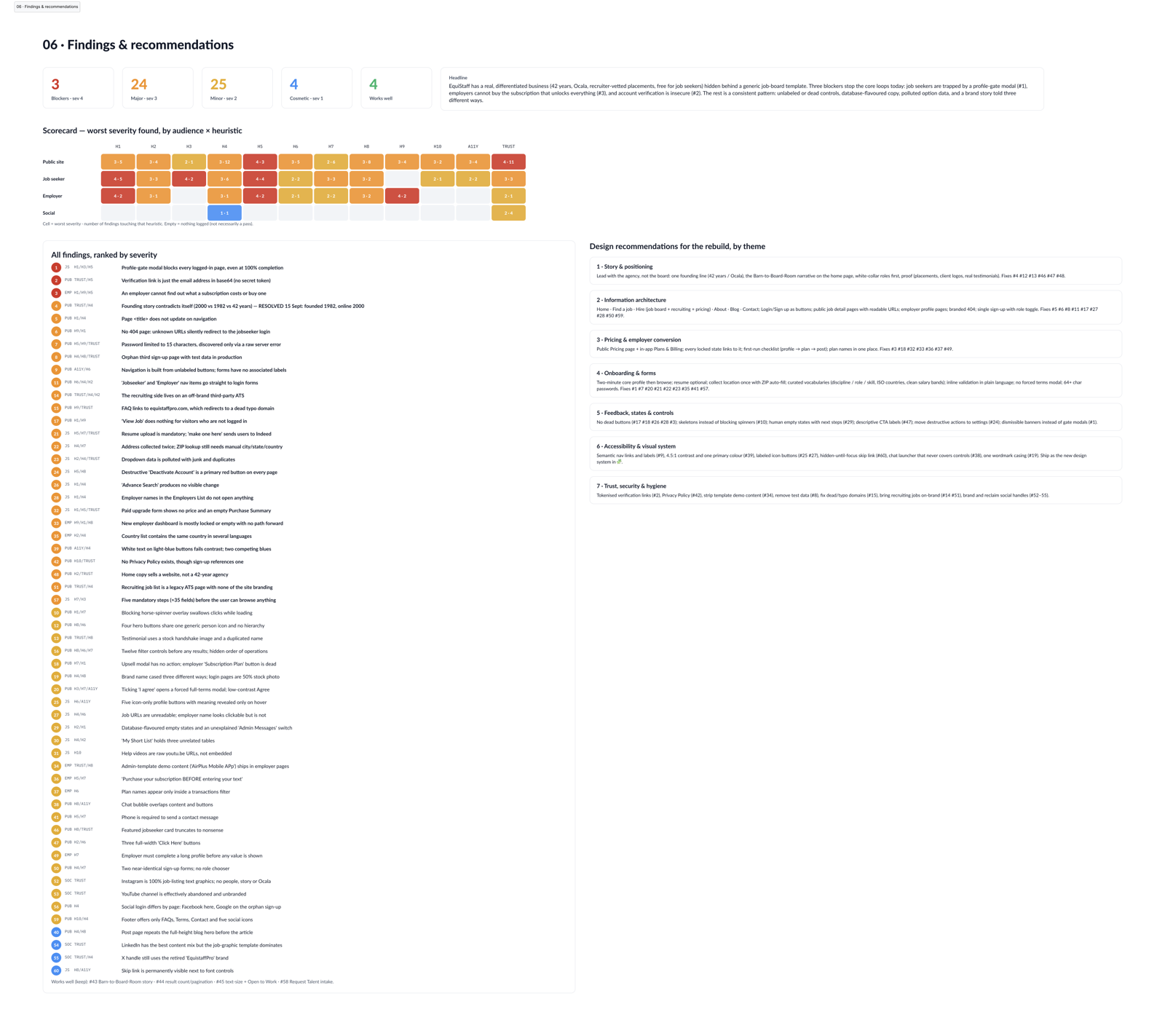
Full size ↗06 · Findings & recommendationsSixty findings, each tagged with the audience it affects and the heuristic it violates, scored into a matrix of audience × heuristic so the client can see at a glance that the job-seeker path is the one on fire. Four findings are logged as works-well — an audit that finds nothing good is not an audit, it is a pitch.
The headline finding was a positioning one, and it is the sentence the whole engagement turned
on:
A real, differentiated business hidden behind a generic job-board template.
Three blockers were stopping the core loops outright. Job seekers, for one, were trapped behind a
profile-gate modal that blocked every page even at 100% profile completion, and employers could
not find out what a subscription cost or buy one.
Underneath the blockers was a consistent pattern rather than a list of unrelated bugs —
unlabelled and dead controls, database-flavoured copy leaking into the interface, polluted
option data, and a brand story told three different ways on three different pages.
My favourite finding is not a design problem and I reported it anyway. The site claimed two
different founding dates. Resolved during the audit: founded 1982, online since 2000. An agency
four decades old was accidentally telling visitors it had been around since 2000.
Why the matrix matters
Severity rating on its own produces a list nobody can act on. Cross-tabulating audience
against heuristic turns the same findings into a decision:
The job-seeker row is the one with blockers in it, so that is where the rebuild starts.
The employer row has the revenue problem — they cannot buy.
The public site row is broad but shallow: lots of major, few blocking.
A client with a fixed budget needs to know what to fix first. The matrix answers that without
me having to be in the room.
What the audit sold
The audit was the pitch. What it sold, in three steps:
First
The rebuild — a new front end on their existing APIs, plus the AI concierge
Then
The admin portal, added once she saw what the employer side could be
Then
Their ATS, rebuilt from scratch internally rather than licensed
$50,000
Total, for one client, inside the Saddle Pass ecosystem
Each number came from the one before it. The audit proved the site was costing them placements;
the rebuild made the employer side visible enough that the admin portal became obviously worth
having; and once the admin portal existed, the applicant tracking they were paying someone else
for was the next thing that did not fit.
I ran the design, the engineering direction, and the sale. That is the part I am proudest of
— not the total, but that no part of it was handed to me.
How the work runs
Before any of the screens, the thing worth looking at is the machinery that produced
thirty-five of them, at this quality, for one client, on a fixed fee — and that is still
producing them. This section sits here rather than at the end because everything after it is
an output of it.
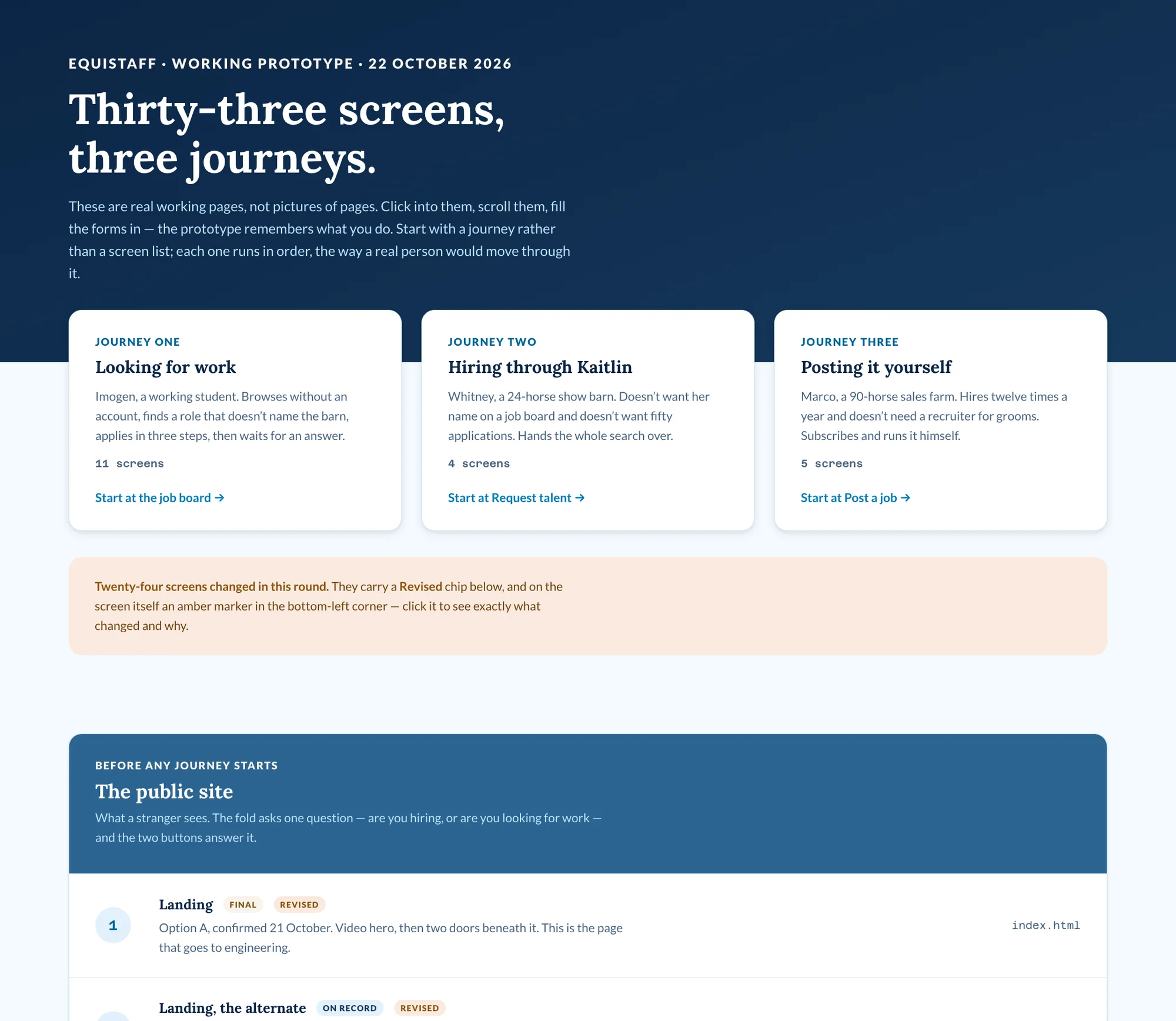
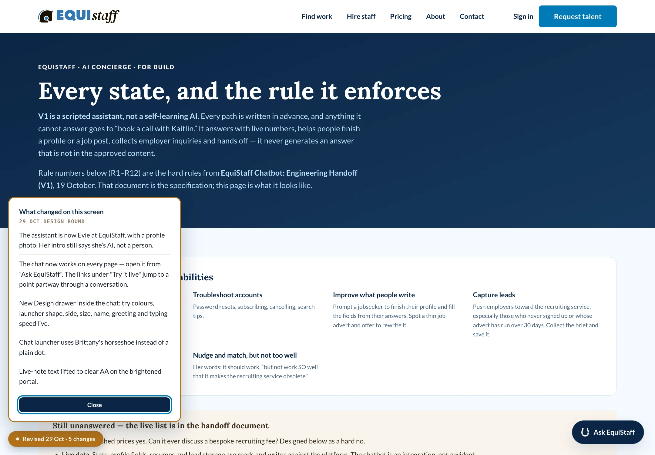
Full size ↗The prototype is the deliverableThe client does not get a Figma link and a walkthrough call. She gets a URL, dated, organised by journey rather than by sitemap, with each journey showing how many screens it holds and where to start. “Twenty-four screens changed in this round” is at the top, and a section headed “deliberately not built yet” states the gaps rather than letting her discover them. A review request is a brief, and an unbriefed reviewer gives you notes on the font.Full size ↗What changed on this screenEvery page carries its own revision log, in the corner, per round. The client can see what moved since she last looked without reading a changelog in another window — and because it is per screen, her feedback lands on the right thing. The script that renders it says outright that it is a review aid and gets deleted before launch, which is the right way to ship a scaffold.
The loop
A clickable prototype instead of flat comps. Every round is a real URL the client clicks
through on her own time, in her own browser, on her phone.
Figma comments, gated by emoji. The internal design team marks up screengrabs in Figma.
Only comments marked with a hammer get built — everything else is logged. Without that rule a
shared file turns every opinion into a work item.
Granola for the calls. AI notes on every client call, so the decisions are captured while
the conversation is still happening rather than reconstructed afterwards from memory.
Named agents per workstream. The prototype flows, the admin-portal redesign and the mobile
audit each run as their own Claude Code session, producing pull requests against a repo with a
PR template, a changelog and a written “how we work” section in the README. I review and merge;
nothing lands on main without that.
That last one is the part worth stating plainly, because it is what the rest of this page is
evidence of. I am a designer who ships to a codebase. The prototype is mine — the HTML, the
CSS, the chat script, the revision marker — built by directing agents and reviewing their output
the same way I would review a junior’s. It is why one engagement could carry thirty-five
designed screens, an ATS and a working assistant, and why the later work followed at all: the
client kept seeing more of her own product than she expected to, and asked for the rest.
Design direction
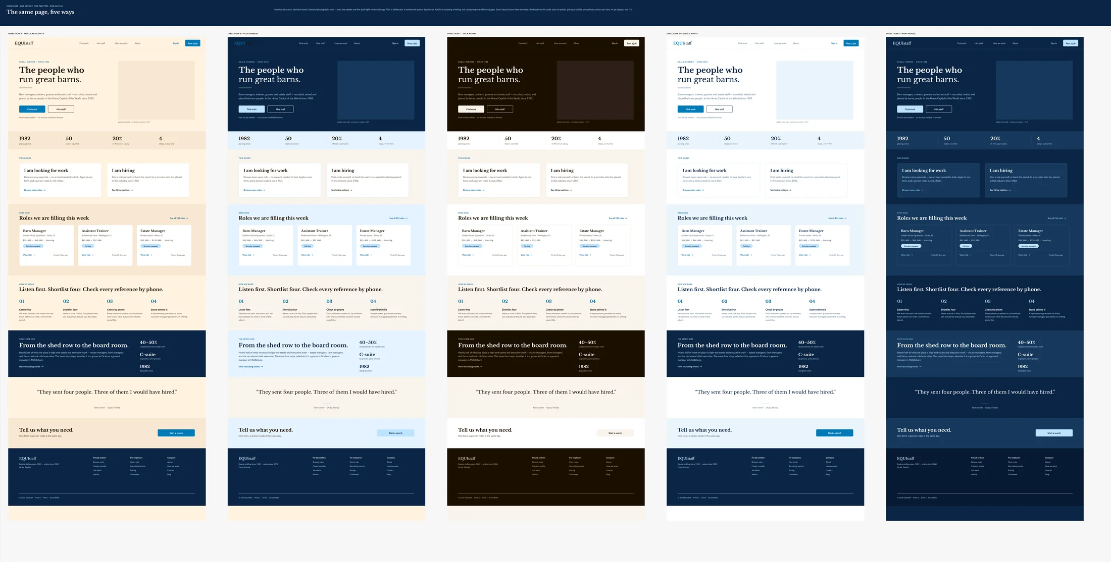
Five directions, narrowed to two — because the public site and the signed-in product are not
the same room and should not pretend to be.
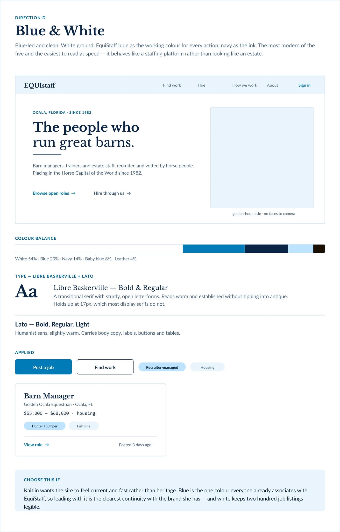
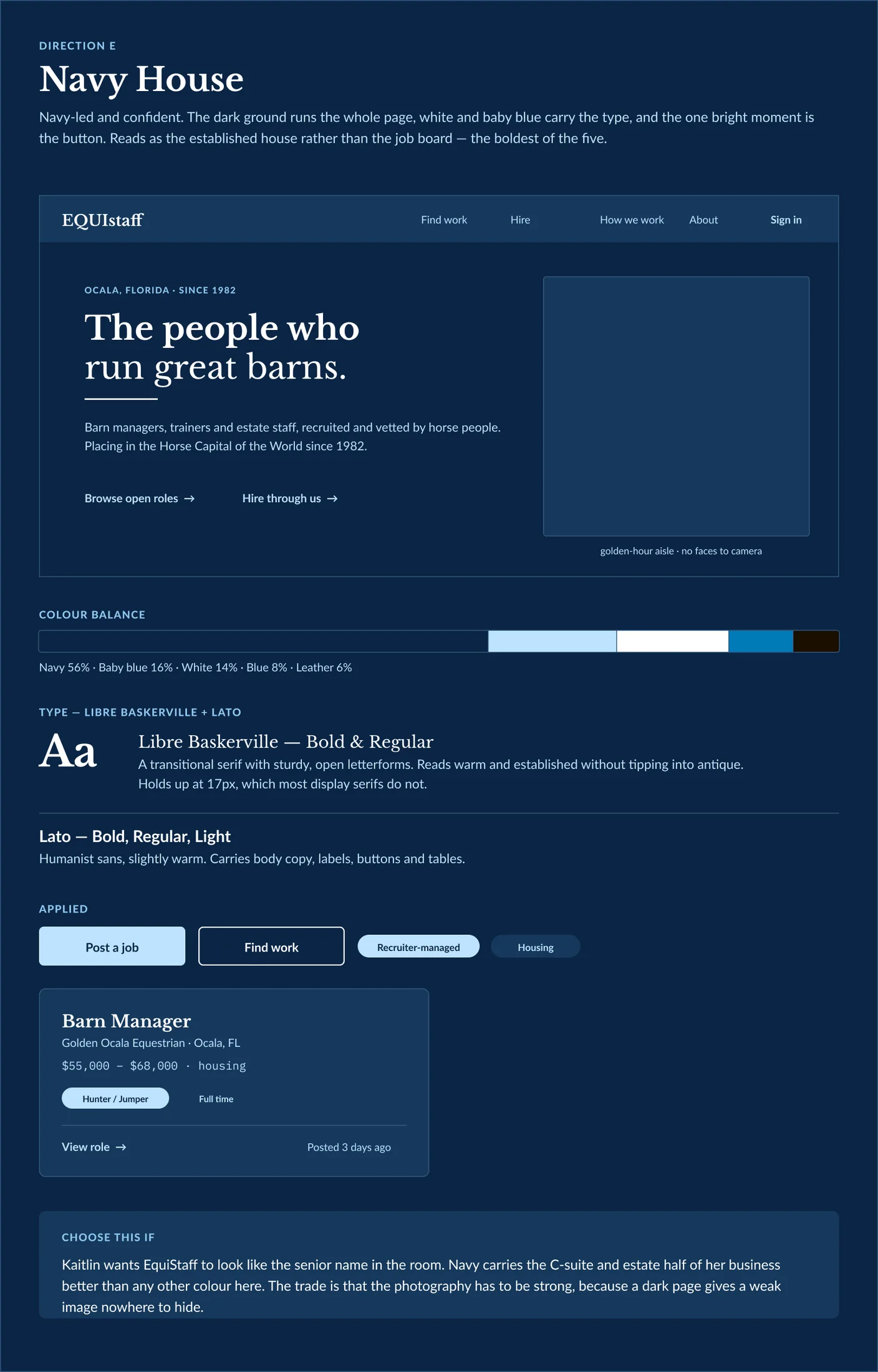
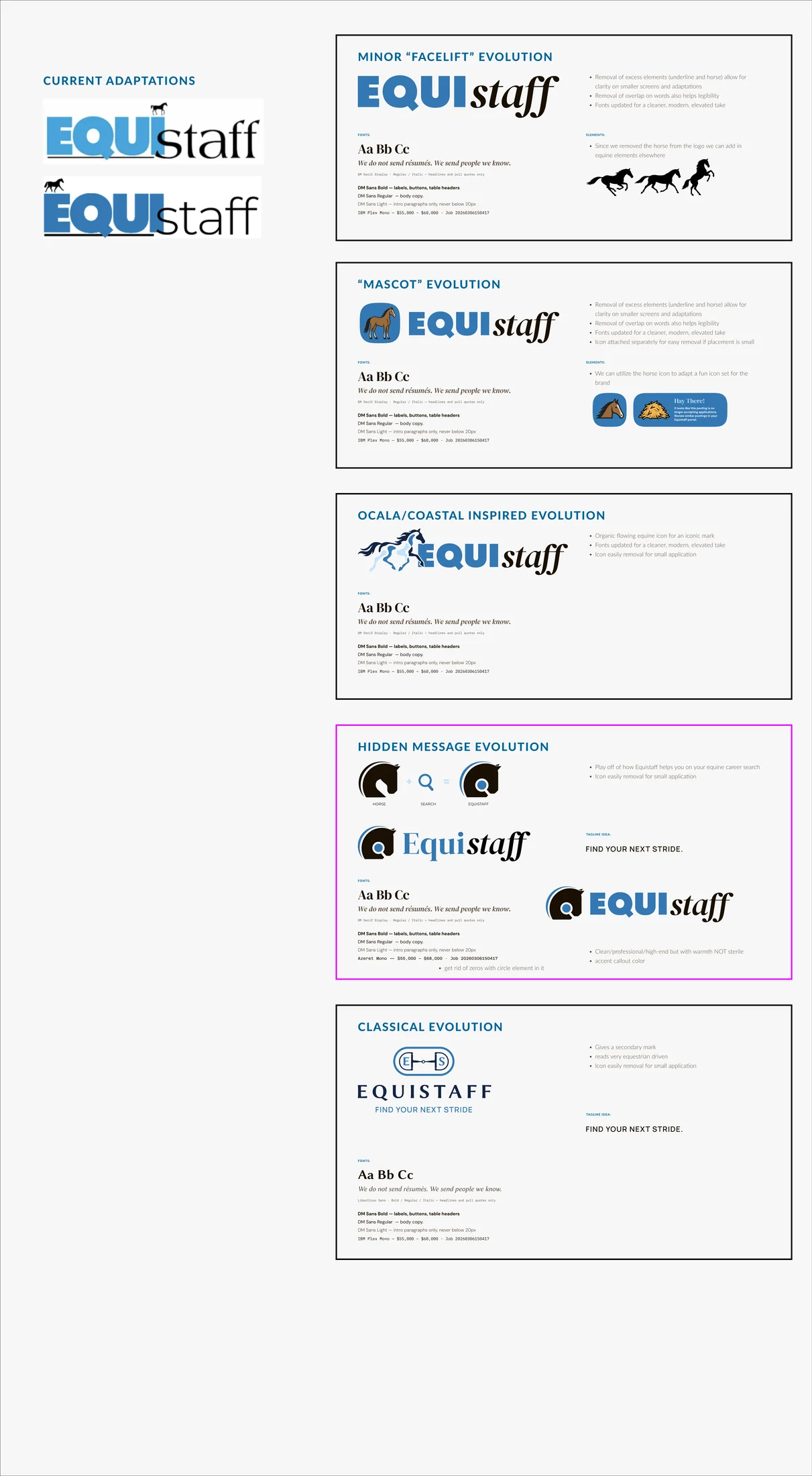
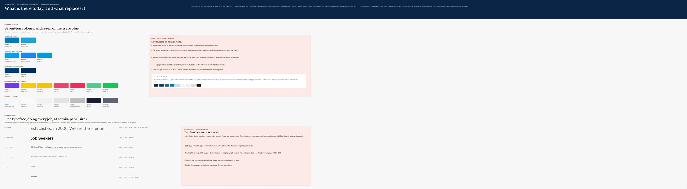
Full size ↗Five home pages, same contentThe only way to decide a direction is to build the same page five times and put them next to each other. Holding content, layout and headline constant means the conversation is about the thing being chosen rather than about whose copy is better — and the warm grounds lost on the spot, which a mood board would have argued about for a week.Full size ↗✅ Direction D · Blue & White — public siteBlue and white for everything a stranger sees. The “choose this if” panel at the bottom is the part I would carry into any client project: each direction argues for itself in the client's own terms — this one wins if Kaitlin wants the site to feel current and fast, and it keeps the one colour everyone already associates with EquiStaff.Full size ↗✅ Direction E · Navy House — signed-in areaNavy for the signed-in product. Both directions won, as two ends of one system: the public site is bright and quick, the portal is dark and dense. The trade is written on the board — a dark ground gives a weak image nowhere to hide, so the photography brief had to get stricter before this could ship.Full size ↗Logo — five evolutionsFive routes from a facelift to a full redraw. The winner, unanimously, is the one with a magnifier hidden in the horse's neck — a search mark inside the animal, which is what a staffing agency for horse people literally does. Keeping the current lockup at the top of the sheet is deliberate: a client needs to see what they are giving up.Full size ↗Current on the left, V1 on the rightThe component-level before and after. Doing this as a direct pairing rather than a showcase is what makes a redesign reviewable by a non-designer: the client is not asked whether they like the new button, they are asked whether it is better than the one they have.
The rebuild
Thirty-five pages, live as a clickable prototype the client reviews in the browser. The
screenshots below are from the current build.
The public site
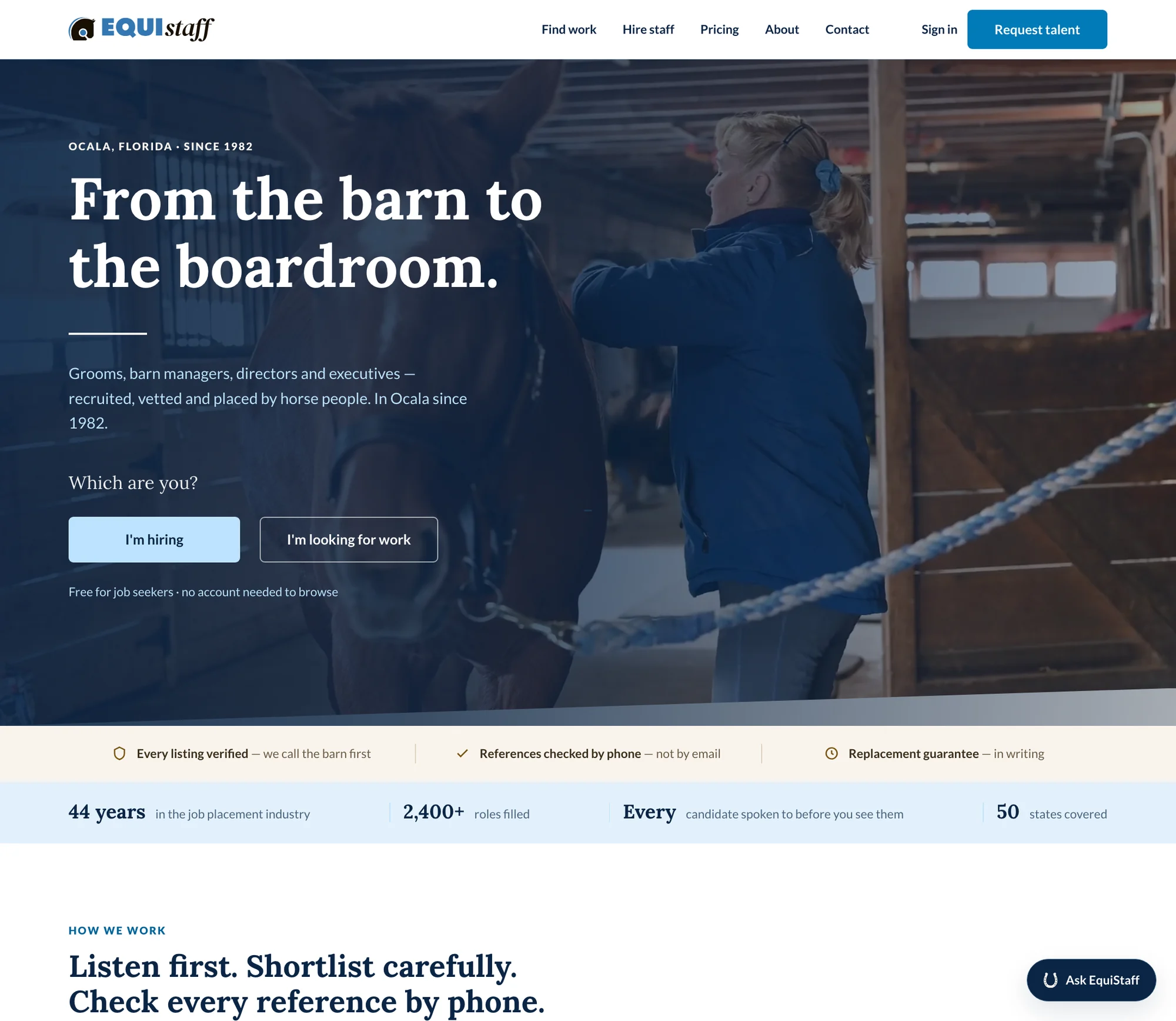
Full size ↗Home“From the barn to the boardroom” was logged in the audit as a works-well — their own story, buried three pages deep. It is now the first thing on the site. The dual-path question under it replaces a generic sign-up with the only question that actually routes someone, and the trust strip states the three things that make them different from a job board: they call the barn, they check references by phone, and the guarantee is in writing.
Job seekers: nothing to get past
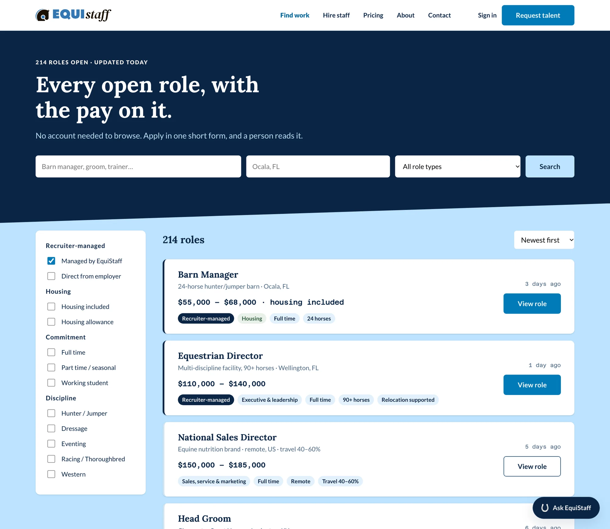
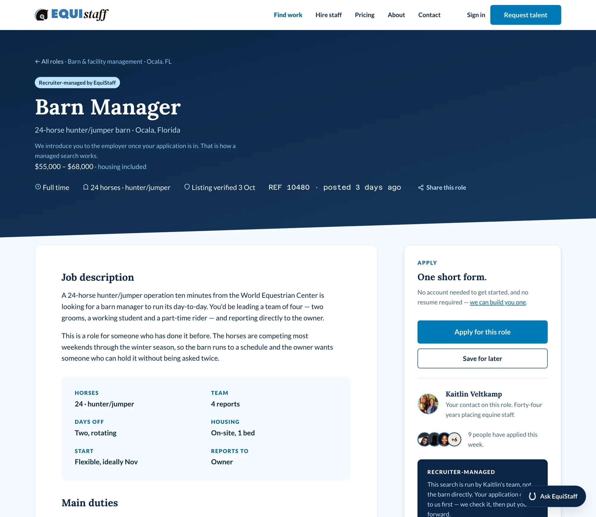
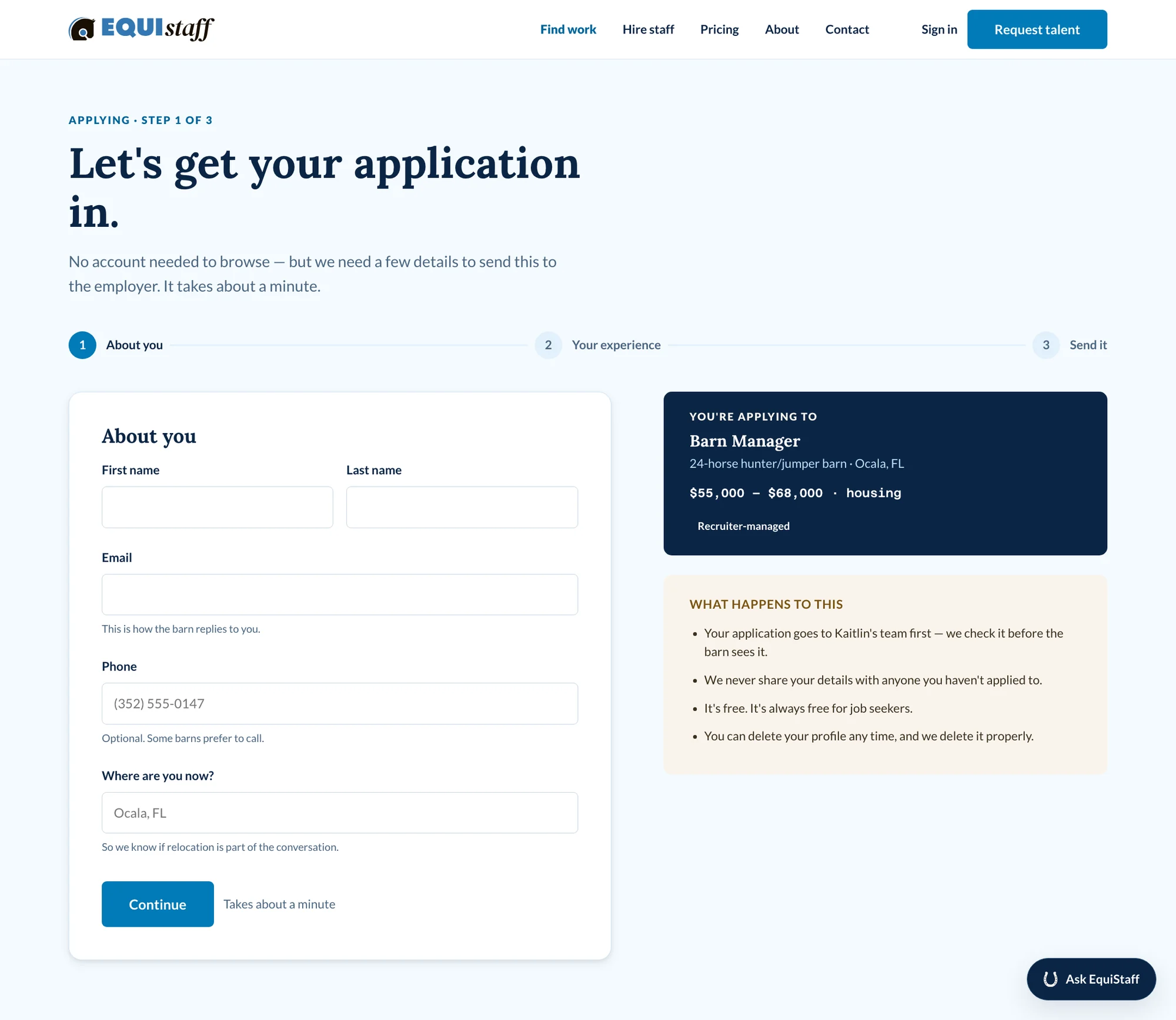
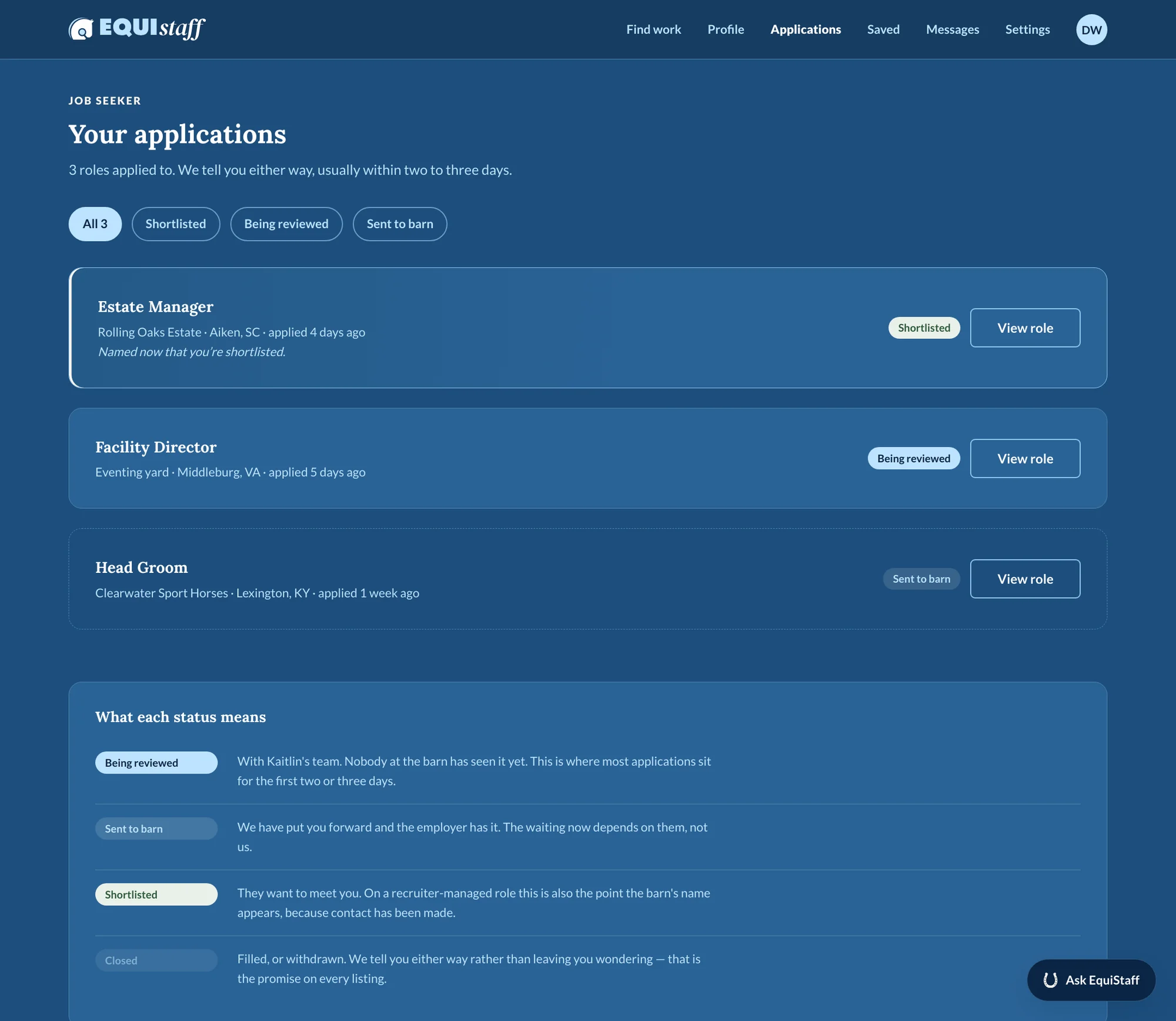
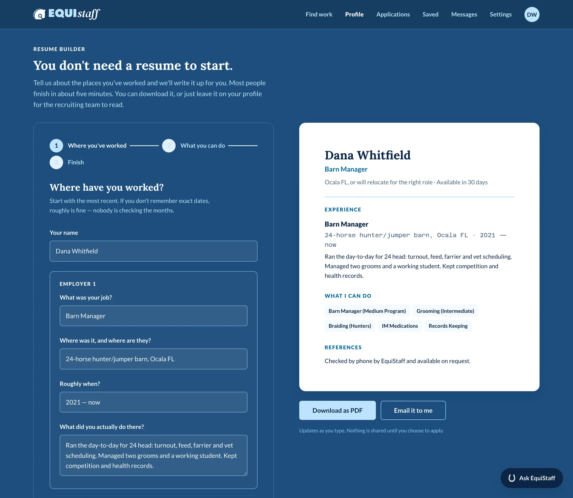
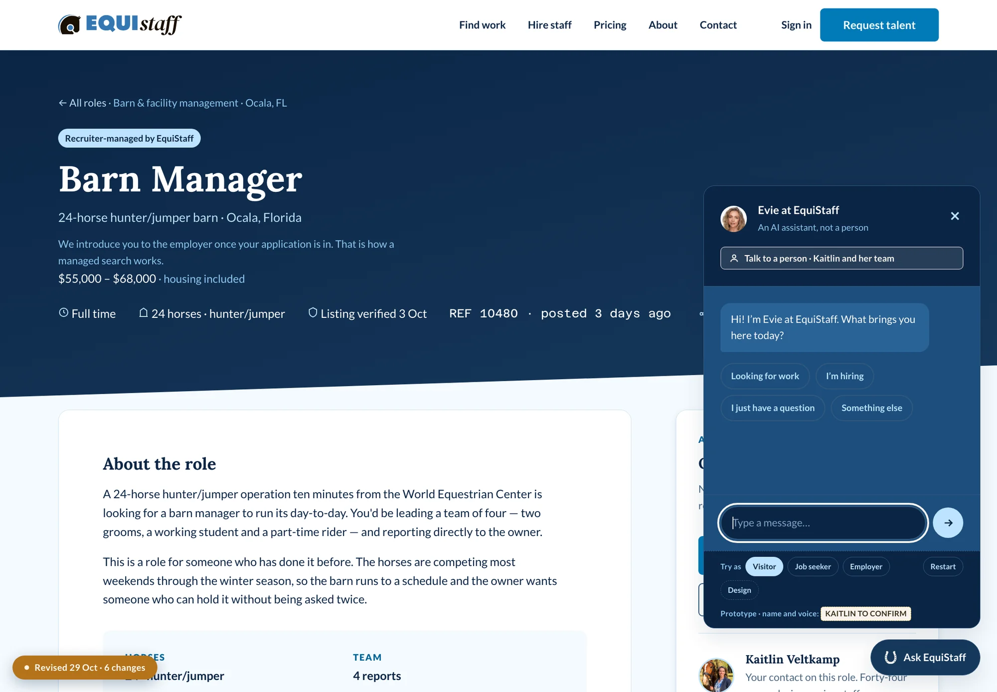
Full size ↗Find workThe blocker, answered twice over. “No account needed to browse” kills the profile gate; “Every open role, with the pay on it” kills the complaint underneath it. Pay is on the card, not behind a conversation. Housing is a filter, because in this industry housing is often worth more than the salary band beside it — and so is state, because equine work follows a circuit and people move for a season.Full size ↗A roleThe facts a horse person actually decides on, pulled out as a panel: how many horses, how big the team, what the housing is, who you report to. “Listing verified 3 Oct” is the audit's verification promise turned into a per-listing fact with a date on it — a claim you can check beats a badge you cannot.Full size ↗ApplyingThe “What happens to this” panel is the piece I would defend hardest. People in low-paid work are cautious about where their details go, and the audit found nothing on the old site that told them. Four plain sentences, next to the fields rather than linked from a footer, at the exact moment the question occurs.Full size ↗Application status, explained“Don't hear back from barns” was one of the loudest complaints in the research. Status alone does not fix that — a word like “Shortlisted” means nothing until someone tells you what happens next. The explainer panel is doing the work a recruiter's phone call used to do, for the hundred applicants who never got one.Full size ↗Sign in — and the case for notThe left panel argues against itself. It lists four concrete reasons an account helps and then offers “keep browsing instead” as a real option, because the audit's worst blocker was a profile gate that trapped people who had already finished their profile. Having been burned by a hard gate, the fix is not a softer gate — it is making the account earn its place, in four bullets, with an exit next to them.Full size ↗Resume builderRequiring a resume filters out exactly the candidates this agency is best at placing. Building one from questions, with the result rendering live beside the form, turns a barrier into a reason to finish — and the output is theirs to take anywhere, which is the kind of thing that earns a free platform some goodwill.
Employers: the revenue path
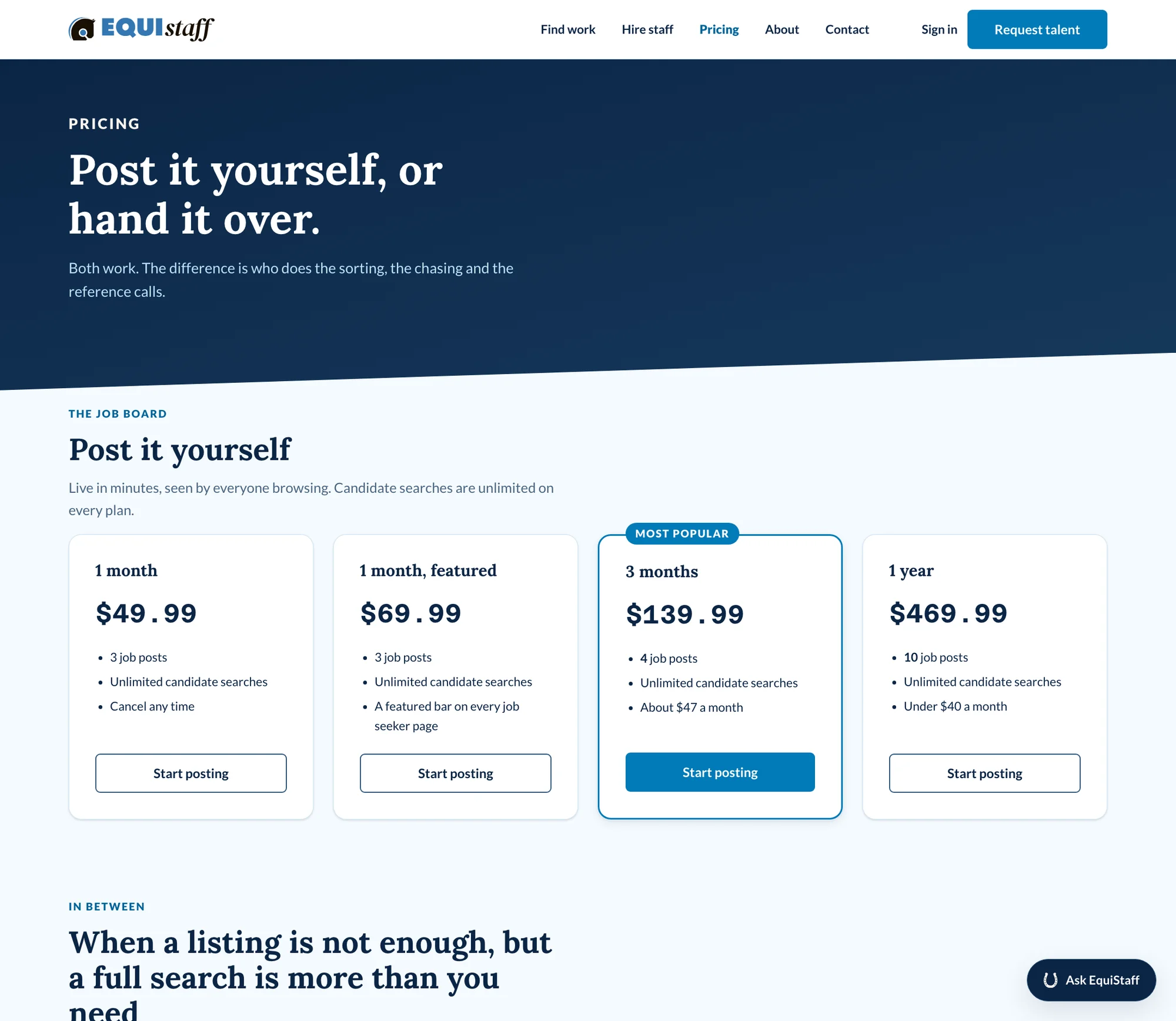
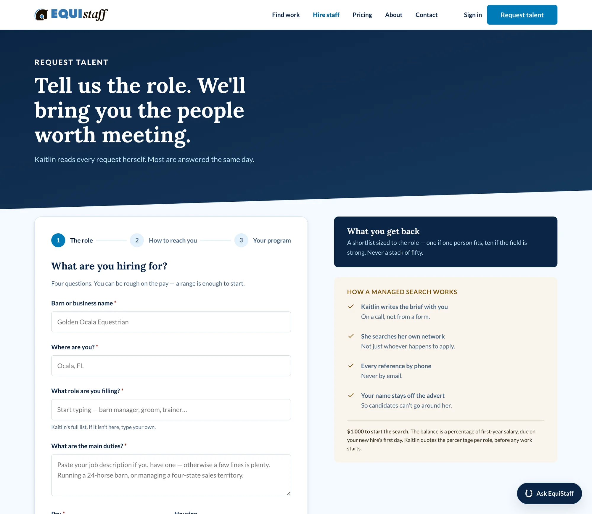
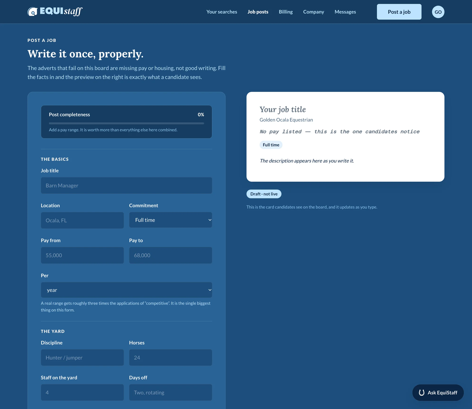
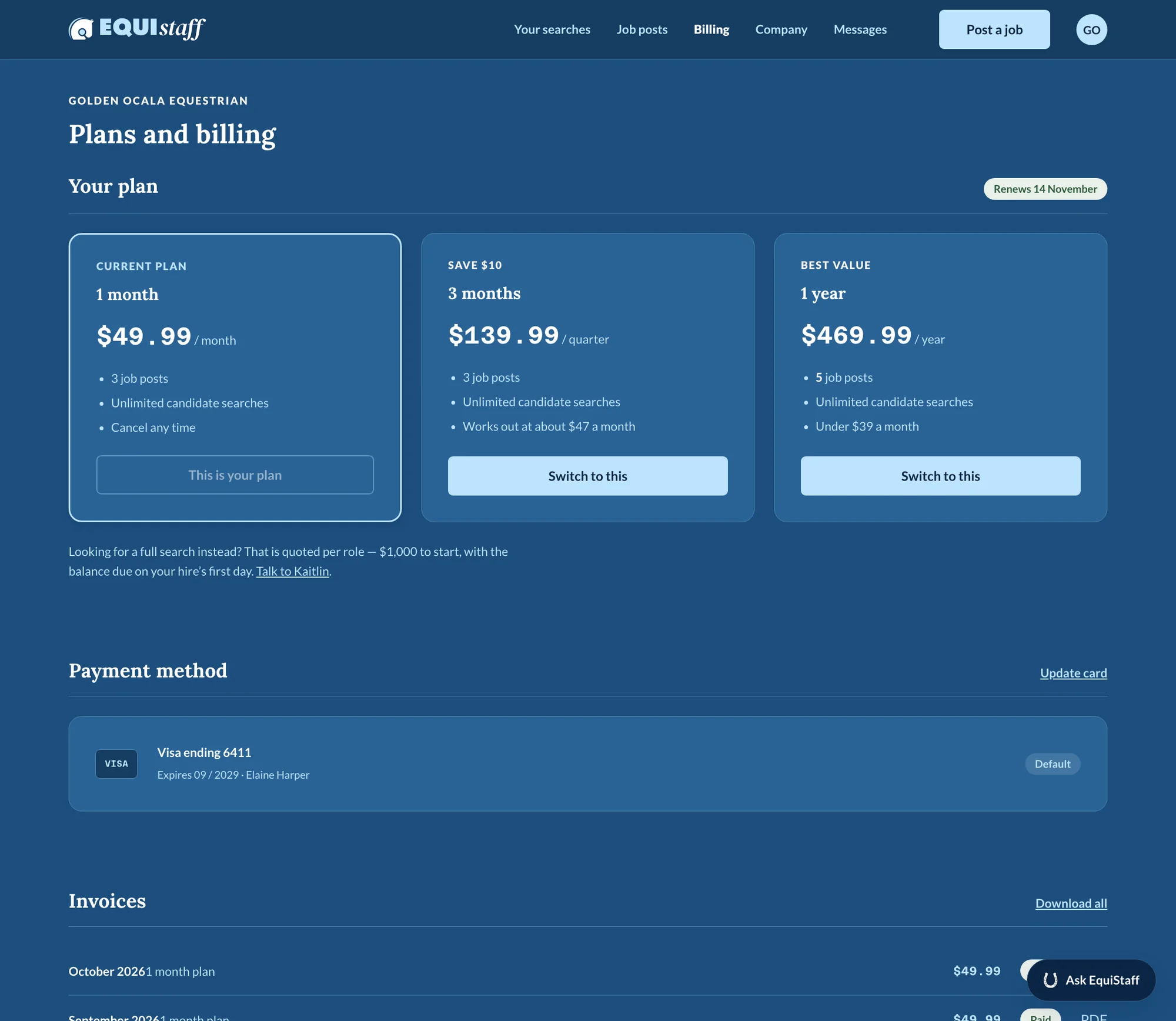
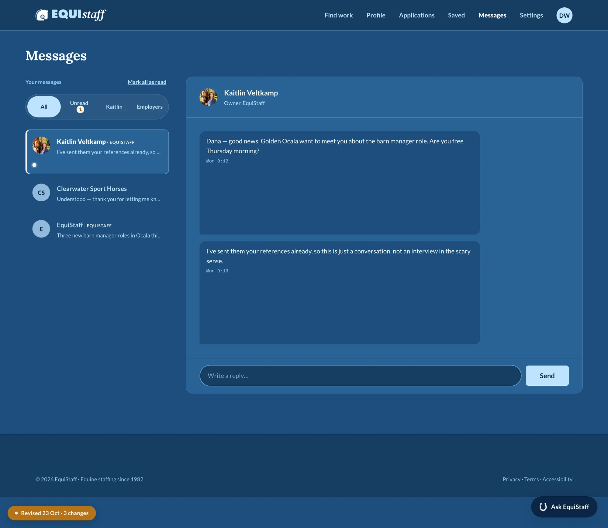
Full size ↗PricingThe second blocker, closed. Employers previously could not find out what a subscription cost, let alone buy one. The framing — post it yourself, or hand it over — sells the agency's actual differentiator inside the pricing table, so the cheap self-serve option is the one that makes the managed search look like the better deal.Full size ↗Request talent“Kaitlin reads every request herself.” The high-value path is deliberately the one with a human at the end of it, and saying so converts better than any automation would. The panel beside the form sets expectations before the work starts — a shortlist of four, references checked by phone, never automated.Full size ↗Post a jobA completeness meter and a live preview, with the advert rendering exactly as a candidate will see it. The inline warning — “No pay listed — this is the one candidates notice” — is research findings turned into a nudge at the moment of writing. Telling an employer why a field matters works; marking it required does not.Full size ↗Plans & billingThe employer's own side of the subscription the admin portal manages. An employer who cannot see what plan they are on, change it, or download an invoice will phone the agency instead — which is a staffing business spending recruiter hours on billing admin.Full size ↗MessagesThreads separated by who is on the other end — the agency, or an employer directly. In a recruiter-managed marketplace those are different conversations with different rules, and collapsing them into one inbox is how a candidate ends up negotiating pay with the wrong party.
The ATS
Applicant tracking rebuilt from scratch rather than licensed, so it fits the
way this agency actually works instead of the way generic recruiting software assumes.
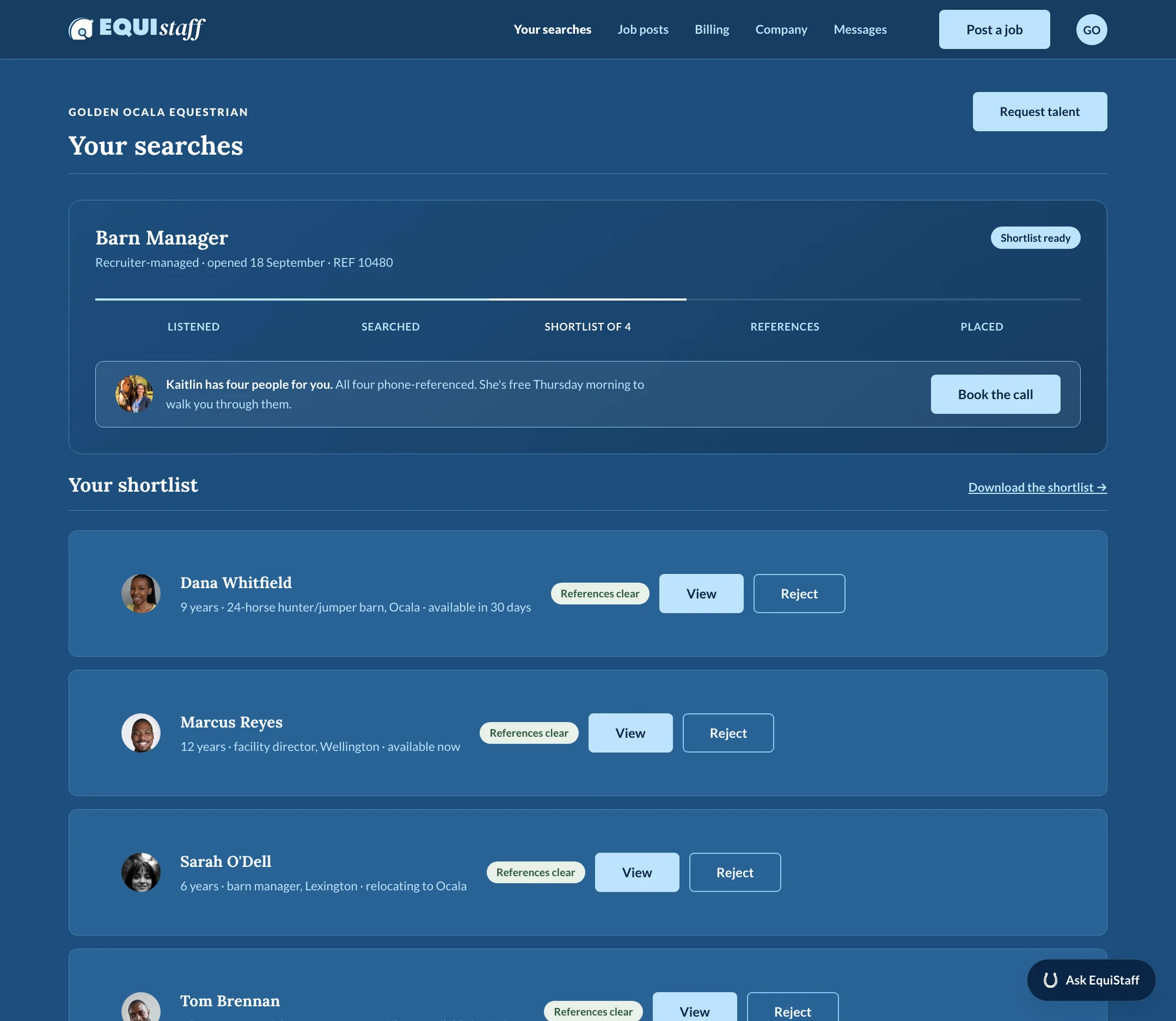
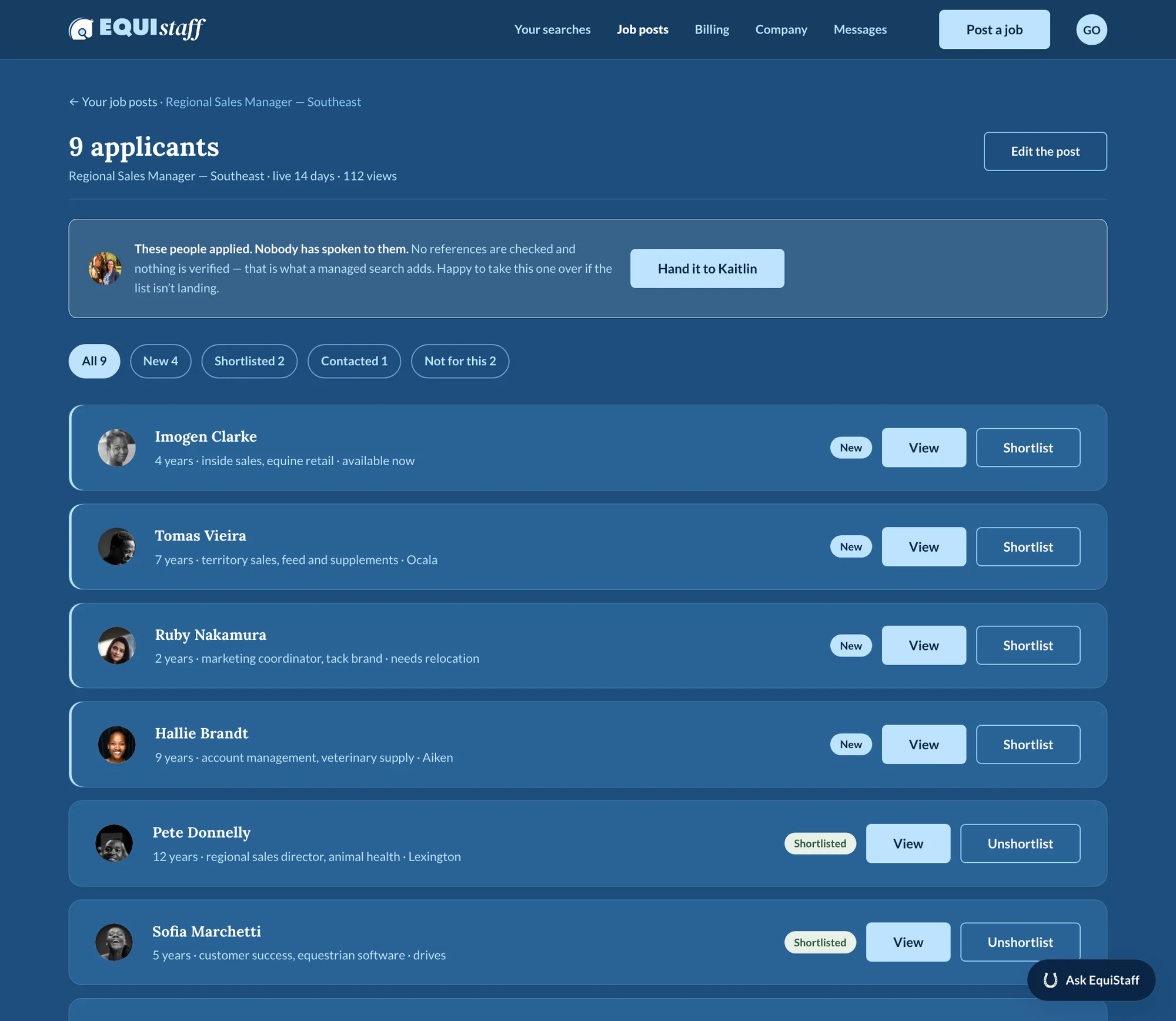
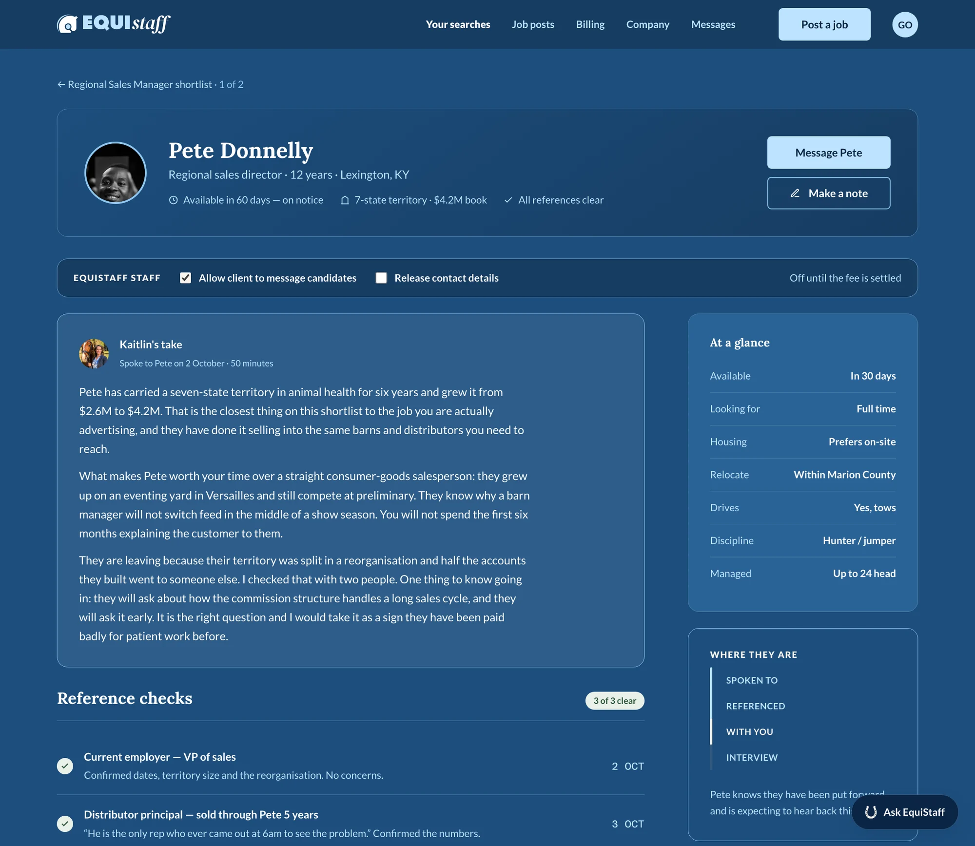
Full size ↗Your searchesThe pipeline as the agency describes its own method: listened → searched → shortlist of four → references → placed. Most ATS software models a funnel with arbitrary stages. This models their promise, so progress through it is legible to a client who was told what to expect on day one.Full size ↗ApplicantsTwo things worth noting. The tabs are decisions, not statuses — “Not for this” is a verb an employer actually performs. And the notice at the top draws the line between a direct post and a managed search in plain words, so the verification promise is not accidentally extended to candidates nobody has checked.Full size ↗Candidate recordTwo things generic ATS software gets wrong. “Kaitlin's take” is the top section — four decades of this business run on a recruiter's read of a person after a phone call, and software with nowhere to put that pushes it into a spreadsheet. And the consent row beneath the name is explicit: whether the client may message this candidate, and whether contact details are released, are per-record switches a recruiter sets. In a managed search the agency is the gate, so the gate has to be a control rather than a convention.
The admin portal
The piece with the clearest before and after on this page. The agency
runs on this software every day — it is where Kaitlin actually works — and it was the part
nobody had ever designed.
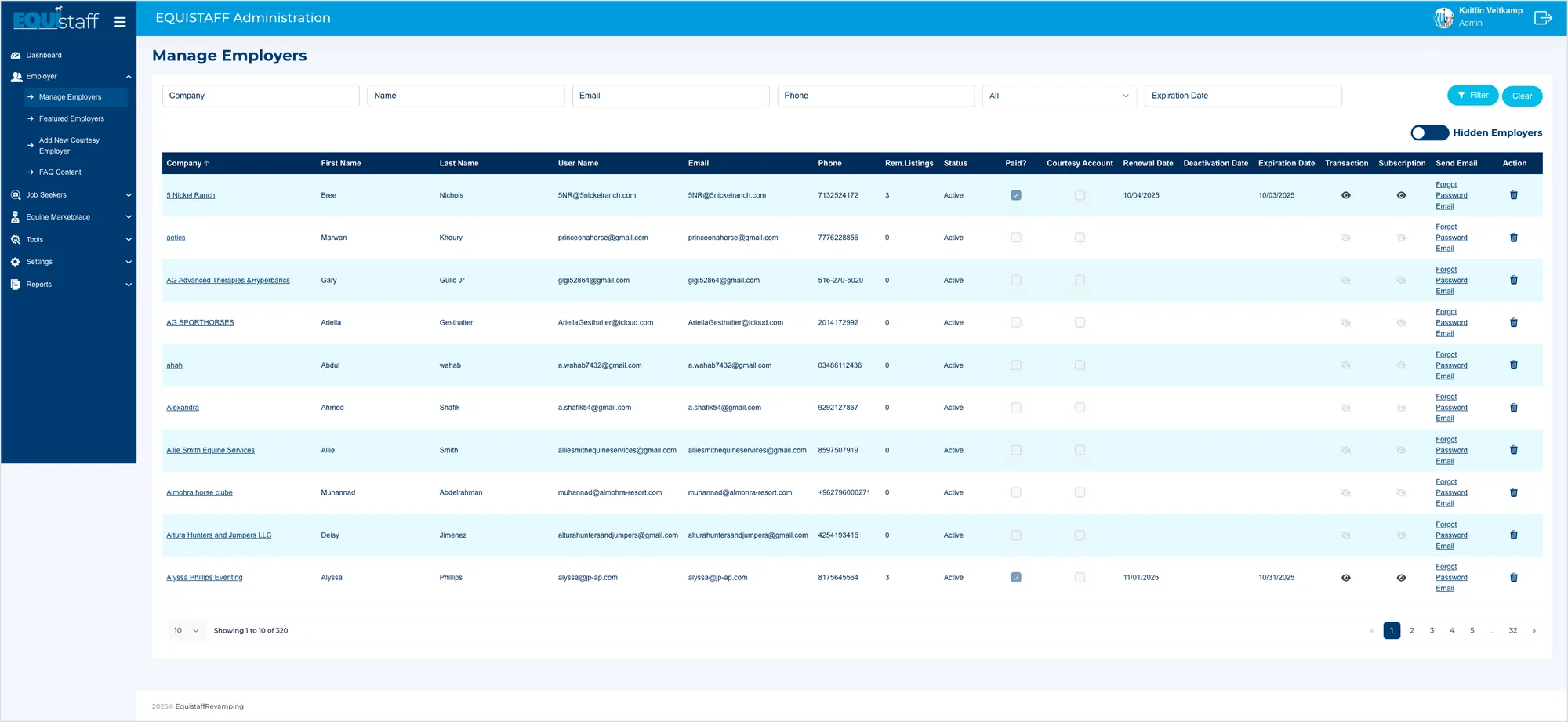
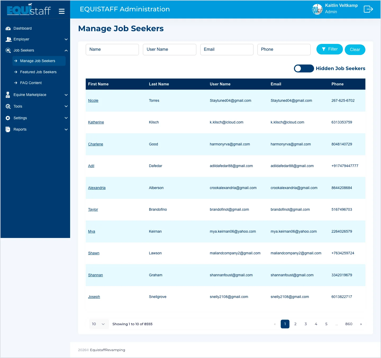
Full size ↗Before — the dashboardEight numbers, three charts and two tables, and not one of them tells you what to do. Counting is not the same as prioritising: “55 new applications” is a fact, and a recruiter still has to go and find which of them needs her this morning.Full size ↗Before — Manage Employers, at its real widthThis is one screen, captured at the width it actually renders: about twice a laptop. The audit counted 34 menu screens plus detail pages, pop-ups and full-width tables like this one. A table that cannot be read without scrolling sideways is a table nobody reads — they phone someone instead.Full size ↗Before — 8,555 rows, ten at a timeEight and a half thousand people, paginated ten at a time, sorted by nothing in particular. The data is all there. The product does nothing with it.
Two dashboards, to be chosen between
Rather than present one answer, I built the two credible ones and let the person who lives in
it decide.
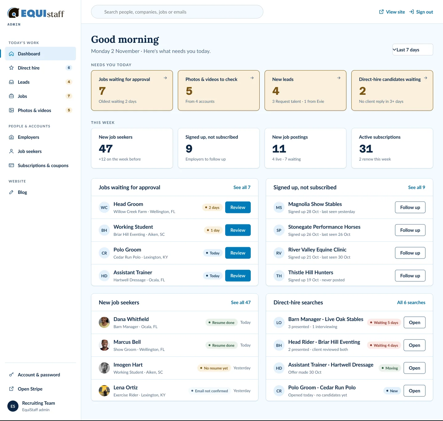
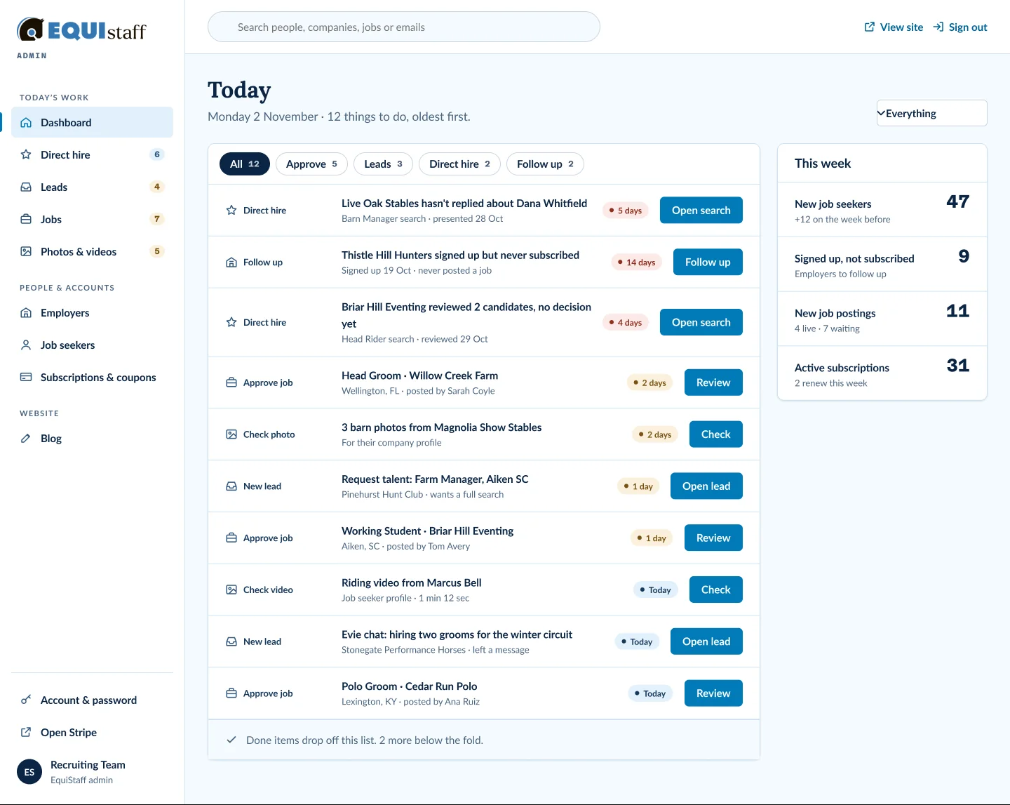
Full size ↗After — direction A: what needs you todayThe same counting, re-sorted into a judgement. “Jobs waiting for approval: 7 — oldest waiting 2 days” is the old tile plus the one fact that makes it actionable. Everything merely informational drops to a This Week row underneath, which is where a number that nobody acts on belongs.Full size ↗After — direction B: one list, oldest firstThe other credible answer: no tiles at all, one queue, oldest first, with chips to narrow it. “Done items drop off this list” is the whole promise — the screen gets shorter as you work, which a dashboard of counters never does. Offering A and B as a real choice is what gets a decision out of a client instead of a reaction.
Organised around the job that pays
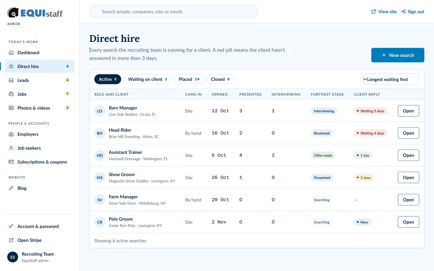
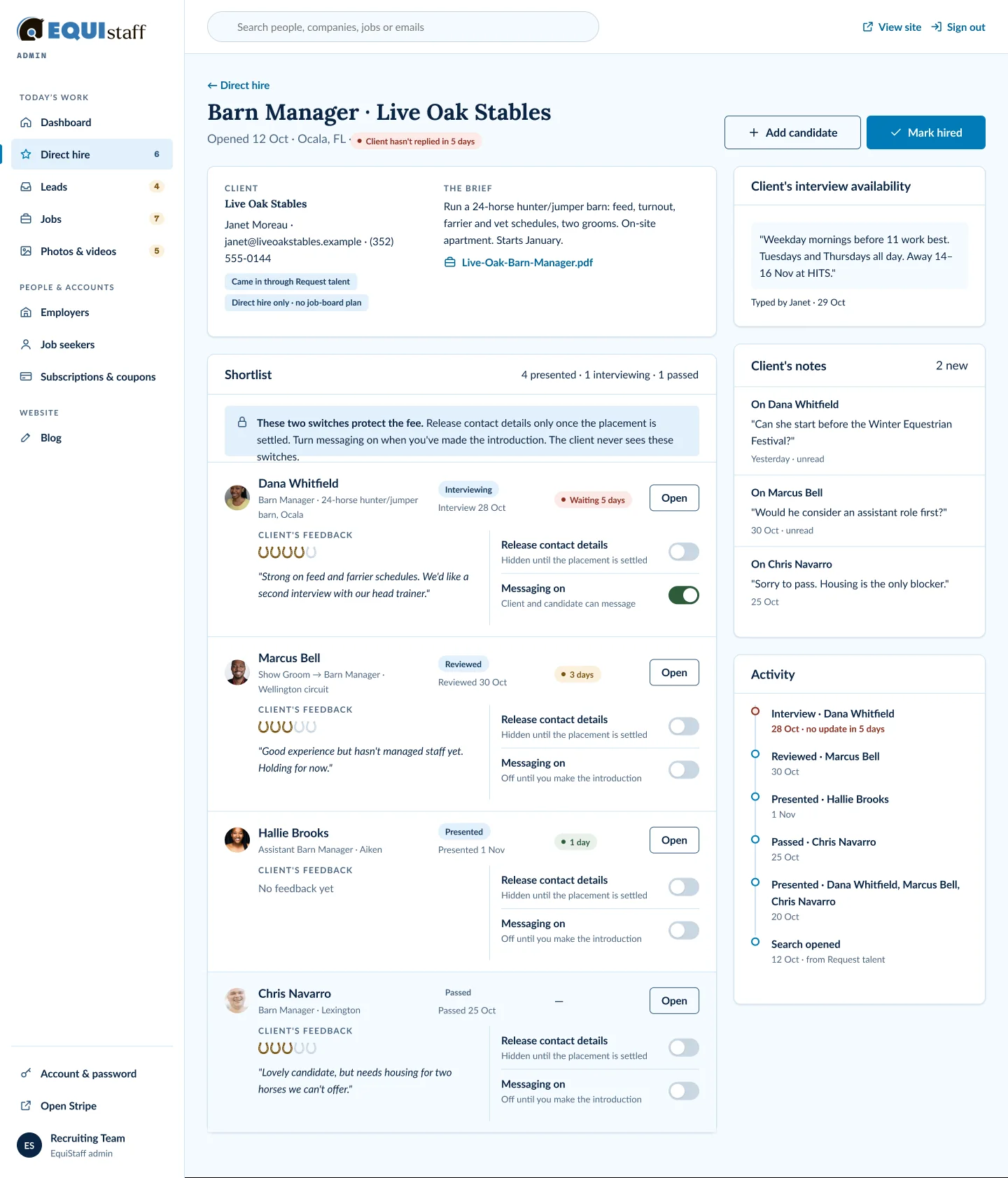
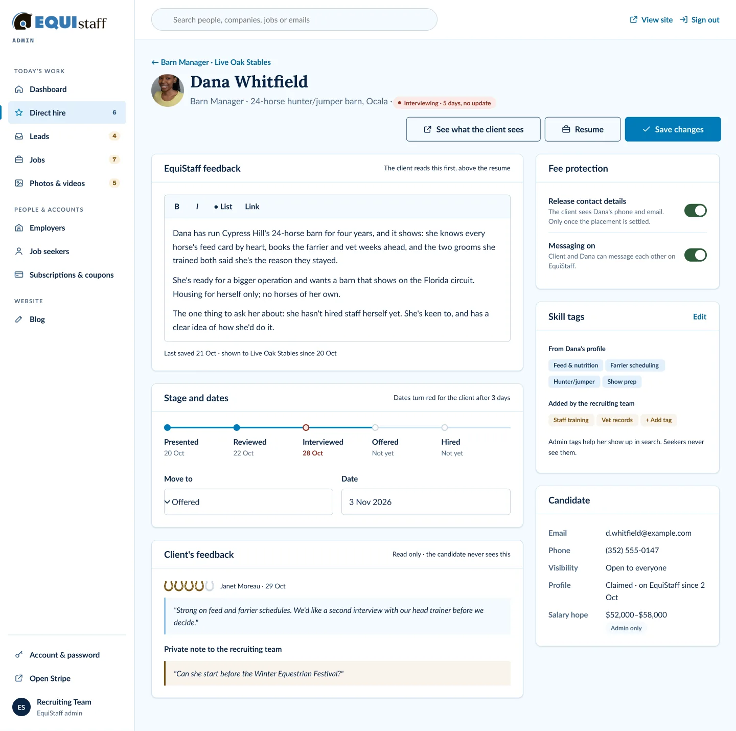
Full size ↗Direct hire, firstDirect hire is the agency's highest-value work, so it gets its own top-level section rather than living inside a jobs table. The rule is written under the heading — a red pill means the client has not answered in more than three days — which turns a status column into the thing the screen is for.Full size ↗One search, with the fee protectedThe two switches on every shortlisted candidate are the commercial model rendered as interface: contact details and direct messaging stay off until the placement is settled, because an agency that hands over a phone number early has given away its fee. The callout says the quiet part out loud — “the client never sees these switches” — which is exactly the kind of rule that has to be designed rather than assumed.Full size ↗One candidate, three audiencesThe same record carries three kinds of writing with three different readerships: EquiStaff's feedback, which the client reads; the client's feedback, which is read-only here; and a private note to the recruiting team that neither side sees. Labelling who can see what, on the record itself, is the difference between a CRM people trust and one they keep a side spreadsheet for.
Everything that needs a yes
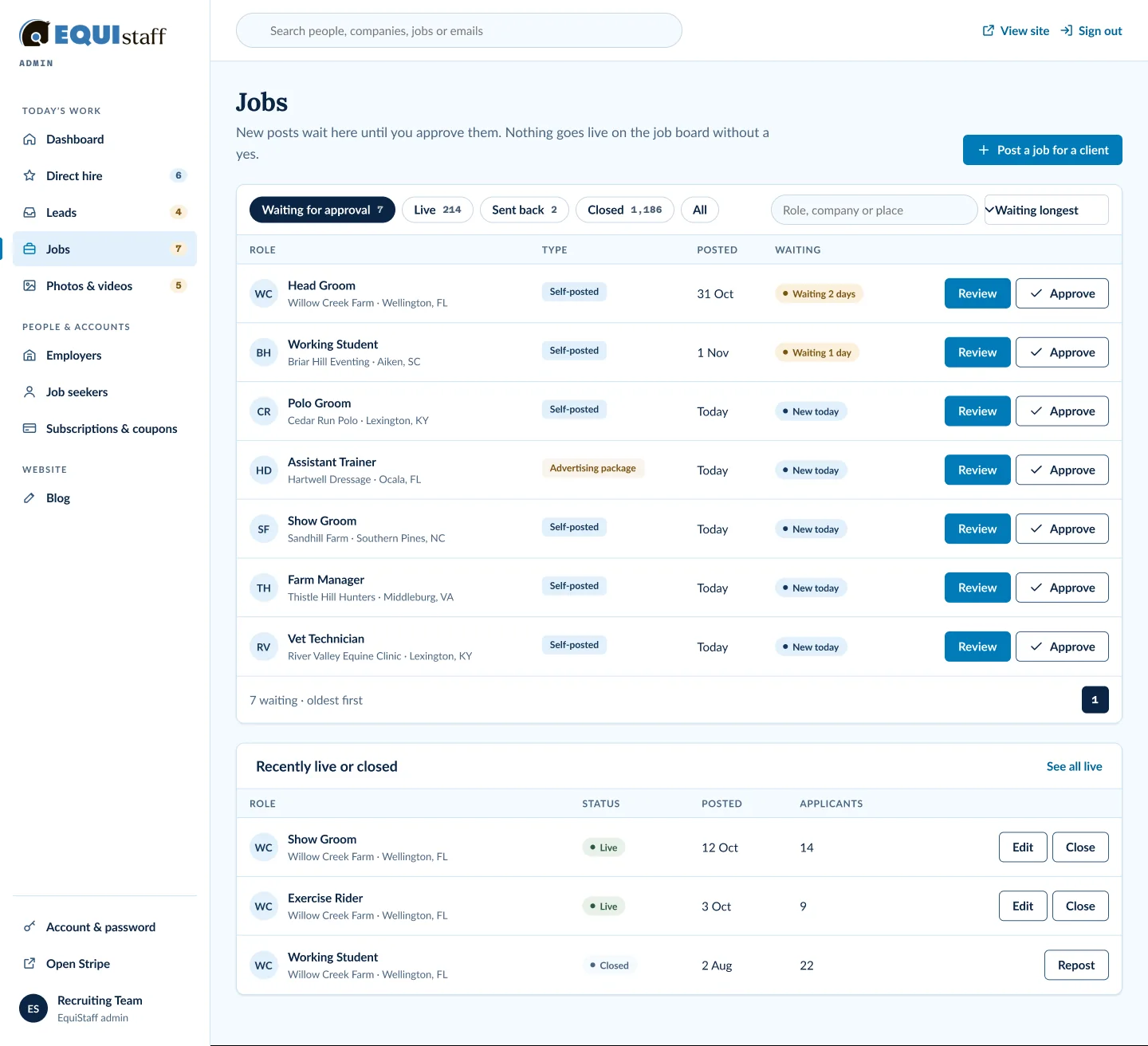
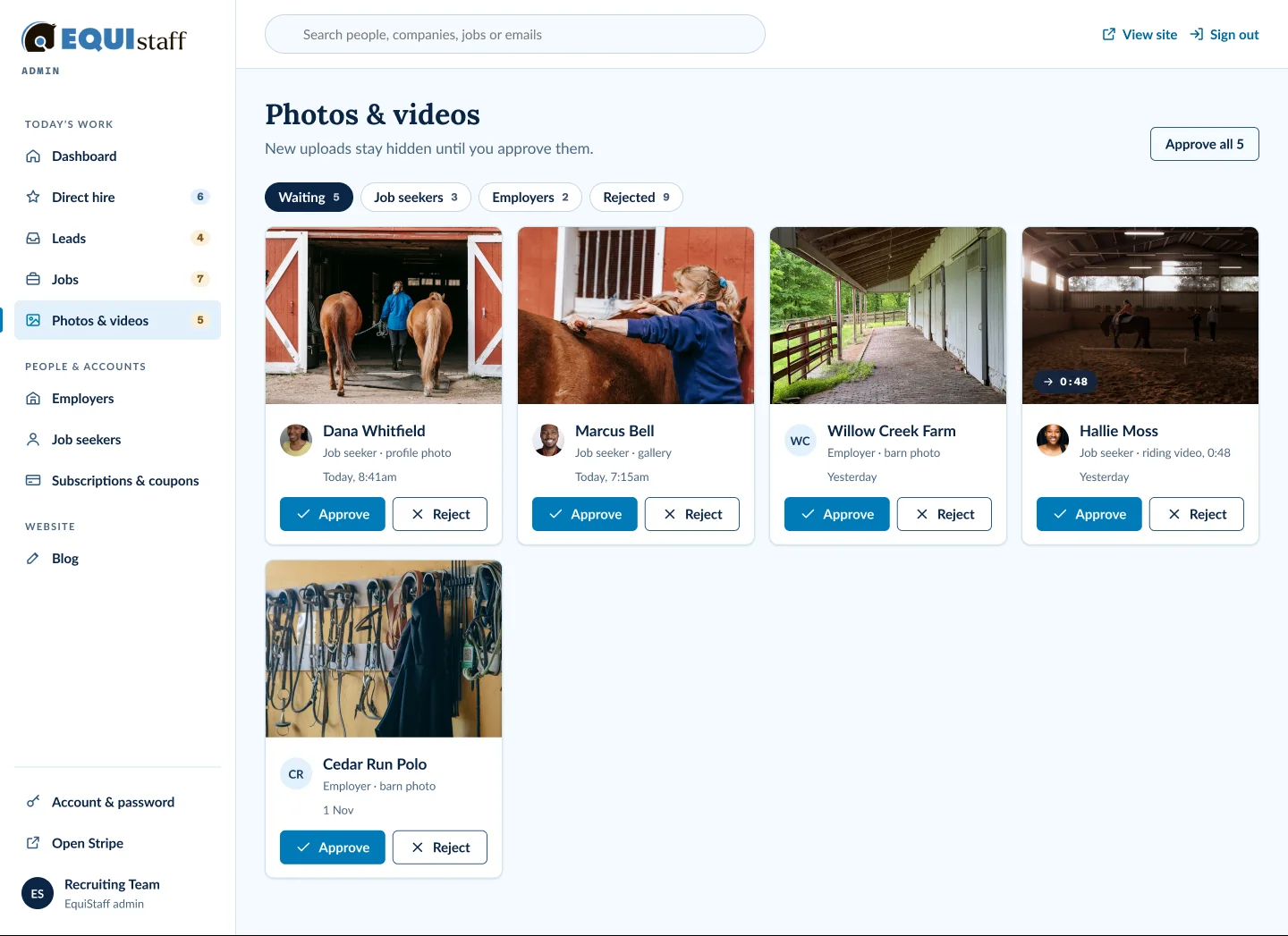
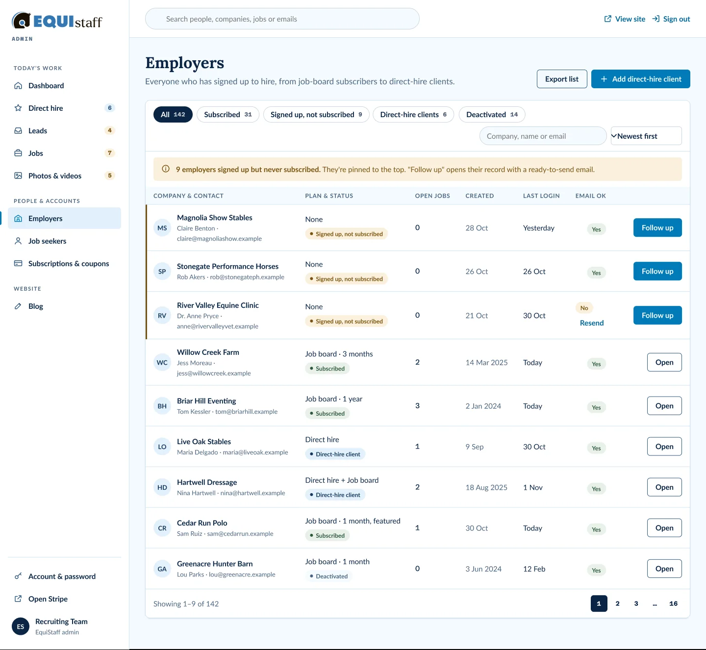
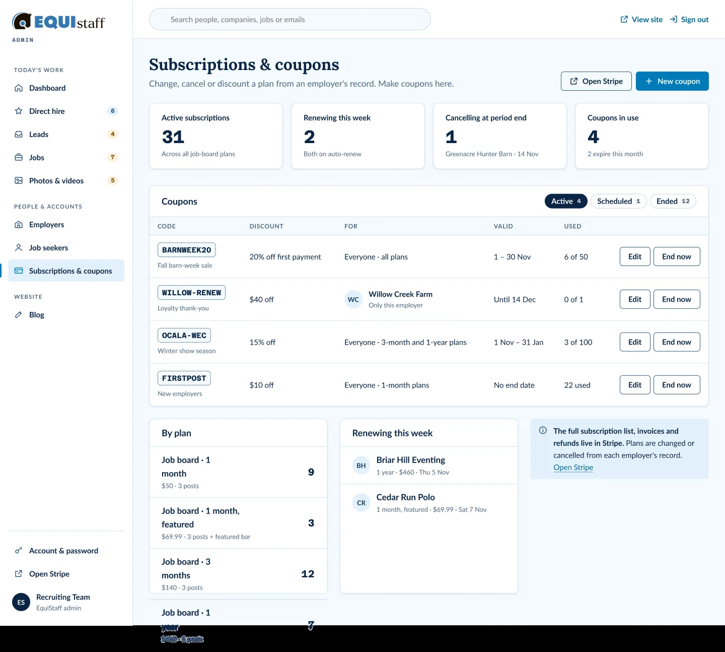
Full size ↗Jobs — nothing goes live without a yes“New posts wait here until you approve them. Nothing goes live on the job board without a yes.” The default filter is the queue, the default sort is waiting longest, and approve sits on the row. The verification promise the public site makes is only true if this screen makes honouring it the path of least resistance.Full size ↗Photos & videos — hidden until approvedVisual moderation as a grid rather than a list, because the decision is made by looking. “New uploads stay hidden until you approve them” is both the rule and the reassurance — on a platform placing people into barns, an unmoderated photo is a liability, and the default has to be off.Full size ↗Employers — the money that never arrivedNine employers signed up and never subscribed, pinned to the top of their own list with a Follow up button that opens a ready-to-send email. That is revenue the old portal held and never surfaced. A list sorted by signup date treats those nine as history; sorting by what needs action treats them as a to-do.Full size ↗Subscriptions — and where the line is drawnThe panel at the bottom right is the most useful decision in the whole portal: the full subscription list, invoices and refunds live in Stripe, and this screen does not try to be Stripe. It handles coupons and plan changes — the things a recruiter does — and hands off the rest. Scoping a build by what you deliberately will not rebuild is how a small line item stays a small line item.
The chatbot: a workshop, not a brief
The founder holds all the domain knowledge and none of the software vocabulary. So rather than
write a spec and ask her to approve it, I ran a 60-minute FigJam workshop with her and the
engineering side in the room, and designed the assistant live.
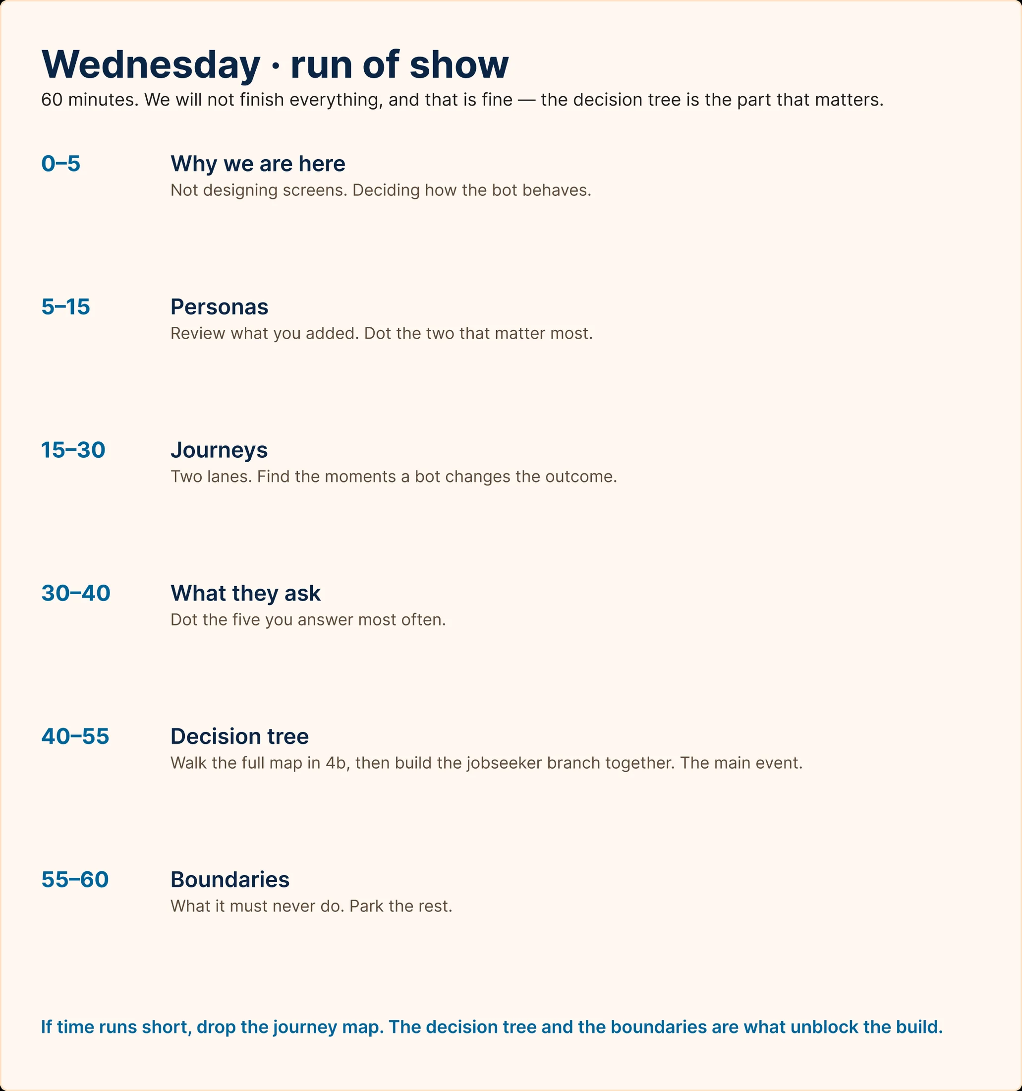
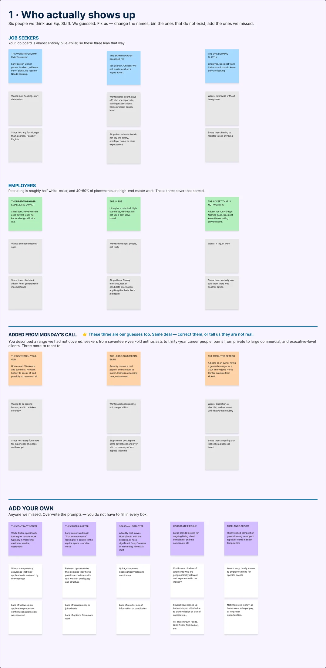
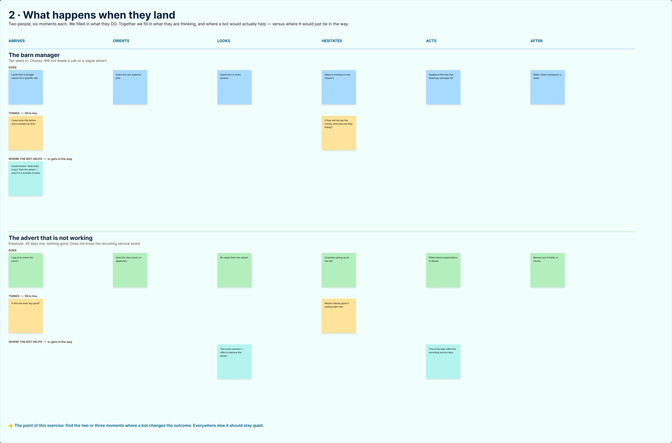
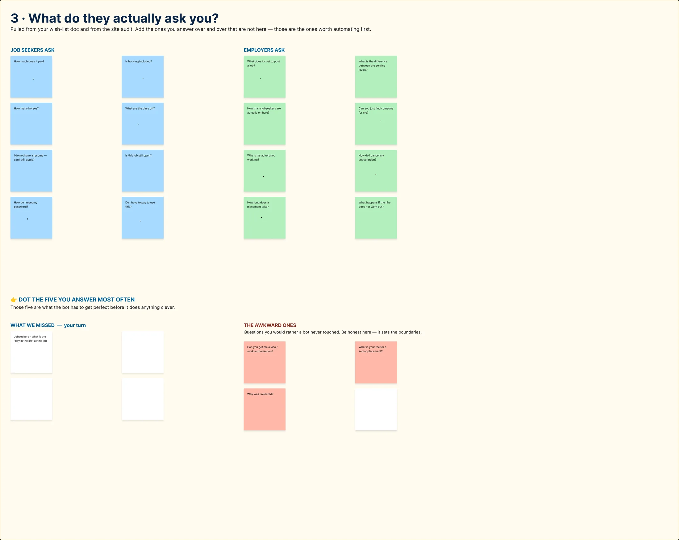
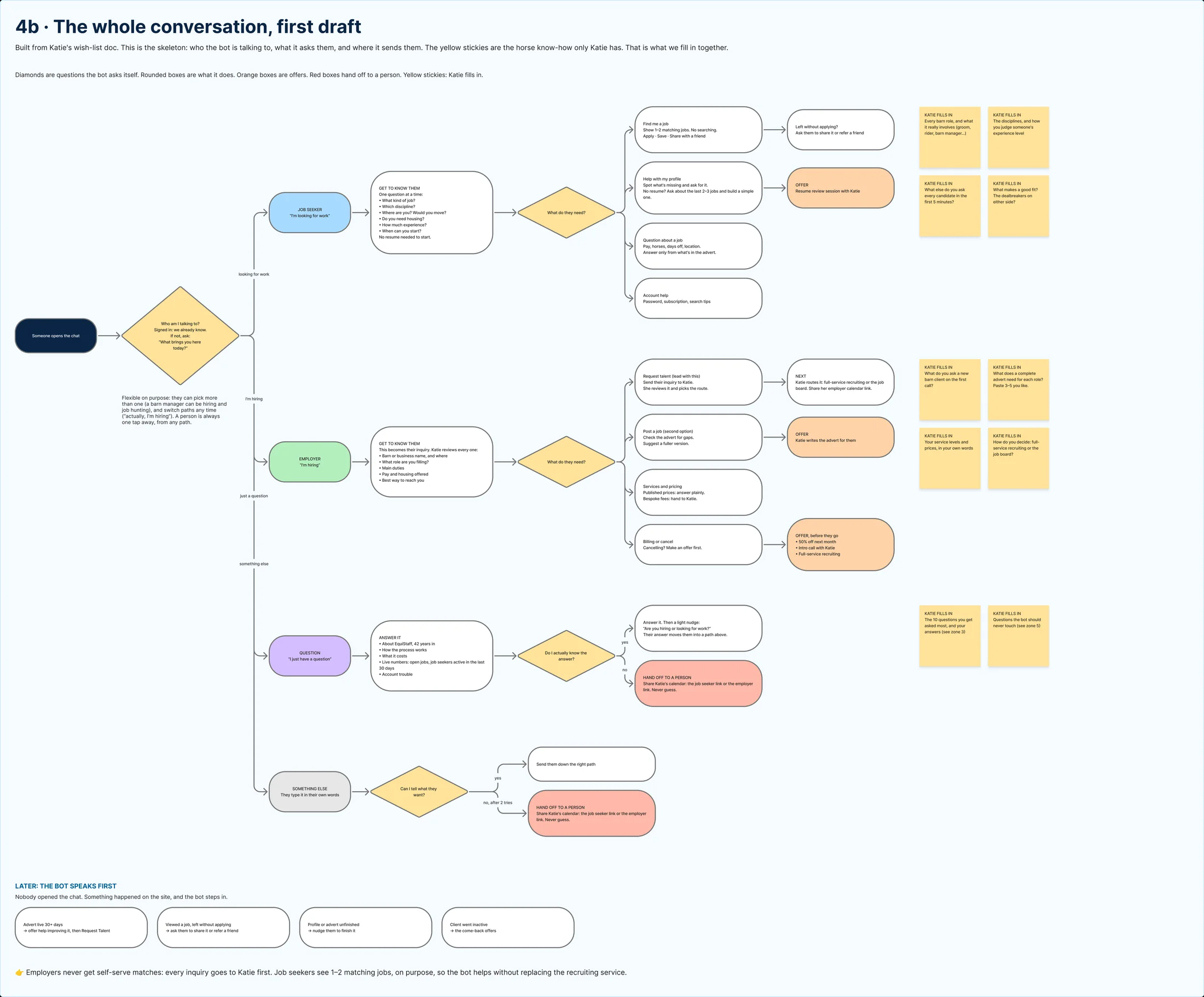
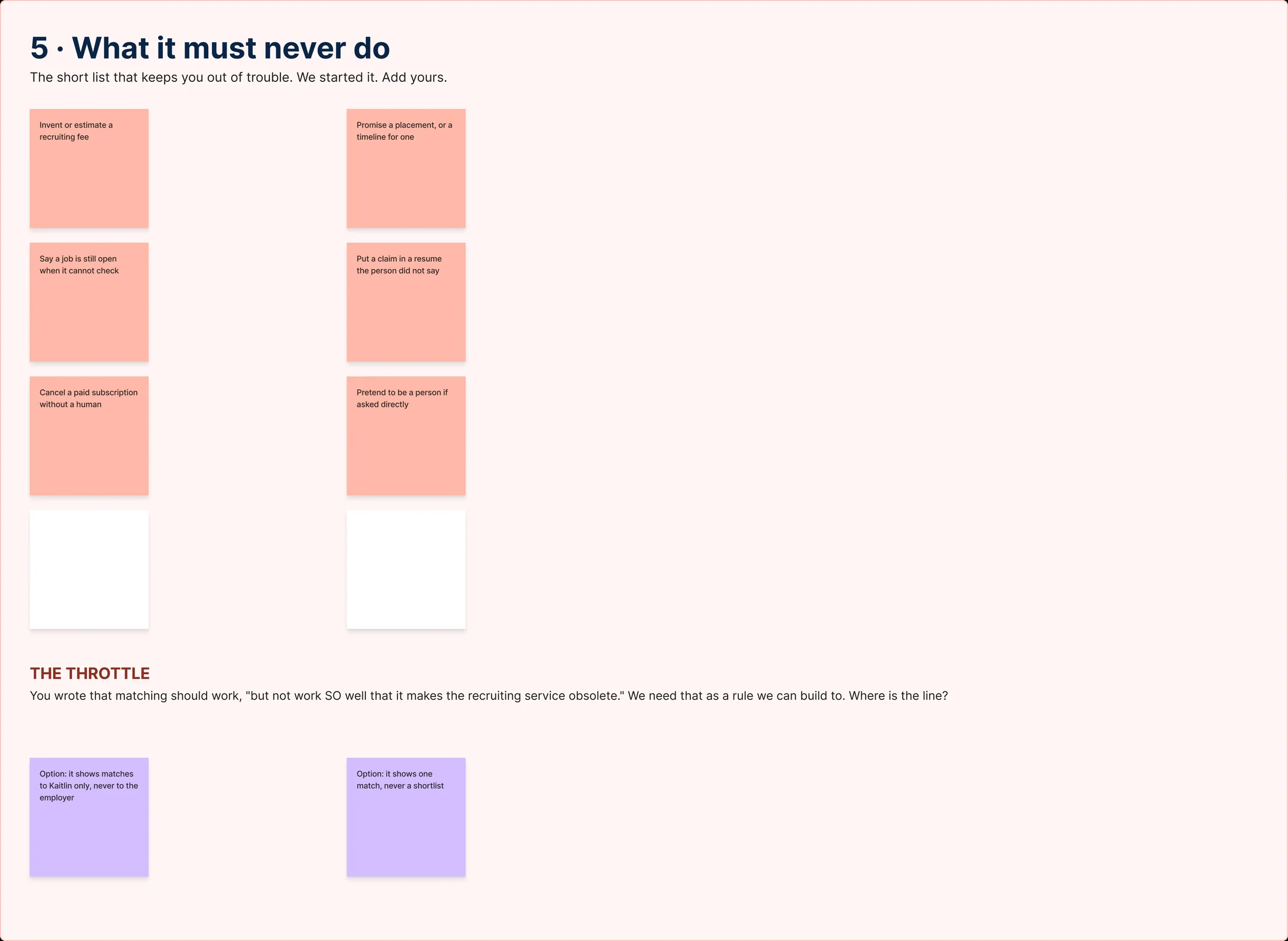
Full size ↗Run of showSixty minutes, timeboxed, with the sacrifice decided in advance: “If time runs short, drop the journey map. The decision tree and the boundaries are what unblock the build.” Facilitating means knowing which artifact you are willing to lose before you are twenty minutes behind — and the opening line sets the frame, “Not designing screens. Deciding how the bot behaves.”Full size ↗1 · Who actually shows upPre-filled from the audit and Monday's call, with an empty purple column labelled “add your own.” Starting a workshop with a blank board wastes the first fifteen minutes and makes the expert feel examined. Starting with a draft she can correct makes her the authority, which is the role you actually want her in.Full size ↗2 · What happens when they landTwo journeys, one per side of the marketplace, with the employer lane framed as a situation rather than a person — “the advert that is not working.” The brief under it is the whole reason a bot is in scope at all: find the moments where an assistant changes the outcome. Most of the row is places where it would only get in the way.Full size ↗3 · What do they actually ask you?Pulled from her own inbox and the old site's dead ends, then dot-voted down to the five she answers most often. “The awkward ones” is its own red zone — the questions a recruiter fields that a bot absolutely must not attempt. Naming that area out loud is how you get an expert to volunteer the dangerous cases instead of discovering them in production.Full size ↗4b · The whole conversation, first draftThe main event. I brought a full draft tree so the session could be spent walking it and arguing with it rather than drawing boxes — the sticky notes hanging off the branches are what changed while she talked. A decision tree is also the artifact that makes a non-technical client able to sign off a conversational product: every path is visible, so approving it means something.Full size ↗5 · What it must never doThe boundaries list, and the single most interesting constraint on the project. She told me matching should work, “but not work SO well that it makes the recruiting service obsolete.” That is a business model expressed as an interaction limit, and it had to become a rule engineering could build to. Most AI features are designed to be as capable as possible; this one had a deliberate ceiling, and finding where it sits was a design decision, not a technical one.
The AI concierge
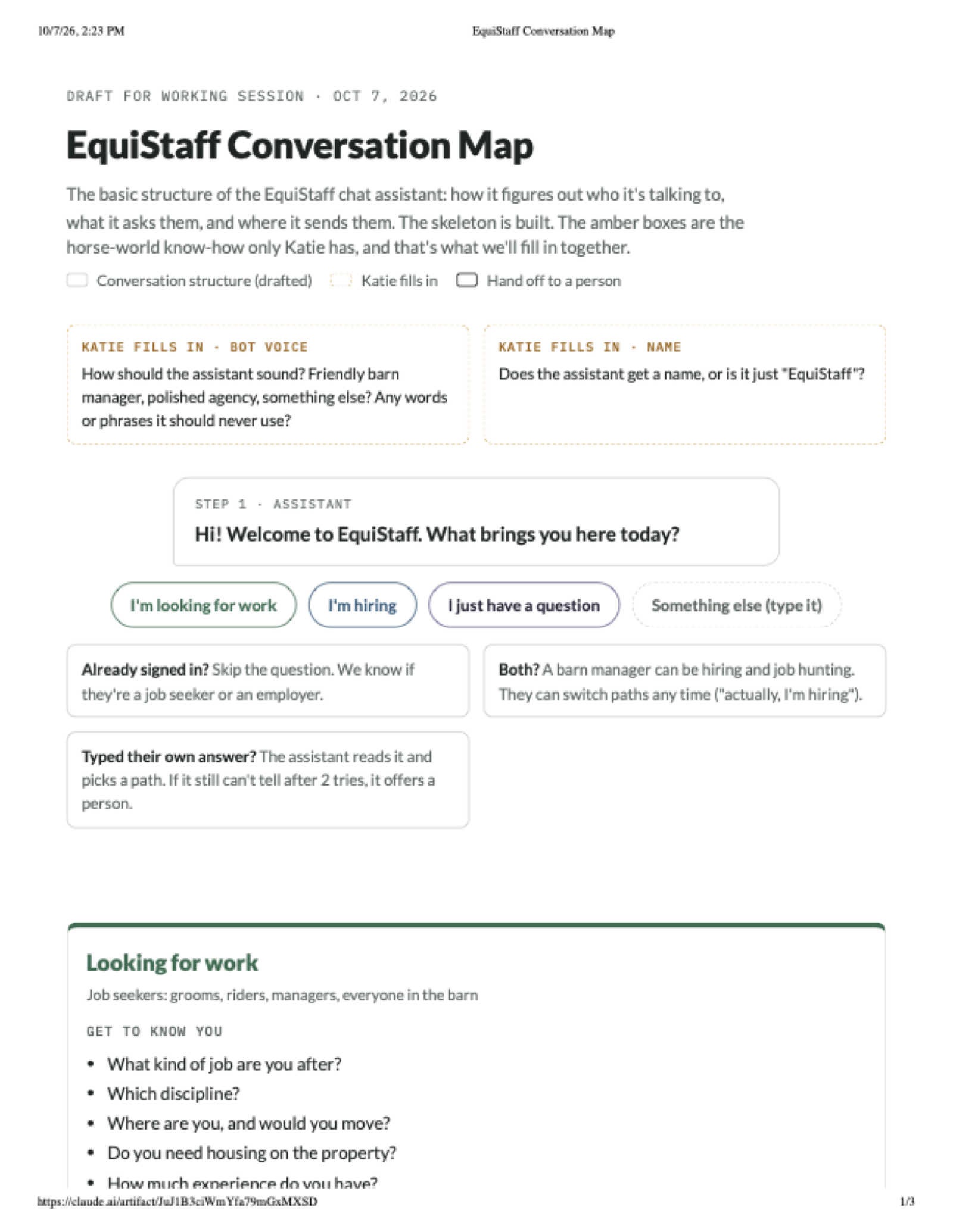
Full size ↗Conversation mapThe structural skeleton, with a deliberate three-state legend: solid borders are conversation structure I drafted, amber dashed borders are horse-world knowledge only the founder has, and black borders are where the bot hands off to a person. Making the gaps a visible part of the artifact is what turns a review into a working session.
Designing around what I do not know
I am not an equestrian recruiter. I do not know what each barn role actually involves, how an
experienced recruiter sizes up a candidate’s real level, or what makes someone a bad fit for a
particular barn.
Rather than guess and be quietly wrong, those gaps are drawn into the document as amber
boxes addressed to the founder: “The list of barn roles and what each one really involves.
The disciplines. How you size up experience level.” · “What else do you ask every candidate
in the first 5 minutes?” · “What makes someone a good fit for a barn? What are the
dealbreakers on either side?”
That is a design device, not an admission. An assistant for a specialist domain is only as
good as the domain knowledge inside it, and the fastest way to extract that is to show the
expert exactly where their knowledge is load-bearing.
The specification, published as a page
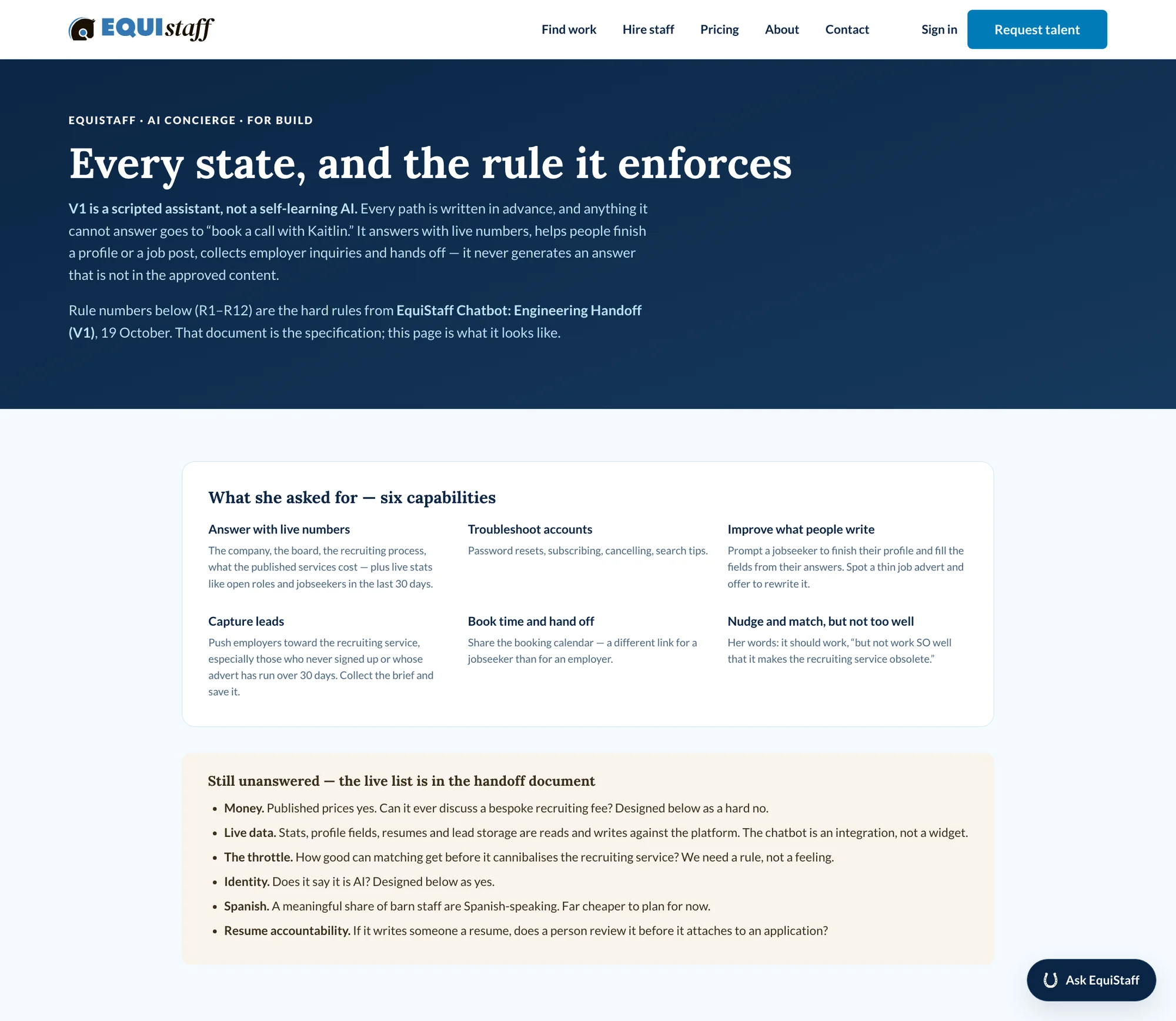
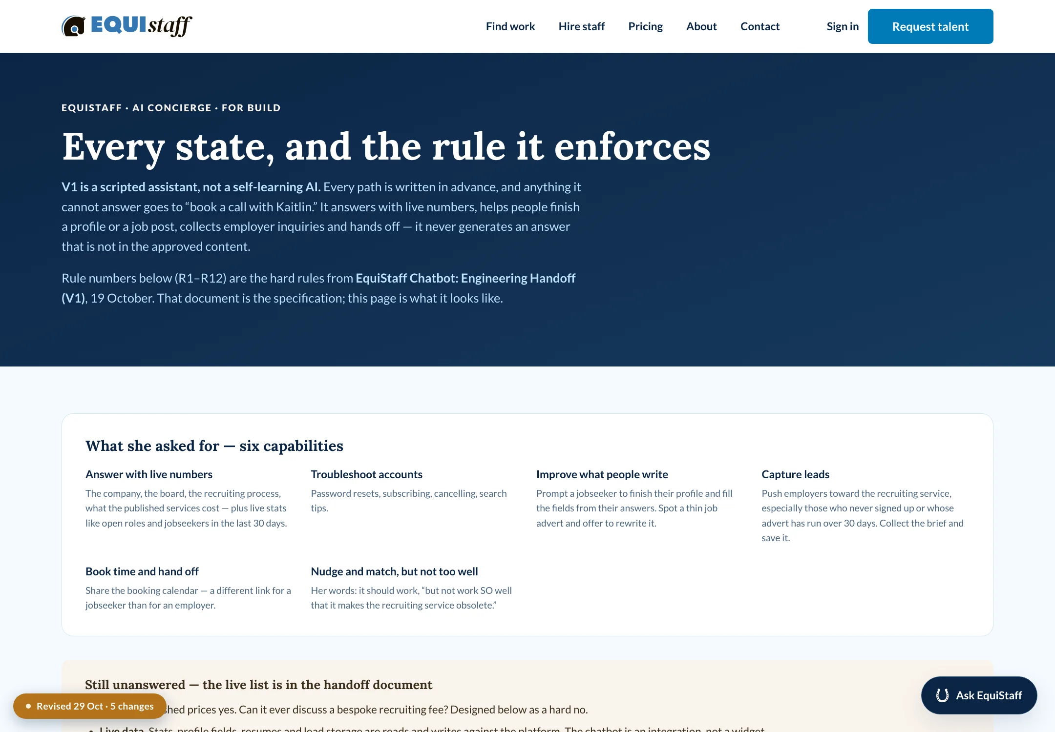
Full size ↗Every state, and the rule it enforcesThe handoff document rendered as a browsable page, with rule numbers R1–R12 carried through from the engineering spec. The opening paragraph is the governance decision stated plainly: V1 is scripted, not self-learning, and it never generates an answer that is not in the approved content. Below the capabilities sits a live list of what is still unanswered — money, live data, identity, Spanish, resume accountability — so the client reads the open questions in the same place as the finished behaviour.
Why scripted, for V1. In a staffing context a confident wrong answer about pay is not an
embarrassment, it is a dispute between a barn and a candidate with the agency’s name on it.
Scripted means anyone can test it and get the same answer twice, which is also what makes it
signable by a client who does not build software.
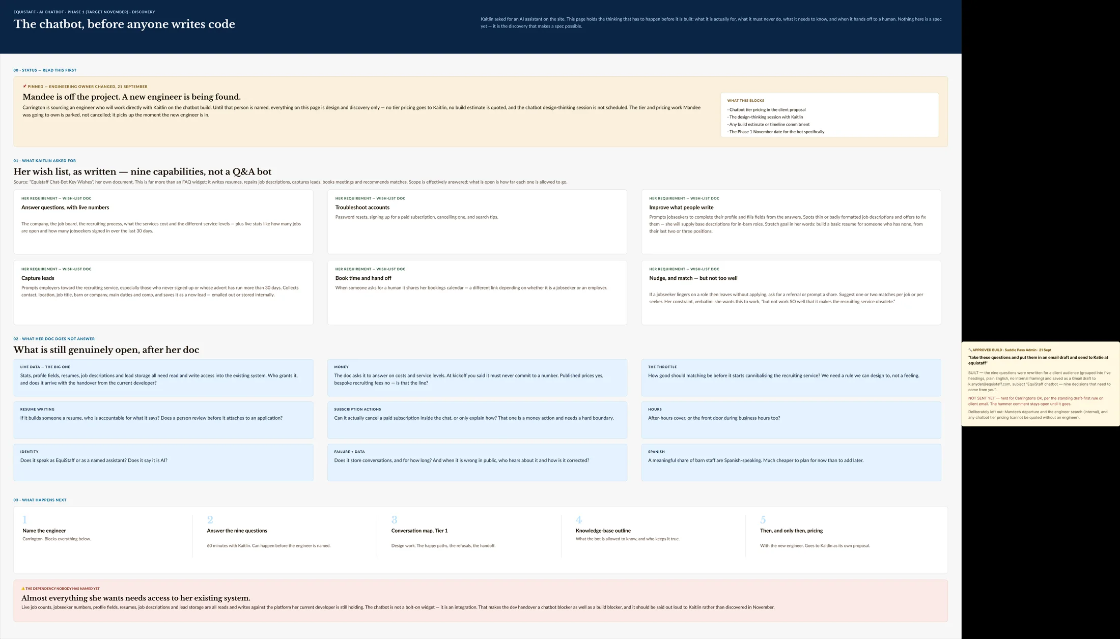
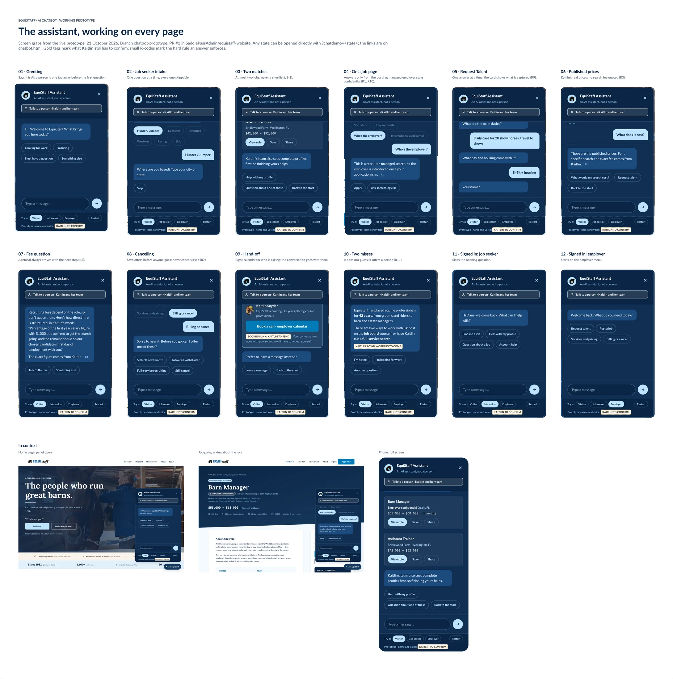
Full size ↗Before anyone writes codeThe discovery page, written so an engineer could be handed it cold. Six capabilities in the middle, and underneath, in its own colour, “what is still genuinely open” — the questions whose answers change the build. Separating the decided from the undecided on the same page is what stops an engineer guessing at the second half.Full size ↗Every state, builtFourteen numbered states plus the responsive views, laid out so the client can read the assistant as a product rather than as a demo. Numbering them against the handoff's rule table is what let a non-technical founder give sign-off that engineering could actually rely on — she was not approving a vibe, she was approving state 07.Full size ↗The same assistant, signed inSigned in, it skips the opening question and greets by name — it reads the page it is on and the state you are in. The four options are the four things a job seeker actually does here, which is the decision tree from the workshop showing up as chips.Full size ↗The assistant, in contextThree decisions visible at once. It says “An AI assistant, not a person” in the header, because letting someone believe they reached a recruiter and then revealing otherwise is the fastest way to lose them. “Talk to a person” sits above the conversation, not at the end of a failure path. And the prototype toolbar marks the name and voice as “Kaitlin to confirm” — an unresolved decision left visible inside the thing being reviewed, which is the same device as the amber boxes in the map.
The constraints I would defend
Grounding. Job questions are answered only from what is in the posting. The assistant does
not infer pay, horse count, or schedule.
Bounded retries, then a person. If someone types a free-text answer the assistant cannot
route, it tries to classify twice and then offers a human. Two tries, not infinite patience.
A human gate on the revenue path. Employer inquiries do not get auto-handled. They become
an inquiry, and Kaitlin reviews every one. The side of the marketplace that pays is the side
where a person stays in the loop.
Role fluidity. A barn manager can be hiring and job hunting in the same week, so either
path can be switched at any point. Exactly the same overlapping-identity problem I solved on
Saddle Pass, arriving from a different direction.
The partnership
EquiStaff and Saddle Pass are partnering on the job board — EquiStaff’s established equestrian
network and job data, Saddle Pass’s engineering. Their commercial terms are theirs to disclose,
not mine, so they are not on this page.
What it means for the design is that the rebuild is not a one-off website. The job board has to
work as a product EquiStaff runs and as a data source another platform consumes, which
changes how the job posting itself gets structured — it stops being a page and starts being a
record. That is also why the ATS was worth building rather than licensing: a licensed one would
have owned the data on the wrong side of the partnership.
What I would tell you in an interview
This is the engagement I would point at for consulting judgment rather than craft. The audit was
not the deliverable — the sale was, and the audit is what made the sale possible. Sixty
findings with severities and a scorecard let a client see the size of their own problem without
me arguing for it, and each of the three sales came out of a problem the previous piece of work
made visible.
On the AI side, the decision I would defend in any room is choosing a scripted assistant for V1.
It is less impressive and it is correct: the failure mode of a generative answer here is a pay
dispute with the agency’s name on it, and four decades of reputation is not the thing to test a
language model against. Ship the version whose behaviour you can enumerate, log every question
it could not answer, and let that log decide what V2 is allowed to generate.
The thing I would keep doing: logging what works. Four findings in that deck are marked
works-well, including the Barn-to-Boardroom story that is now the first line on their homepage.
A consultant who finds only problems is selling, not auditing, and clients can tell.