Saddle Pass
I ran the research, wrote the specs, designed the screens, managed the design team, and built the agents that checked our output. This is the case study where all of those turn out to be the same job.
The problem
The horse world still runs on Facebook groups, text threads and paper calendars.
That is one sentence, and it took four months of research to earn it. Four groups of people are all stuck in the same gap, for different reasons:
| Riders | Finding a lesson or trail ride means scrolling Facebook groups and waiting days for a text back. |
| Barns & trainers | Bookings, boarding waitlists and payments live in notebooks, spreadsheets and Venmo. |
| Service pros | Farriers, vets and bodyworkers grow by word of mouth only. There is no place to get found. |
| Hiring | Barn jobs fill through who-you-know. A bad hire costs horses, clients and money. |
And underneath all four:
The missing piece is trust: no vetting, no shared reviews, no protection when something goes wrong.
That last line is the one that decides the product. A marketplace that only fixes discovery in this market is a better Facebook group. Trust is the thing nobody has solved, and it is a design problem before it is a feature list — it lives in verification states, in what a stranger can see about you before they book, and in who is allowed to do what on a barn’s behalf.
It is also a market with no digital home rather than a market with bad software. The core customer is the adult amateur rider plus the barns, trainers and pros who serve them, across every discipline from Western to dressage, and Texas alone is a multi-billion-dollar horse economy with a few hundred thousand horse owners in it. That scale is why the answer is a marketplace rather than a tool.
Research first, because the problem was not obvious
Everything above is stated with a confidence I did not have at the start. Plenty of markets look broken from outside and work fine for the people inside them, and the horse world is proud, close-knit and perfectly capable of preferring its group texts. So the question was never whether I could see the gap — it was whether the people in it wanted it closed.
So before any screen, I fielded a 47-question discovery instrument to horse professionals, and a second cut aimed at the business side.
The instrument is the part I would defend in an interview. It maps the current state before it goes anywhere near a solution — how clients book today, how cancellations are handled, which admin tasks eat the week, how payment gets chased. Only then does it ask about the product, and the two most useful questions are the uncomfortable ones:
- Q34 — “What would make you NOT want to use a marketplace/booking platform?”
- Q35 — “What fee structure would feel fair?”
Most founder-run surveys ask whether people like the idea. Asking for the objection and the price up front is how you get something you can design against instead of a compliment.
Both sides described the same failure
Providers, on booking: “It’s not centralized.” · “Not having everything in 1 place.” · “Keeping tabs on who, what, when.” · “Taking away the need for the back and forth communication of booking.”
Riders, on booking anything horse-related: “Lots of back-and-forth messages.” · “Hard to find pricing.” · “Don’t hear back from barns.” · “Not sure what’s safe or reputable.”
Supply and demand naming the identical failure, unprompted, is the strongest signal a two-sided marketplace can get in discovery. It means one product can serve both without trading them against each other.
The objection that shaped everything after
Q34 came back overwhelmingly consistent. Nearly every respondent said “fees too high.” A clear majority said “too complicated to learn.” Three said “takes control away from me.”
That ordering directed more of the design than any feature request did. A platform these users adopt has to be visibly simple, and it must not feel like it takes the barn out of the barn owner’s hands. That last objection is not a pricing problem — it is an interface problem, and it returns later in this case study as a permissions system.
The product, in three words
The whole thing is organised around a sequence rather than a feature list — Look. Book. Ride. — because that is the order the user actually moves in, and it keeps the team from arguing about navigation.
| Look | Search lessons, trail rides, boarding, services and jobs by discipline, distance and price. Every provider is vetted. |
| Book | Request, sign the waiver and pay in one flow. No phone tag. |
| Ride | Day-of check-in, reviews and one-tap rebooking keep riders coming back. |
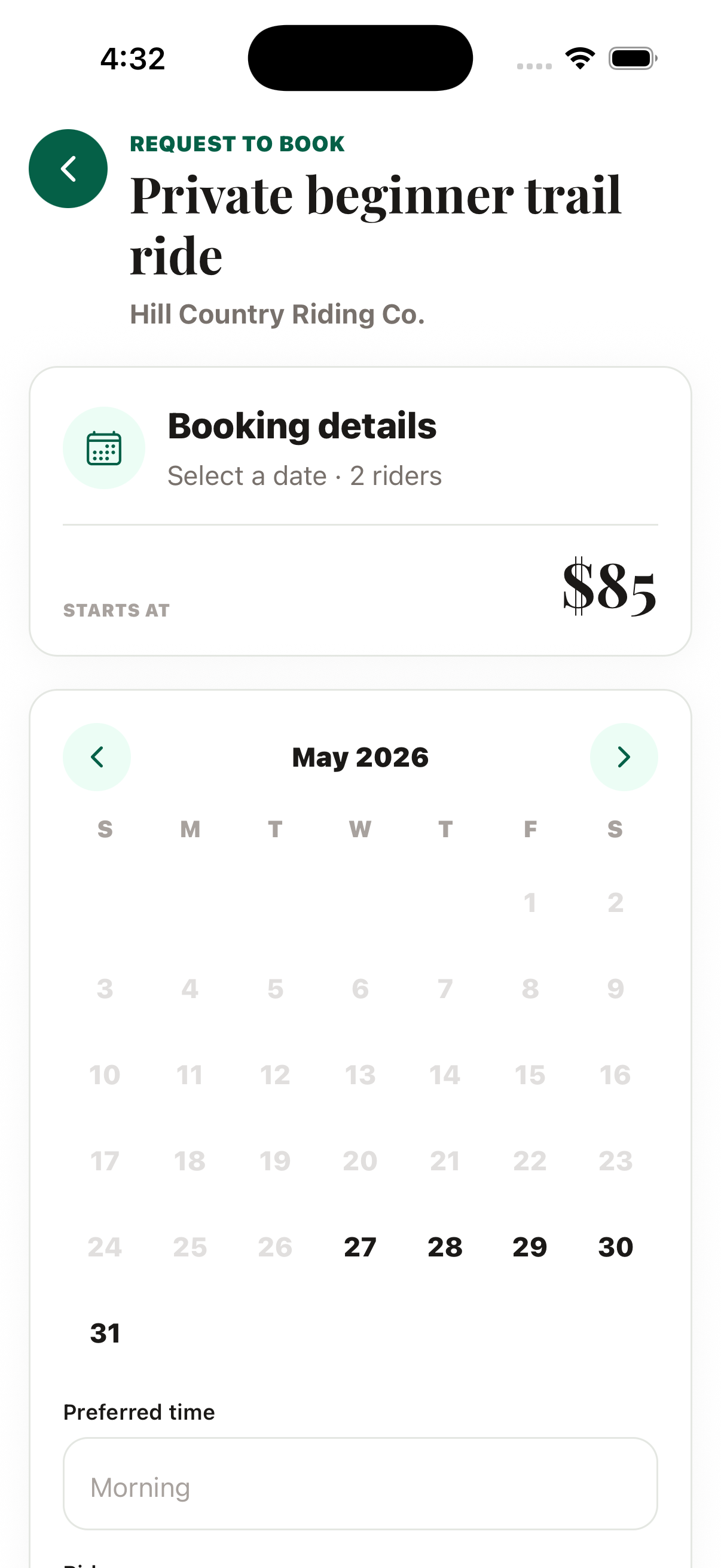
Five pillars, one account
Profiles & accounts · marketplace · job board · boarding · events. One account covers all of it, because a person in this world is rarely only one thing.

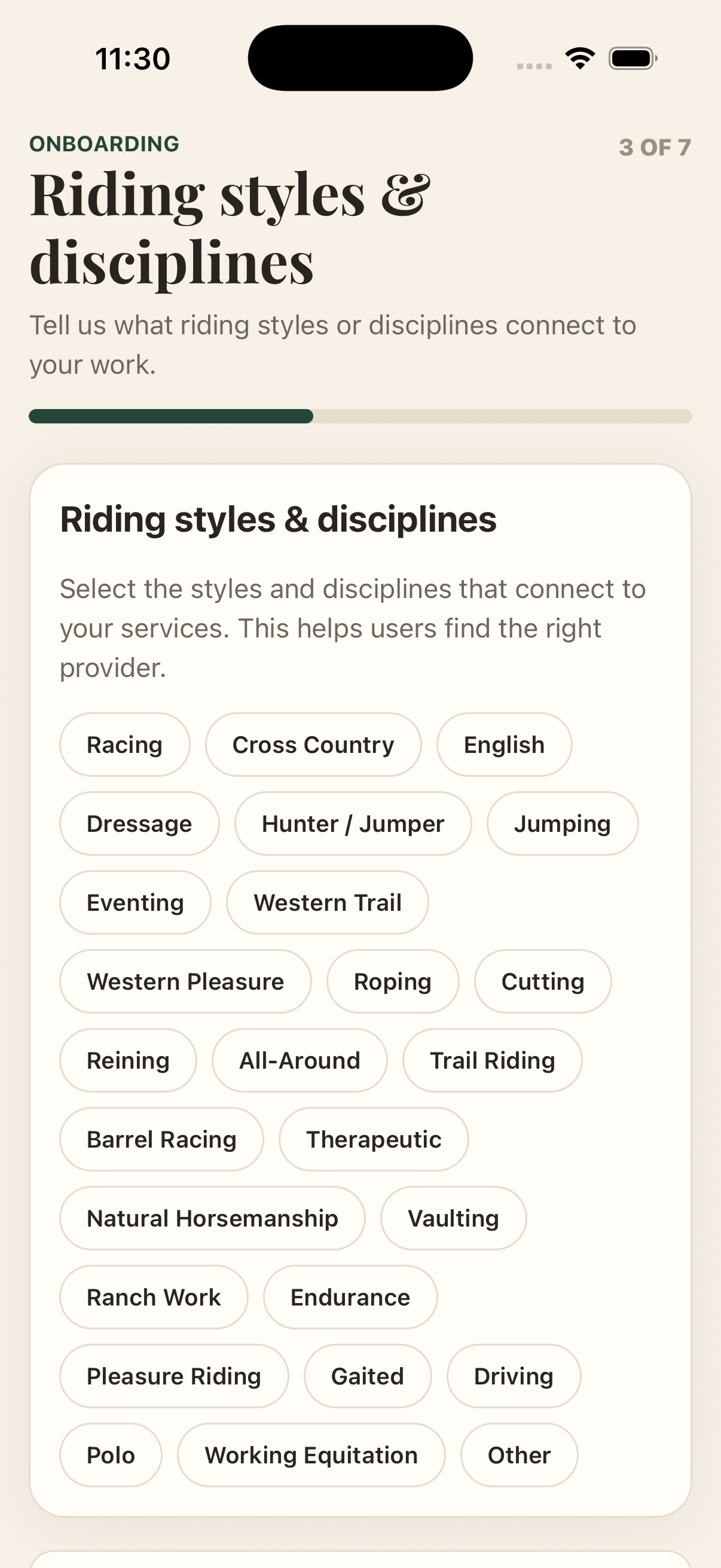
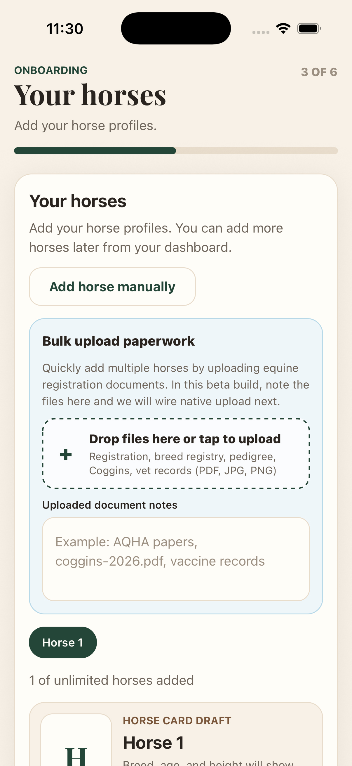
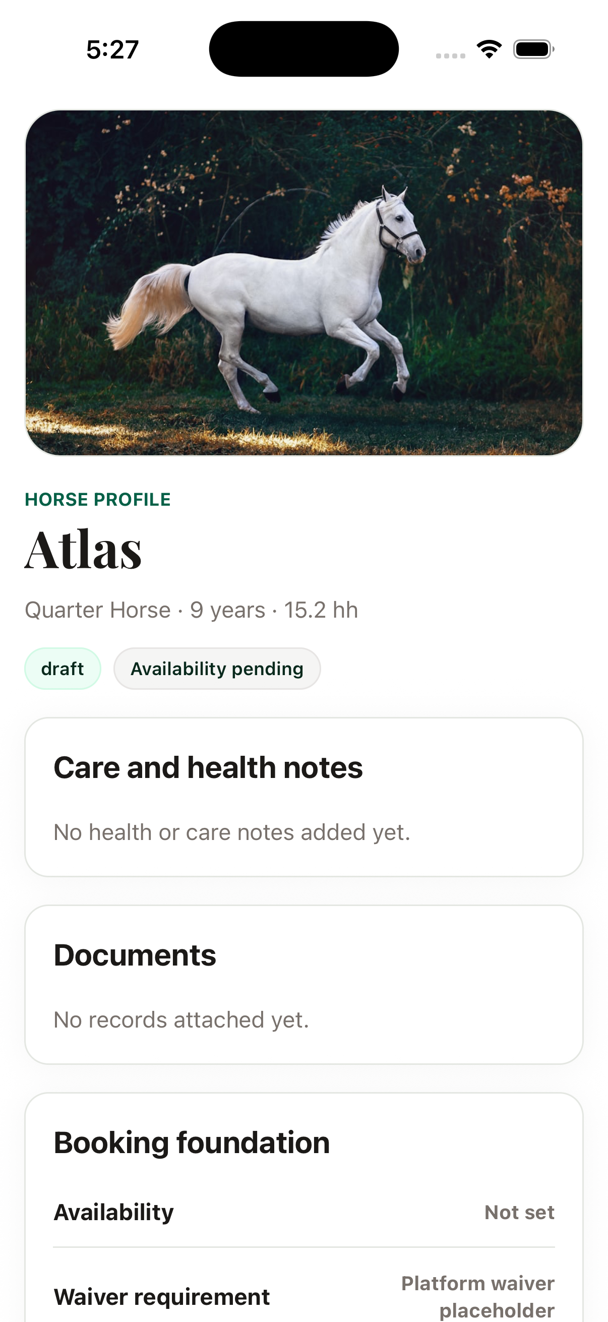
We monetise supply, not riders
The decision that shaped more of the interface than any visual choice: the barns and providers pay, and the riders do not.
That inverts the usual marketplace instinct, and it means the product has to earn its keep on the supply side by replacing the back office these businesses have never had — the day sheet, availability, boarding waitlists, payouts. Those are not secondary admin screens. They are the product the paying customer actually opens every morning, and they are why the permissions model further down this page is load-bearing rather than a settings page.
Research into specification
Findings only count if they survive into the build, so the specs live in Figma beside the screens rather than in a document nobody opens.
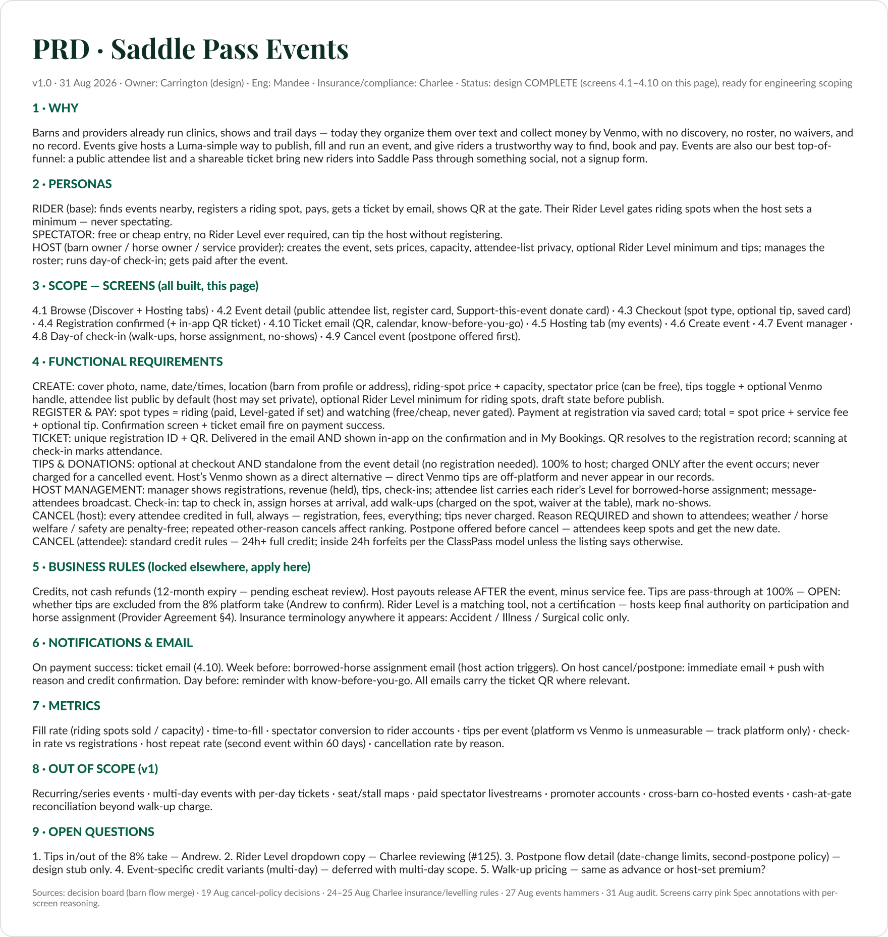
Managing the work, not only doing it
With a design director, a contract designer, and two interns in the file, the structure of the file is the management system. Pages sit in four bands:
- DELIVERY —
✅ Dev-Ready (Final Drafts)·👀 Review-Ready·↔️ Responsive - WORKING —
🔵 Working (carrie) Source of Truth·🦄 Future Features Phase 2 - RESEARCH — Discovery · User Research
- ARCHIVE —
💀 Archive/Outdated
Every delivery section carries the date it reached that stage — DEV-READY (13 Sep), REVIEWING (31 Aug). An engineer opening the file never has to ask which version is real, and a designer never has to ask where to put something.
Two smaller conventions do a lot of work. 🚩 REBUILD FLAG marks a component that shipped wrong and must be redone, so the debt is visible in the file rather than in somebody’s head. ⛔ copy-gated marks the insurance and protection screens, where the words cannot ship until a partner and a lawyer sign off — so nobody builds against copy that is going to change.
A/B testing my team’s work against my own
The thing I am proudest of here is a critique method, not a screen.
Saddle Pass ran two parallel design tracks: a dashboard track owned by another designer, and the consumer track I owned. Rather than argue about which was better, I ran a structured comparison.

Three things make that worth more than a design review:
- The dimensions are fixed before the comparison, so a verdict rests on a stated basis rather than on whoever talks last.
- Losing is visible. Blue appears on that board. I did not win every dimension and the record says so.
- The output is a merge, not a verdict. Each chosen screen is marked
✅ CHOSENand is a synthesis.
The third is the actual management skill. Picking a winner takes thirty seconds. Taking the losing design seriously enough to find what was right in it is what keeps a designer on your team after you have overruled them.
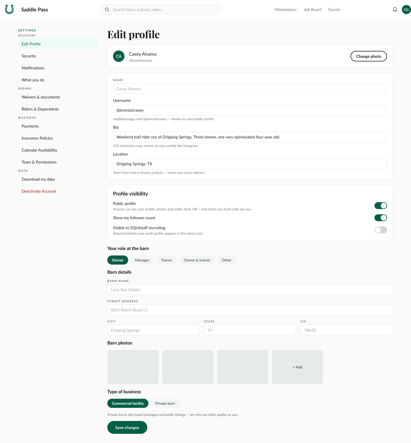
The permissions model, where the research lands
Remember the objection: “takes control away from me.”
A barn runs on staff — barn hands, trainers, a vet, a working student. If the platform cannot represent who may do what, the owner either hands over their own login or does not adopt it.
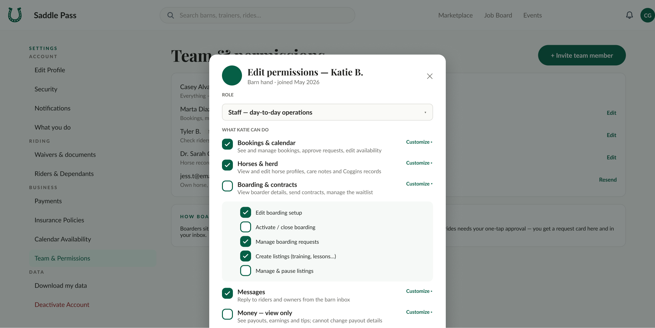
This is the same problem I spend most of my time on in AI products. A permission model is a design surface: what may this actor do alone, what needs approval, and how is that made legible to the person who is accountable. This is the barn-staff version of the question I answer for every agent I build.
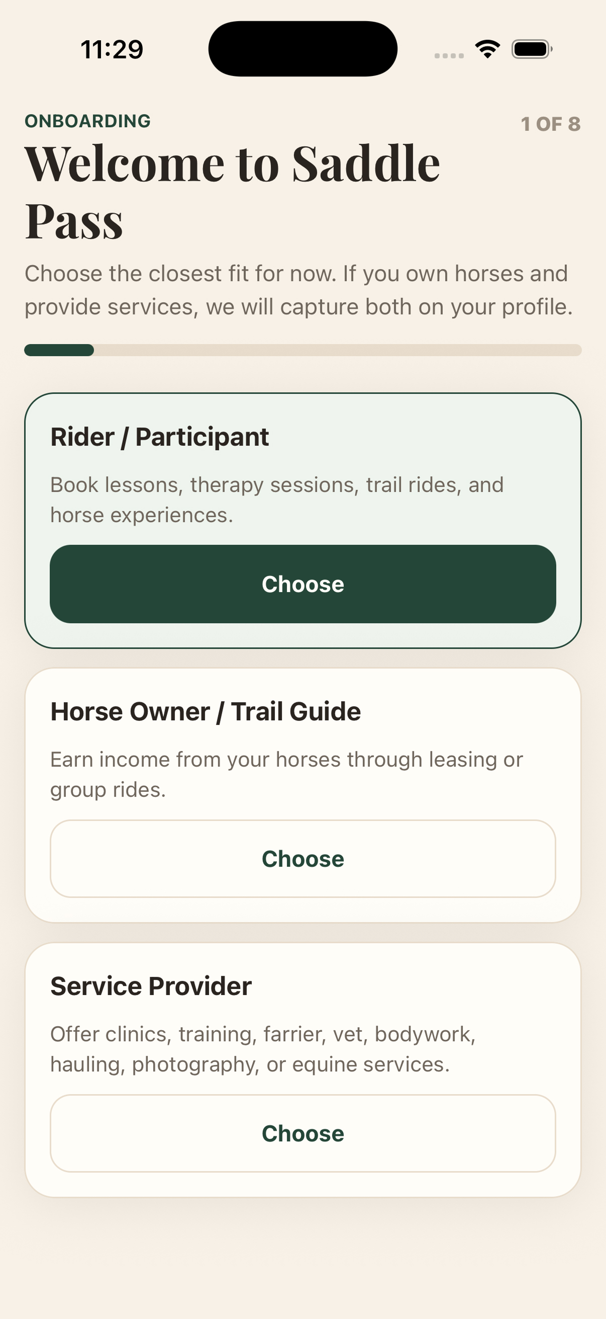
Four roles whose identities overlap
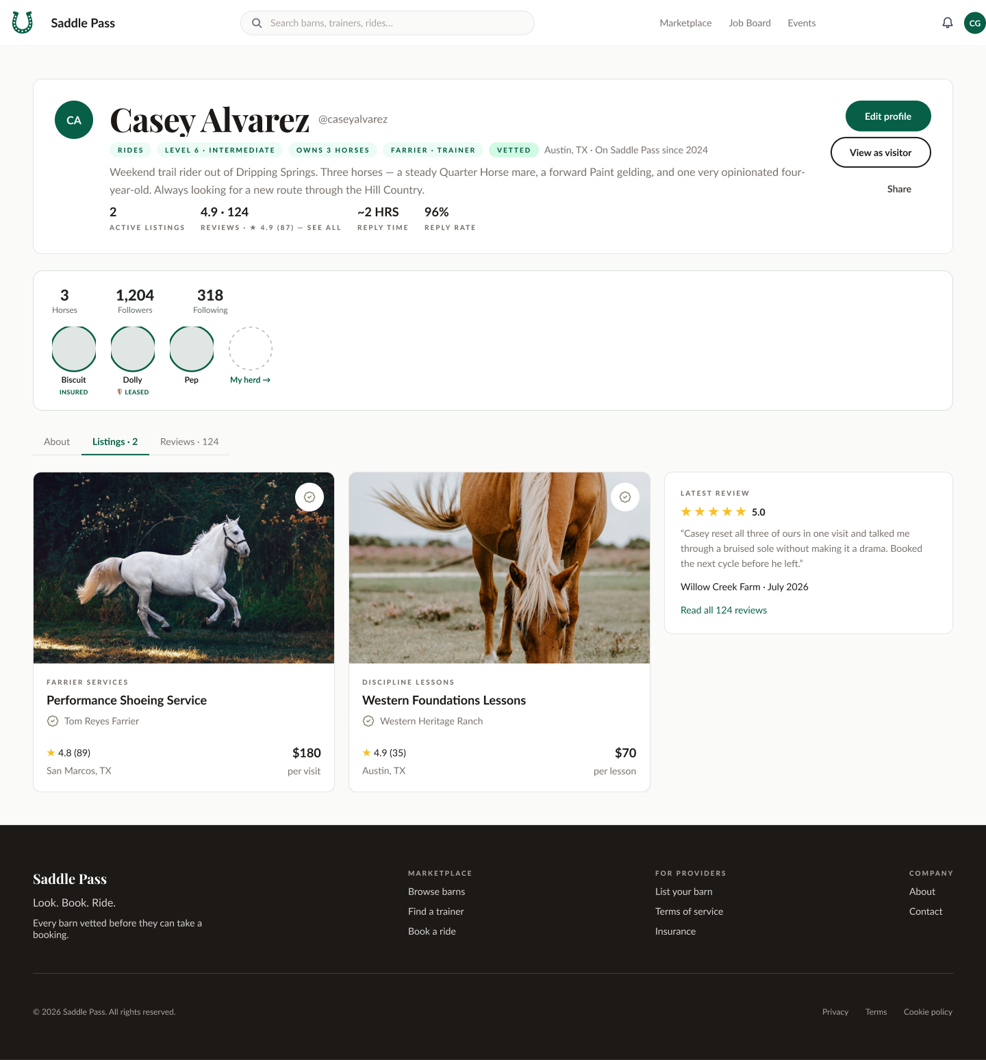
The assistant, scoped by copy
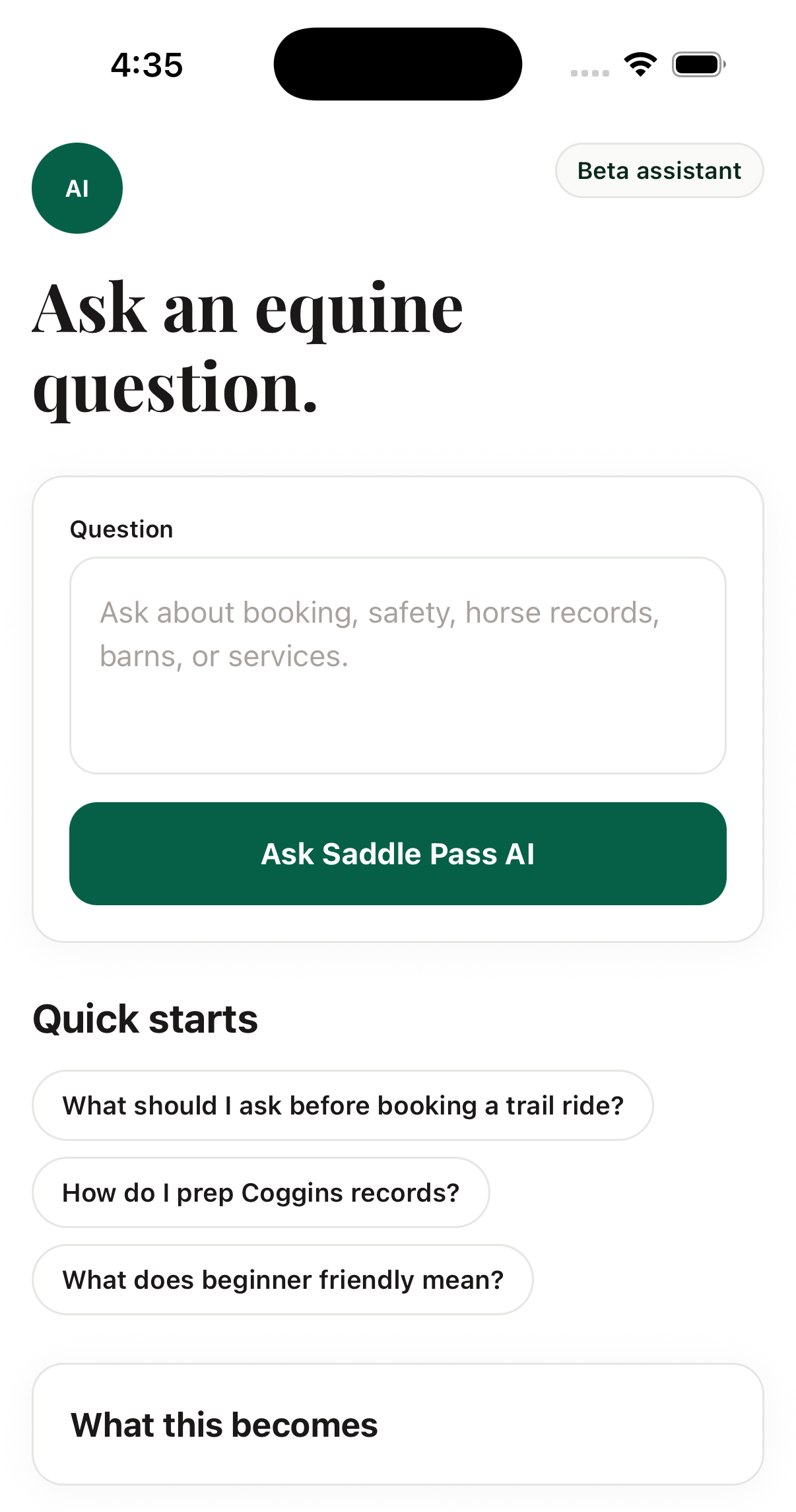
Scoping the assistant was a product decision disguised as a copy decision. That placeholder is doing the work a refusal message would otherwise have to do later, at a worse moment, after someone has typed out a question about their sick horse.
Where AI actually entered the process
Not as a feature. As how the work got done.
I design in code as well as in Figma. Working in Claude Code from the terminal collapsed the distance between a decision and a running implementation from a sprint to an afternoon. The specs I handed engineering were ones I had already built against.
The design system is enforced by tests, not vigilance. Tokens live in the repository with a sync script and tests that fail the build when any of the three codebases — React, React Native, Flutter — diverges from source. A system nobody checks drifts within a sprint. This one cannot.
I built agents to QA the work. Screen capture, review sweeps, and comment triage run as automation rather than as somebody’s afternoon. The design-capture parameters in the web app — render a single view, suppress the entrance animation — exist so an agent can produce a clean, repeatable screenshot set with no human driving a browser.
That is the throughline between the design degrees and the engineering: research says what to build, design decides what it should be, and automation is how a small team holds the quality line once it exists.
Where it stands
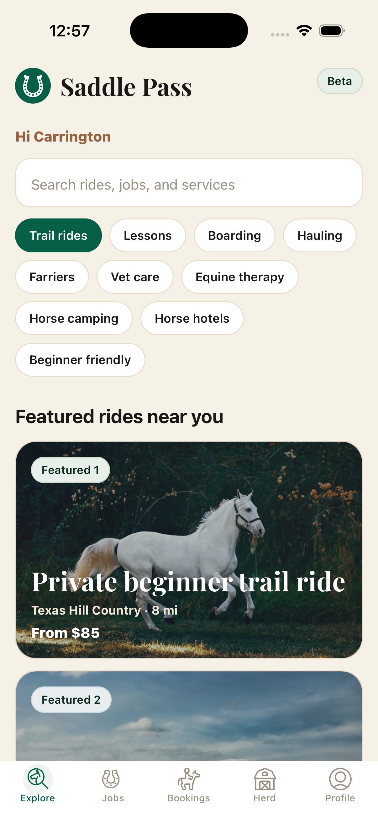
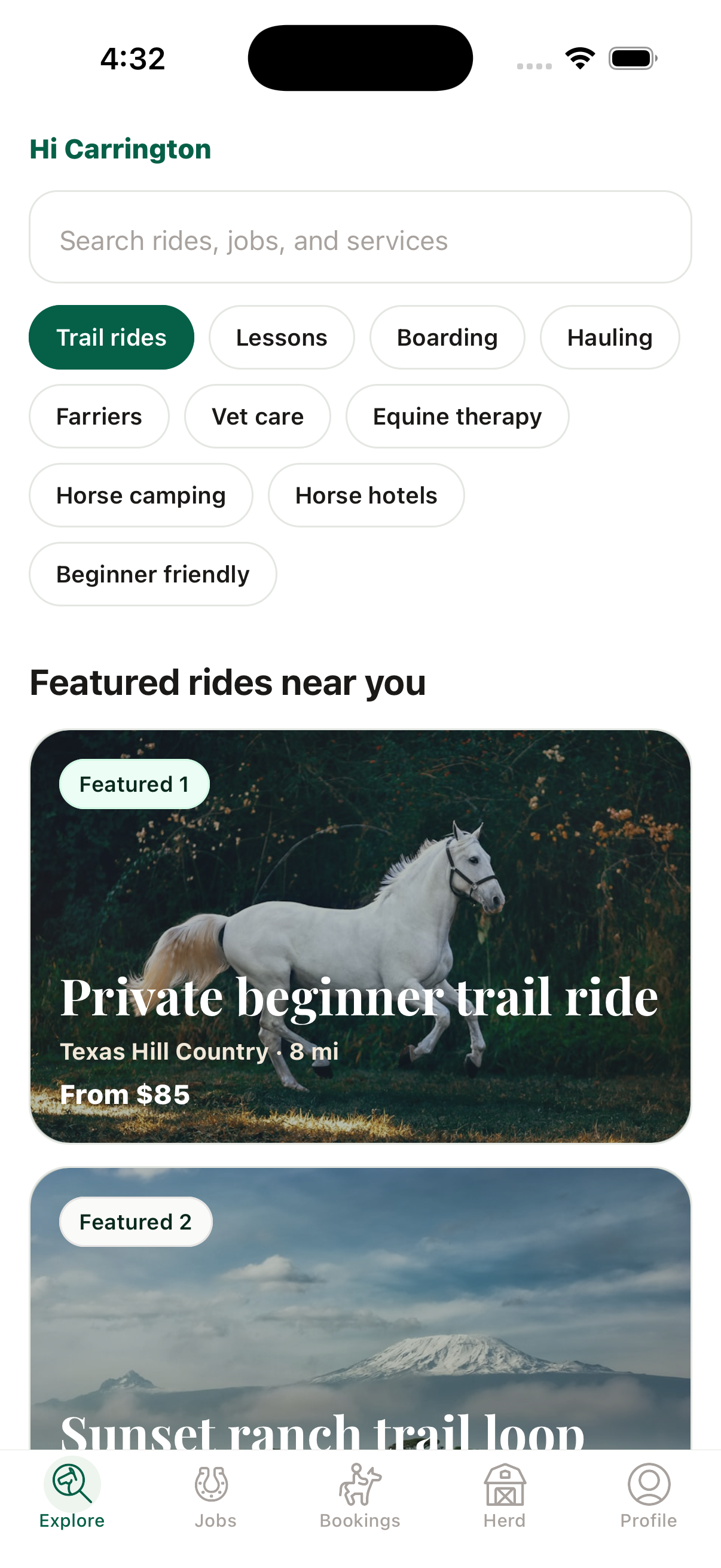
The design is built and handed to engineering across rider, barn owner, horse owner, service provider and admin surfaces, specified against the token system. The web app is complete and gated behind a feature flag, waiting on beta.
The near-term plan is sequenced rather than scattered: the EquiStaff site, job board and AI hiring assistant go live first, then the Saddle Pass MVP beta in Austin with the first ten barns and providers each taking real bookings, then in-app payments switched on, then provider subscriptions, then the iOS app through TestFlight. Partner work funds the platform while the platform gets built, which is the whole reason the studio and the marketplace sit under one roof.
What I will not claim
There are no outcome metrics, because it has not launched to users. Anything I told you about conversion or retention would be fiction. What I can defend is the chain: a 47-question instrument, a quantified objection set, specs written against those findings, screens A/B-tested against a second designer, and a token system with tests that stops it drifting on the way into three codebases.
What I would tell you in an interview
I did four jobs here and they were not separable. The research produced the objection list, the objection list produced the permissions model, the permissions model is the thing a barn owner adopts or doesn’t, and the token tests are why any of it survived five contributors and three codebases.
What I would do differently is measurement. I have a defensible rationale for every screen and no instrumentation plan written down before handoff. Deciding what you will measure is easiest while you still remember why you chose the thing — I left it until later, which is how it ends up not happening at all.