School projectRun alongside my design research coursework
Restaurants cannot keep staff, and service workers cannot afford Austin. The startup's bet was that those are the same problem. I ran the research that tested whether the product people actually built was usable.
A built product, not a prototype — findings had to be actionable by one developer
Five participants, recruited from the industry itself
Ended by Covid
The problem
How might we help restaurant and bar owners retain employees better, by offering housing
benefits as a solution?
Austin service workers cannot afford Austin. Restaurants cannot keep staff. The founder’s bet
was that those are one problem with one answer — a housing platform offered as an employment
benefit, so the restaurant gets retention and the server gets a home they can pay for.
In his words:
I want an app that helps servers and bartenders find affordable housing that also leaves
them feeling valued at their place of work. If we can keep retention rates higher at these
lower-income gigs and help fill apartment complexes, we’re helping both groups of users save
money and make money.
I was in the middle of my design research class, so I used it as a chance to do real user
testing on a real product with real stakes.
I interviewed twelve people in the service industry about their income, how valued they
felt at work and why, what they spent on housing in Austin, and how it could be better. Then I
ran a moderated usability study on the working prototype.
What the study was actually testing
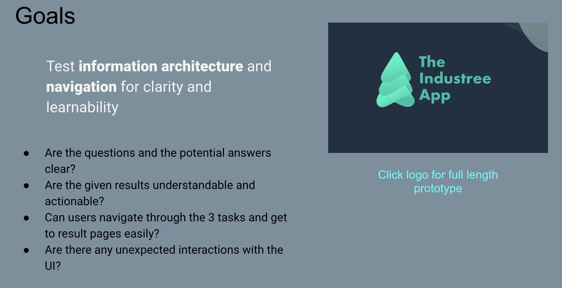
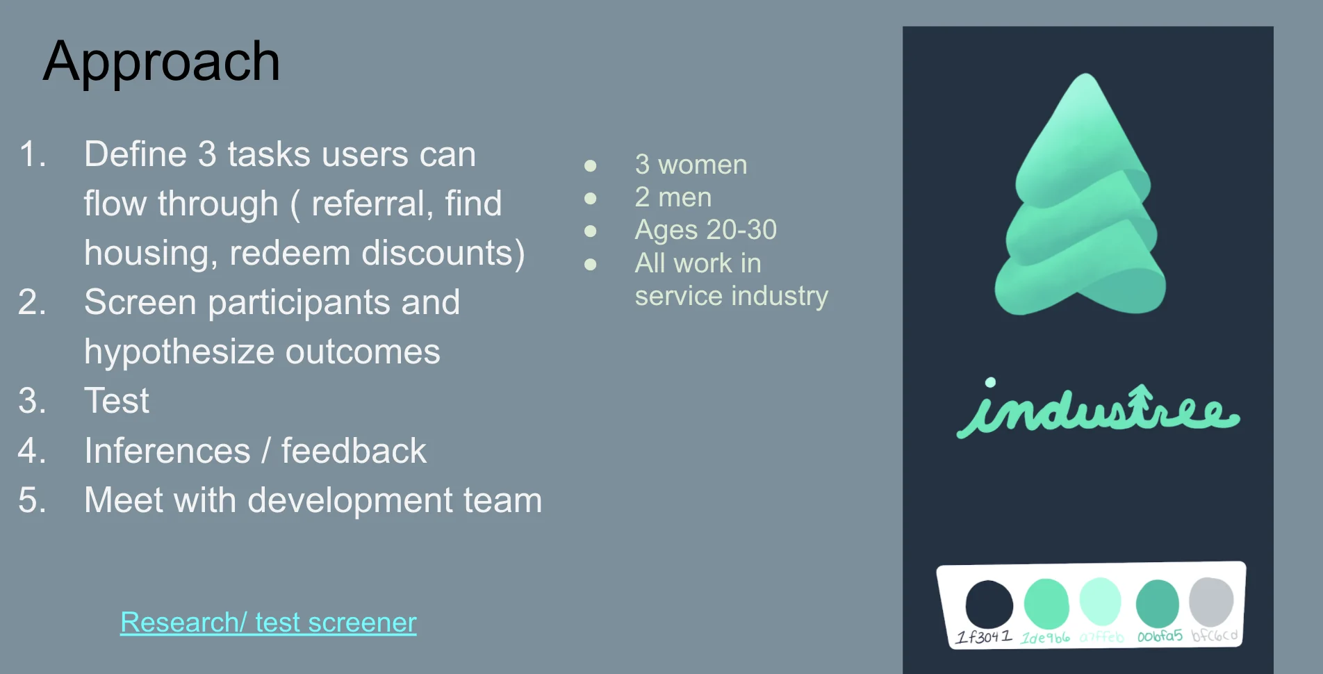
Full size ↗Study goalsInformation architecture and navigation, for clarity and learnability. Not “do people like it” — the four questions underneath are all answerable by watching someone, which is what separates a usability study from a satisfaction survey.Full size ↗Approach and participantsFive steps, ending at “meet with the development team” — the study was scoped from the start to produce changes somebody would make, not a report. Five participants, all currently working in the industry, screened against eleven questions covering whether they rent, how happy they are with their rent, whether they use apartment locators, and whether they already understand Zillow.
Three task flows were tested, and they map exactly to the three things the product claimed to
do: find an affordable apartment (through to signing a lease and getting the application
fee refunded), access industry discounts, and refer a friend for a bonus.
Findings
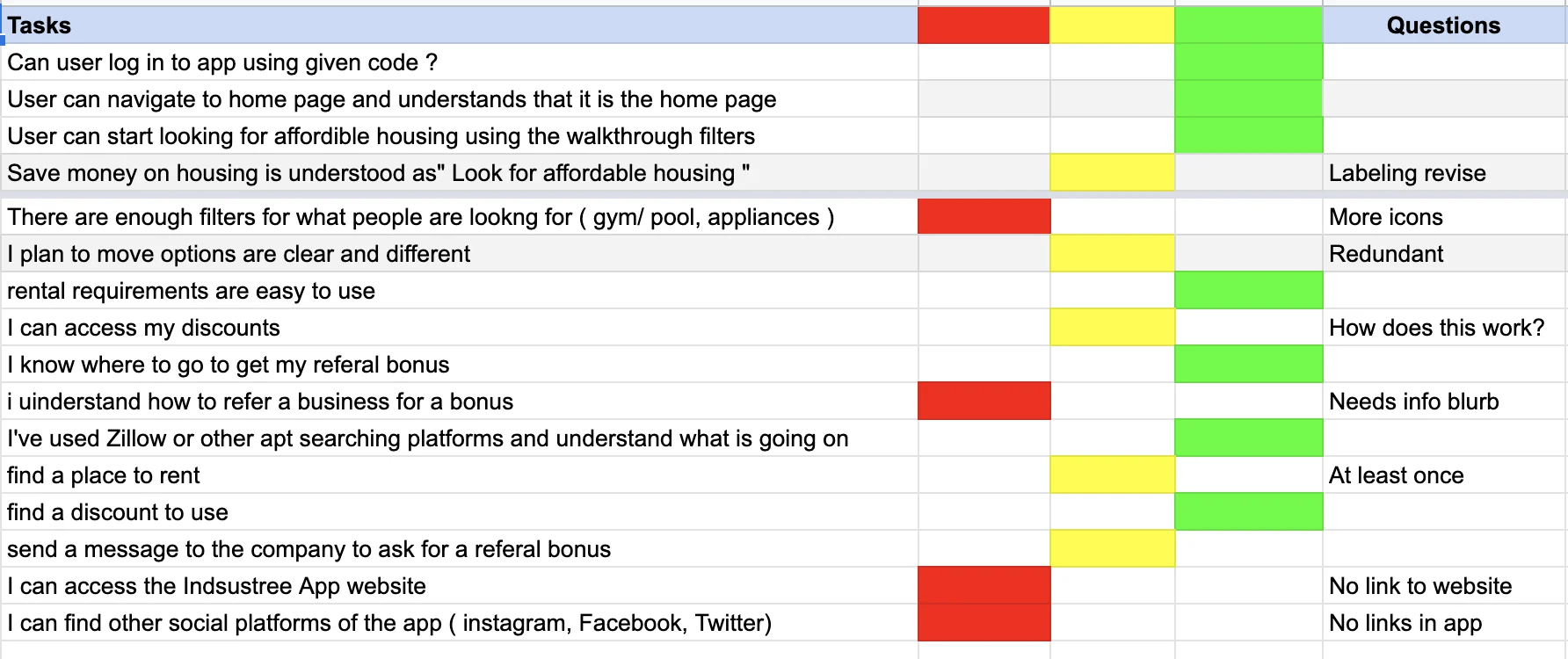
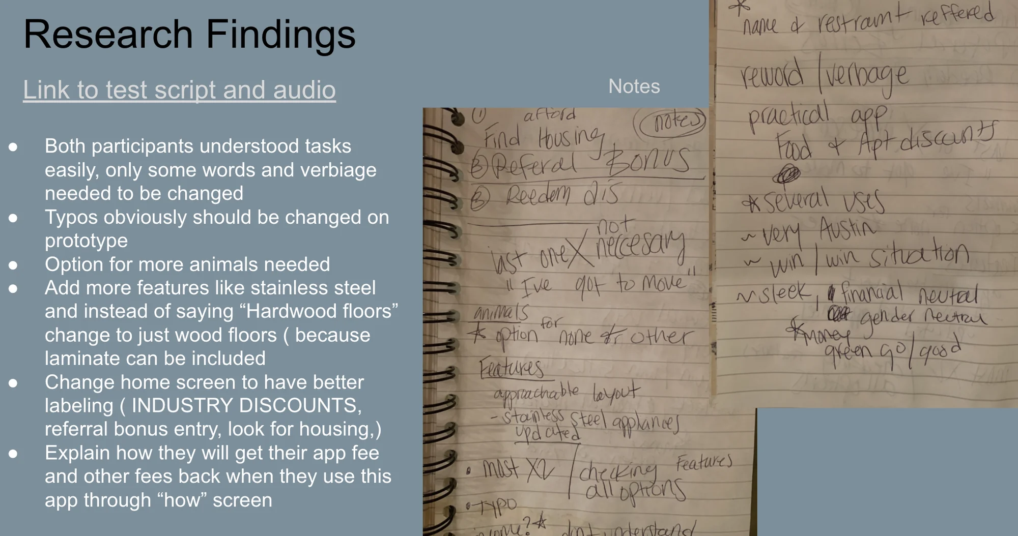
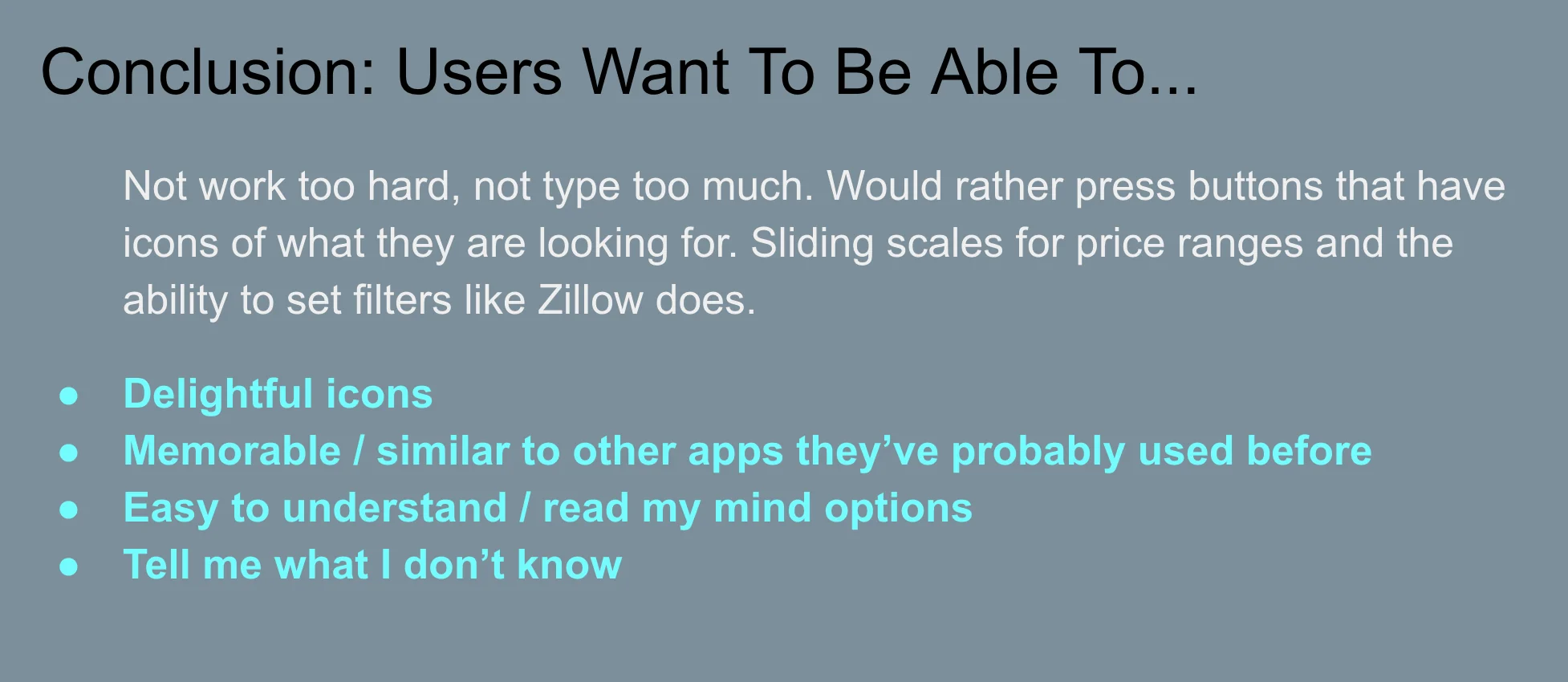
Full size ↗Task success matrixEvery task against every participant, rated red, amber or green, with a questions column for what to fix. This is the artifact I would hand a founder: red cells are where the product does not work, and they cluster — referral bonuses and the route back to the website are red for nearly everyone, while basic search is green.Full size ↗Findings, with the raw notesBoth participants understood the tasks. Typos and verbiage needed changing. The home screen needed better labelling — industry discounts, referral bonus entry, look for housing — and the app had to explain how application fees come back. The handwritten pages beside the bullets are the session notes they were synthesised from, kept in deliberately: findings that cannot be traced back to an observation are opinions.Full size ↗The conclusion“Not work too hard, not type too much.” Four words of that sentence carry the whole study: this audience searches for housing on a phone between shifts, and every text field is a reason to stop. The last bullet — tell me what I don't know — is the one I still use, because it reframes a search tool as something that should volunteer information rather than wait to be asked.
Findings into a change list
The deliverable was not a slide deck. It was a screen-by-screen set of requests the developer
could work through.
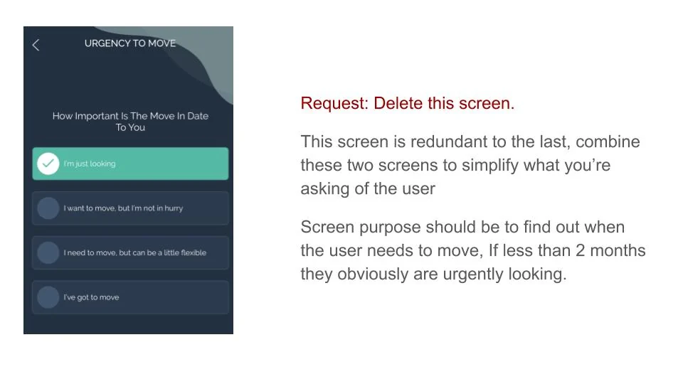
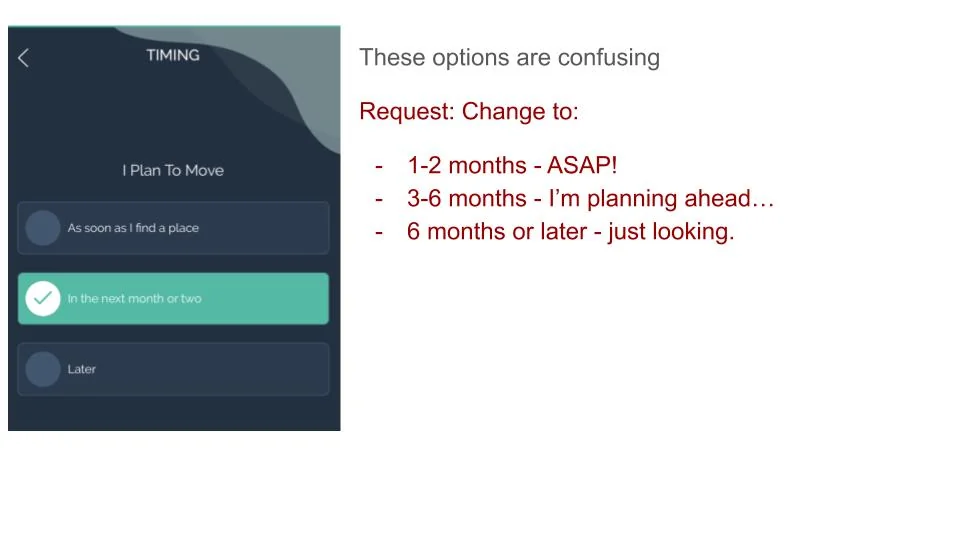
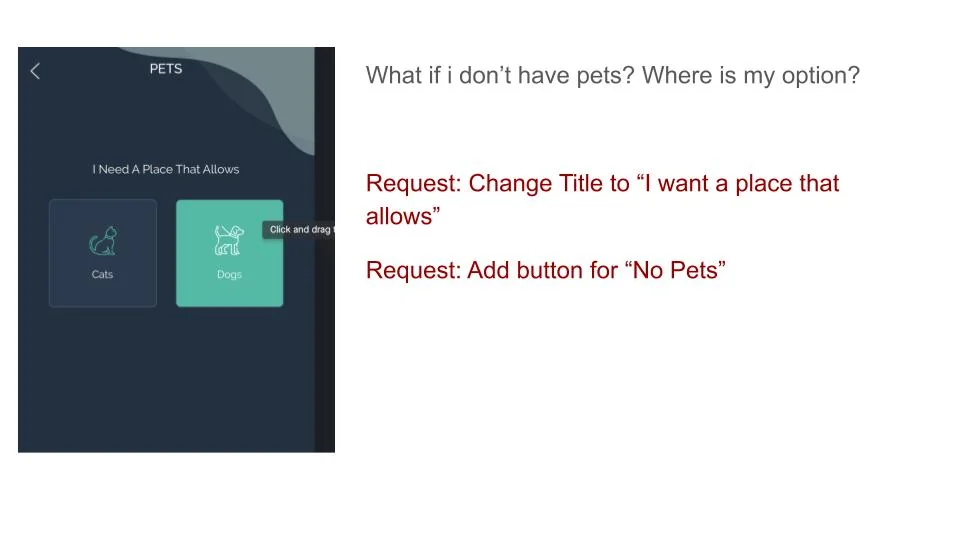
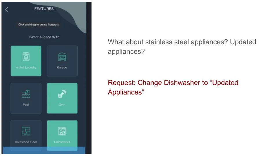
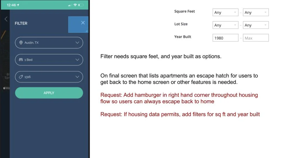
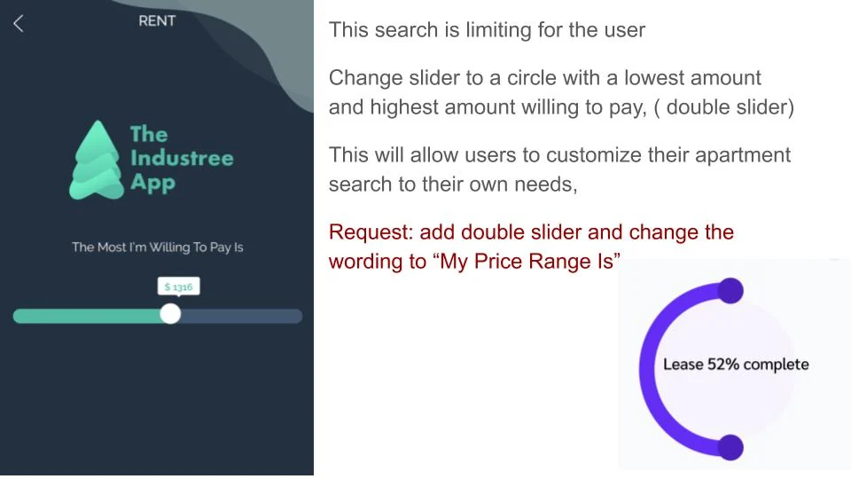
Full size ↗Request: delete this screenTwo screens asked the same question in different words. The note says to merge them and reframe the question around when the user actually needs to move — under two months means they are urgently looking, and the app can infer the urgency rather than asking for it. Deleting a screen is the cheapest usability improvement there is and the hardest one to get agreed.Full size ↗Request: rewrite these options“These options are confusing.” The fix pairs a timeframe with the intent behind it — 1–2 months, ASAP; 3–6 months, I'm planning ahead; 6 months or later, just looking. People do not know which abstract option describes them; they do know which sentence sounds like their own situation.Full size ↗Request: add the option for no“What if I don't have pets? Where is my option?” A filter that offers only inclusions traps everyone who wants to exclude. This is the smallest finding in the study and the most common bug in filter design — the absence of a thing is a valid answer and usually needs its own control.Full size ↗Request: widen the labelA participant asked about stainless steel appliances and there was nowhere to put the question. Renaming one tile from Dishwasher to Updated Appliances covers the whole category a renter actually cares about. Labels in a filter are not descriptions, they are buckets, and a bucket too small sends people back to Zillow.Full size ↗Request: an escape hatch“On the final screen that lists apartments an escape hatch for users to get back to the home screen or other features is needed.” Guided flows feel efficient until someone wants out of one. A persistent way back is not a nice-to-have in a search product — without it, the only exit is closing the app.Full size ↗Request: a range, not a ceilingA single slider asks for a maximum. People shopping for housing think in ranges, and the bottom of the range carries real information — below a certain rent, they assume something is wrong with the place. Two handles and three words of new copy, and the control now matches the mental model it was standing in for.
The marketing side
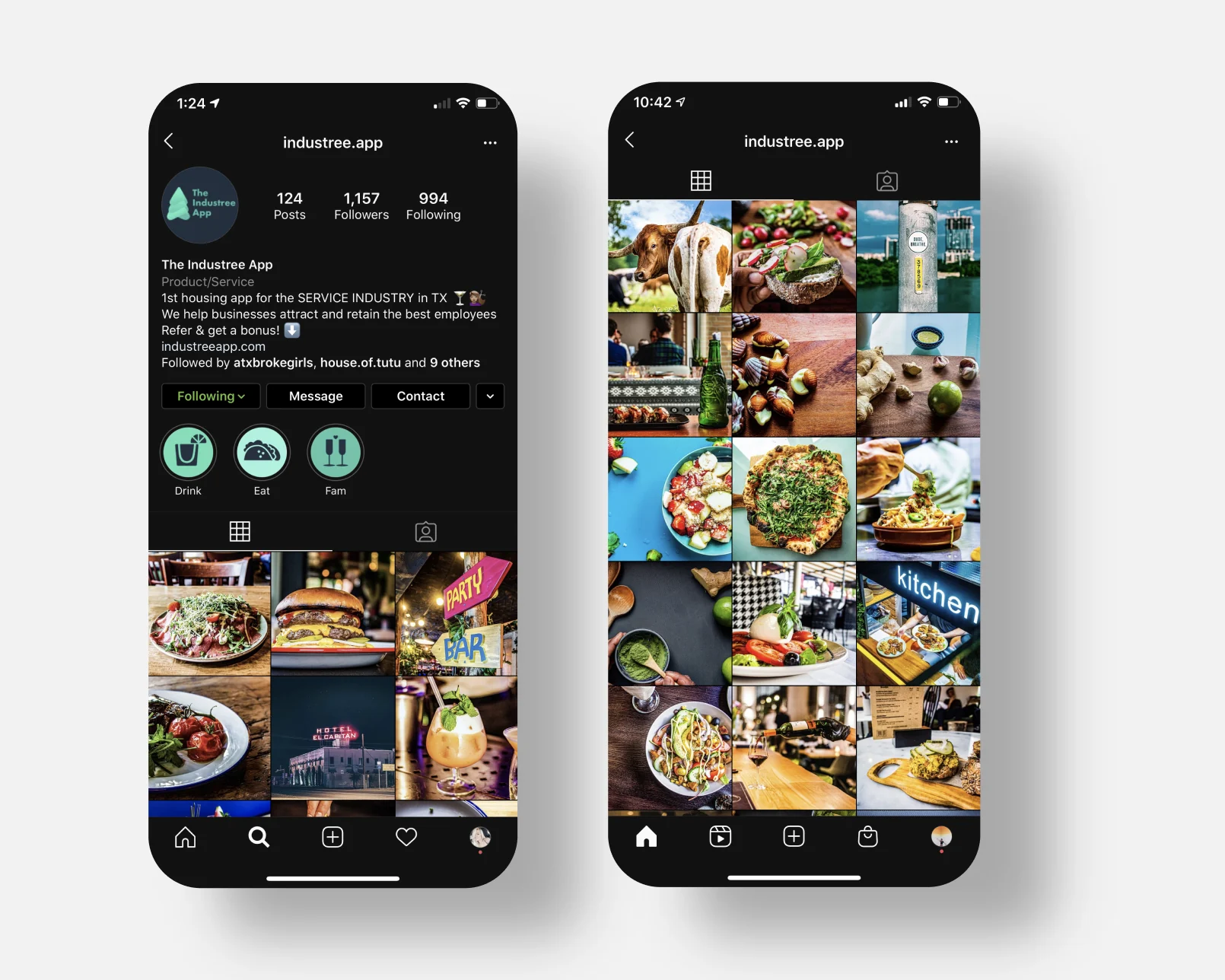
Full size ↗@industree.appI was the marketing manager as well, and ran the account from January 2020. The grid is restaurants rather than apartments on purpose: the audience had to recognise themselves before they would care what the product did. Research told us these users were reached through the places they worked, not through housing content.
How it ended
The project was discontinued due to Covid. The findings went back to the development team
for a second iteration, and then every restaurant in Austin closed.
I am not going to dress that up as an outcome. What exists is a complete, honest research
cycle — screener, tasks, five moderated sessions, a scored matrix, synthesised findings, and a
change list specific enough to build from — on a product that ran out of world before it ran
out of road.
What I would tell you in an interview
This is the project where I learned to write findings as requests rather than observations.
“Users were confused by the timing options” is true and does nothing. “Change to: 1–2 months —
ASAP; 3–6 months — I’m planning ahead; 6 months or later — just looking” is the same finding in
a form a developer can act on before lunch.
The research is only half the job. The other half is handing it over in a shape that survives
contact with a backlog, and I have written every usability finding that way since.