Intapp Risk decides whether a law firm can take a client at all. It worked, and it looked a decade old — and partners were meeting it for the first time. I rebuilt the request and files experience on the design system.
Role
Associate UX Designer
Timeline
2.5 months · 2023
Client
Intapp
Team
With a Senior Designer, a second associate designer, and a PM
Surfaces
Overview & Request Form · Client Details · Files
Stack
Figma · Intapp Design System
Constraints
Legacy technology that might not support the new designs
A fixed, short timeline
Joined at the midpoint of an initiative already scoped by others
Six distinct roles touching one workflow
The problem
Before a law firm can take on a new client, it has to prove the engagement will not create a
conflict of interest, breach confidentiality, or break a regulation. That process is called
new business intake, and Intapp Risk is the software that runs it.
The product did its job. It also looked and behaved like software from a decade earlier — and
that mattered more than it sounds, because the people meeting it for the first time were
partners. A partner initiates a request, spends very little time in the application, and
forms an opinion of the firm’s technology from that short encounter.
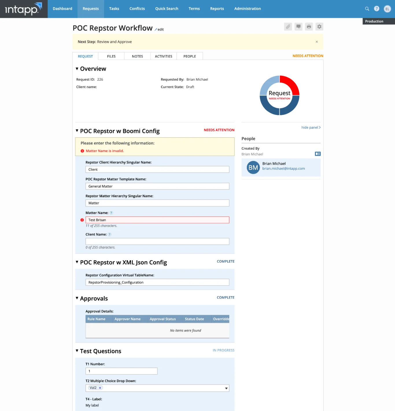
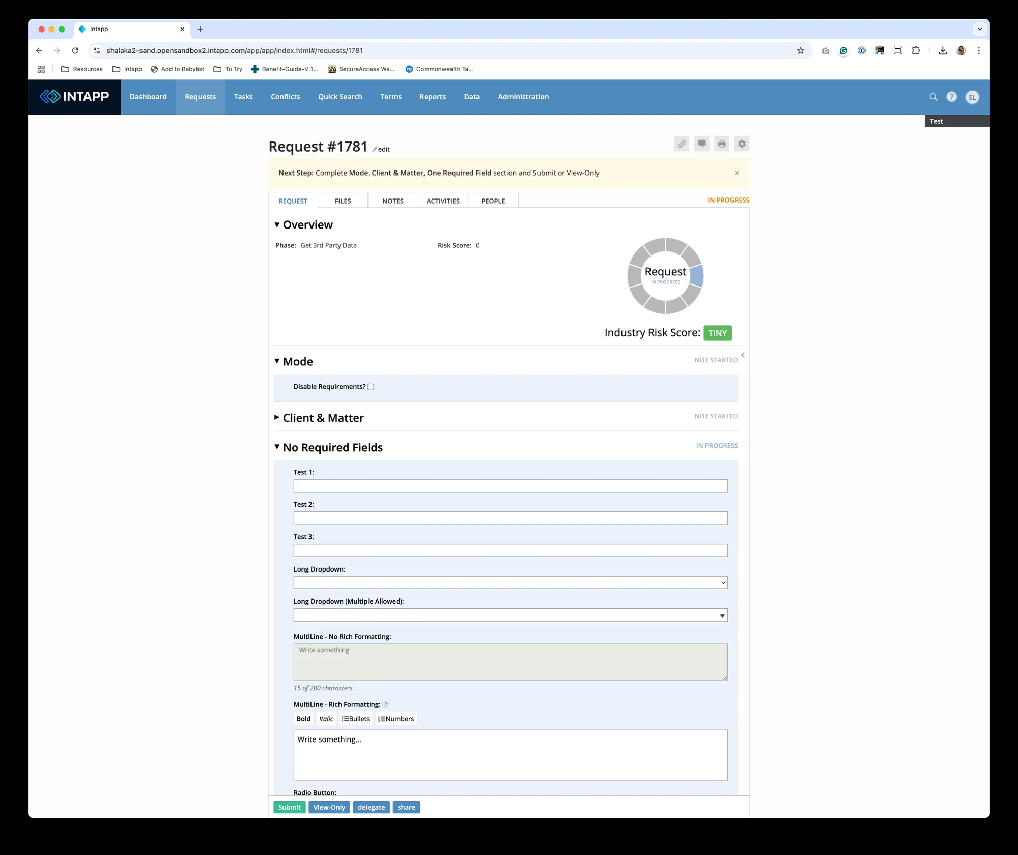
Full size ↗Before — the legacy request workflowCollapsible section stacked on collapsible section, each one hiding a long unlabelled form. Everything a user needs is technically present and almost nothing is findable. The brief called it a facelift; what it actually needed was a structure.
The brief, stated plainly: give this legacy product a major facelift and integrate the
design system into it.
The challenge, stated just as plainly: a strict timeline, and technology old enough that it
might not support what we drew.
What success meant
The goals were not mine — they came from the product side, and I kept them visible throughout,
because they are what a design gets judged against.
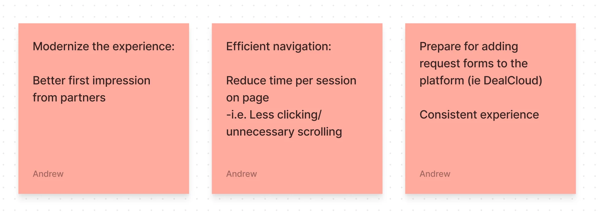
Full size ↗The three goalsModernise for the partner's first impression. Reduce time-on-page through less clicking and less scrolling. And make it consistent enough that request forms could later be added to the wider platform. The third goal is the one that constrains the other two — anything invented here had to generalise.
Note what the second goal actually asks for. Less time on page is a win, not a loss. This
is not a product anyone wants to spend time in; it is a gate they need to get through
correctly. That inverts a lot of ordinary design instinct.
Where I came in
The initiative was already defined when I joined. The Senior Designer and PM had scoped it,
drafted the timeline, and assigned verticals; generative research and a sitemap of Risk were
already done. Two of us came in as associates for the second half, and mine was the
Overview Request Form, Client Details, and Files.
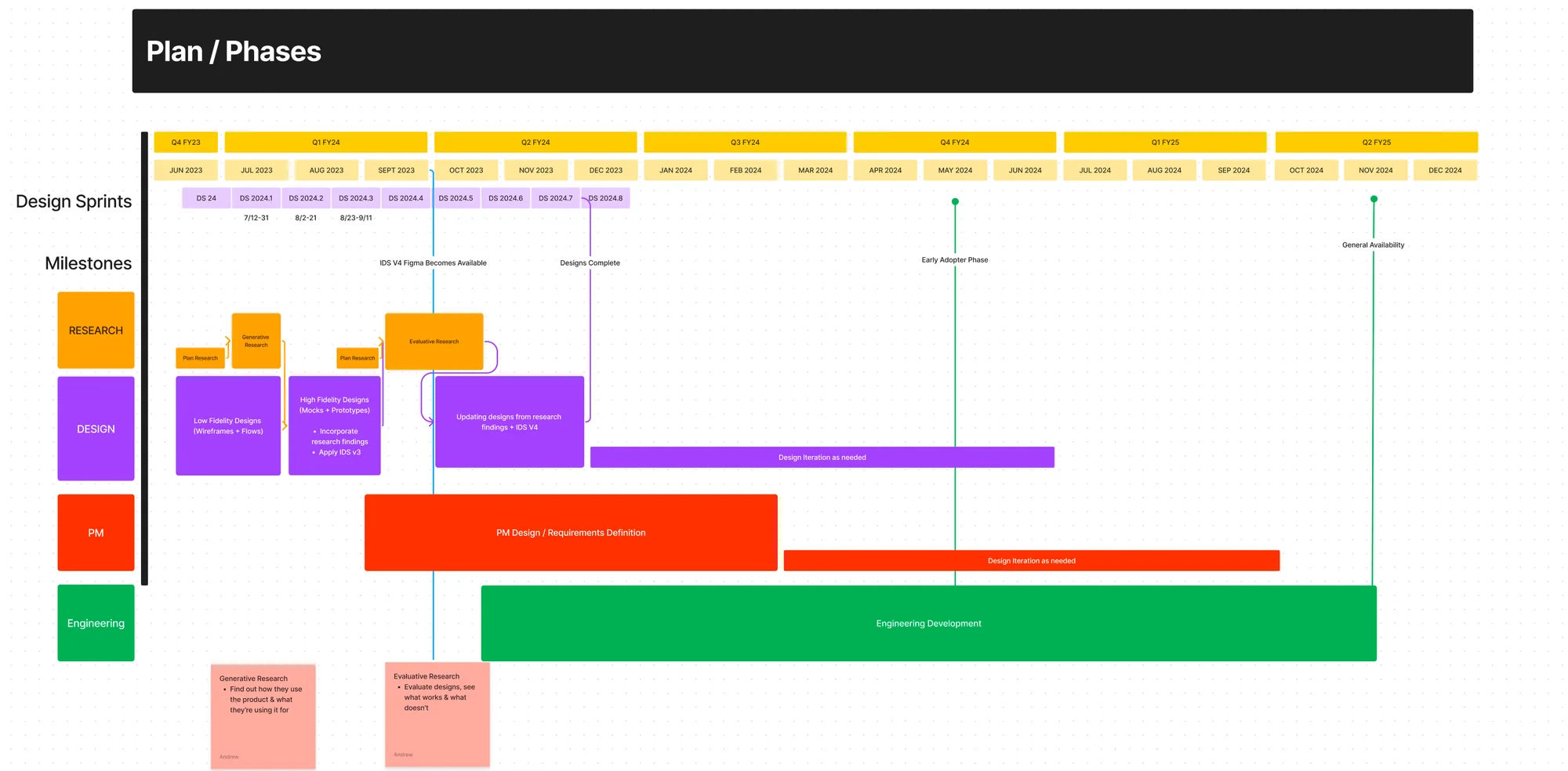
Full size ↗Plan and phasesThe plan I inherited. Joining mid-initiative means the interesting decisions about scope have already been made by someone else — the work is finding the room that remains inside them, and being useful fast enough to matter.
Discover: the shape of the thing
Before drawing anything I needed the existing structure in my head. The sitemap work covered
the current state, the proposed state, and a future state.
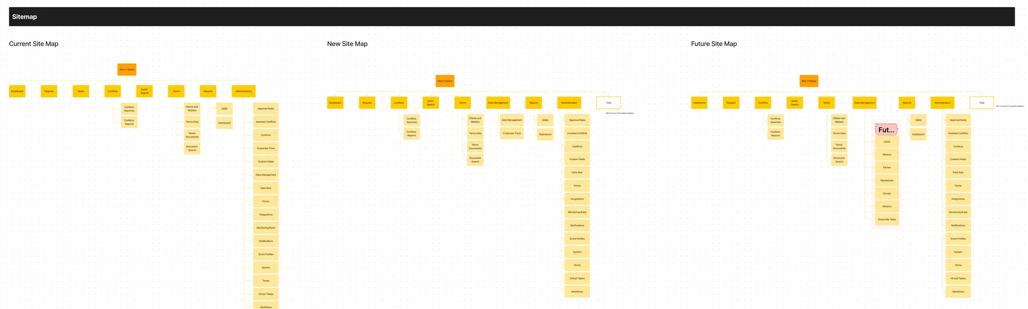
Full size ↗Current, new, and future site mapsThree maps rather than one: what exists, what we were building, and where it was heading. The third map is what stops a redesign painting itself into a corner — the future state is where those additional platform request forms were eventually going to have to live.
Define: six roles, one workflow
The thing that makes intake hard to design is that a single request passes through six
different kinds of person, and each wants something different from the same screen.
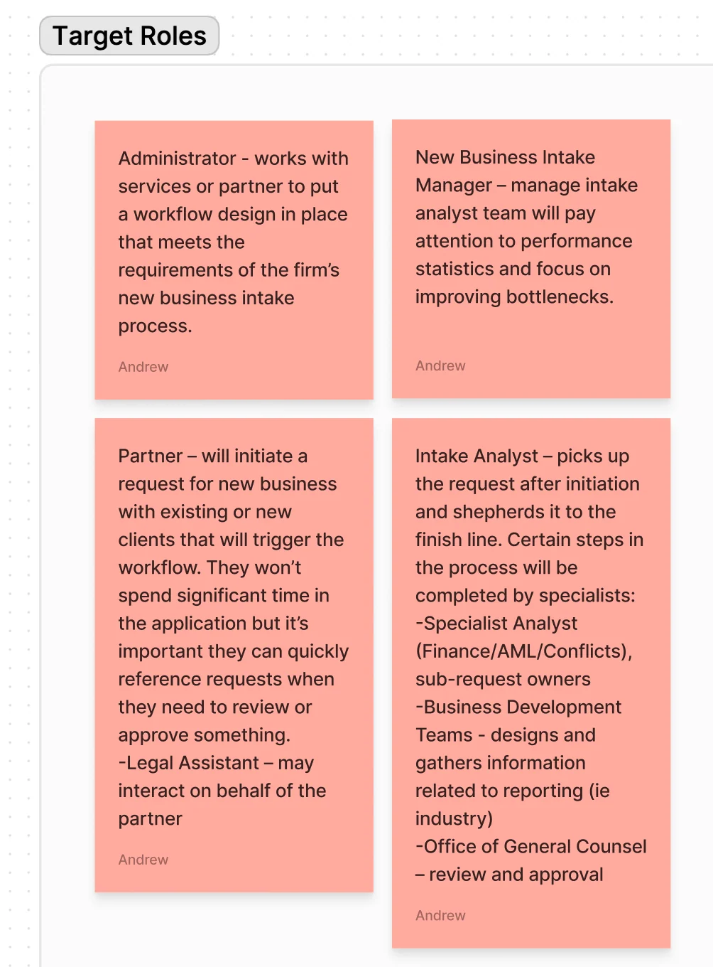
Full size ↗Target rolesThe distinctions that mattered were about time and depth, not demographics. The Partner initiates and leaves — won't spend significant time in the application, but needs to reference a request quickly when something needs approving. The Intake Analyst picks it up and shepherds it to the finish line. A Legal Assistant may act on the Partner's behalf. Specialists in Finance, AML and Conflicts own sub-requests, and the Office of General Counsel reviews and approves.
That is the actual design brief hiding inside the facelift: one screen serving someone who
will spend ninety seconds here and someone who will spend all day. Partners need scannable
status and a fast approve. Analysts need depth, filtering, and bulk action.
Audit before redesign
I went through my assigned area component by component, marking up what the legacy screens
were doing before deciding what should replace them.
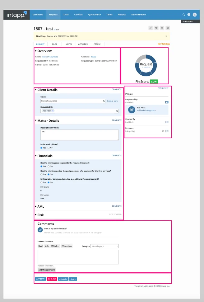
Full size ↗Component auditBreaking the existing screen into regions and asking, for each one, whether the design system already had a pattern for it. Doing this first is what tells you where the system genuinely has a gap versus where you simply have not looked hard enough — and the gaps are where the real design work turns out to be.
Ideate: layout options
With the inventory done, the question became how a long, multi-section form should actually be
presented. I built and compared real options rather than arguing about them abstractly.
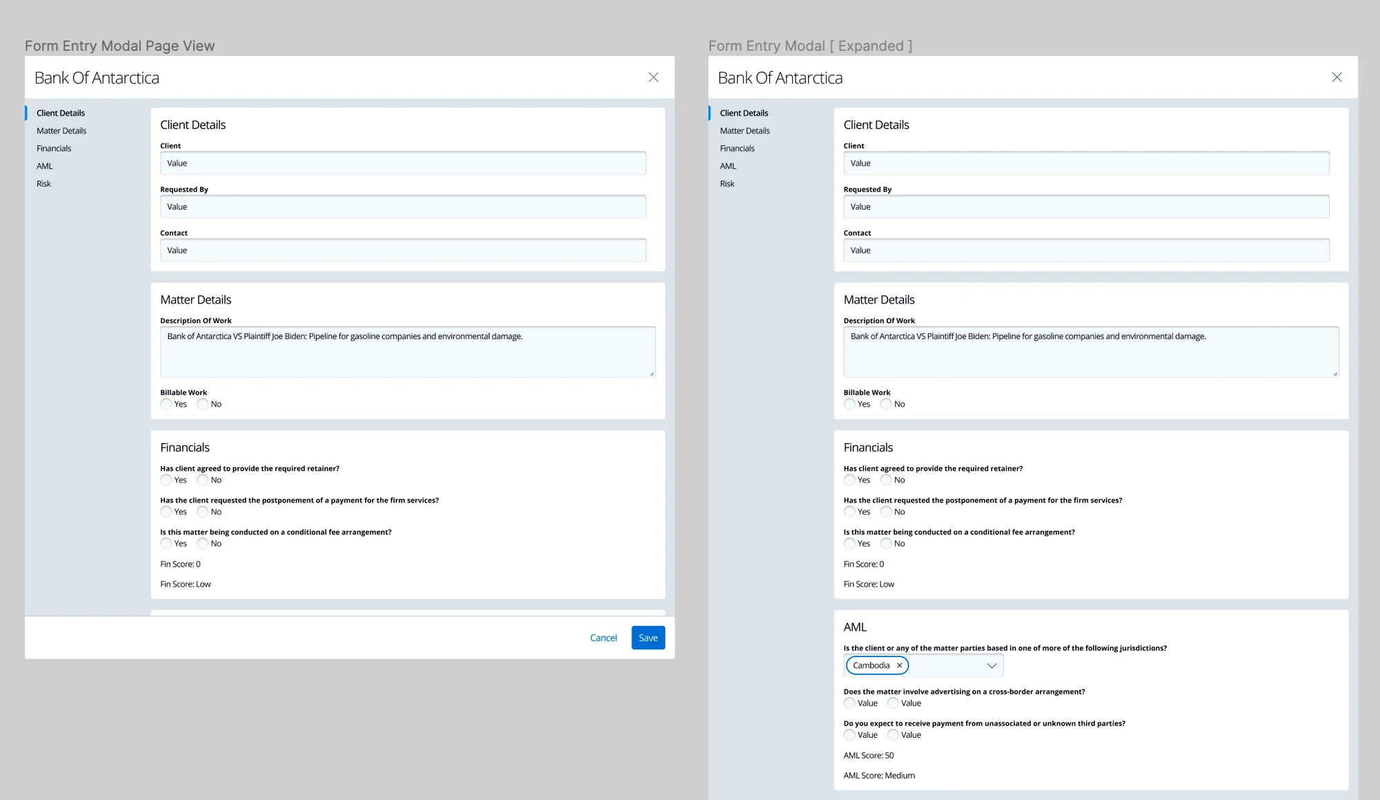
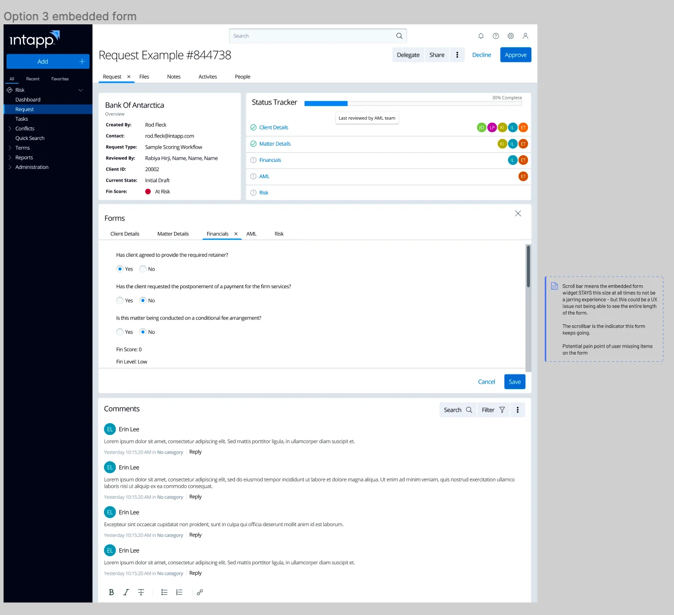
Full size ↗Option — page view vs expanded modalThe same content as a full page and as an expanded modal. The modal keeps the user anchored to the request they came from; the page gives the long form room to breathe. For a partner doing one approval the modal wins, and for an analyst working a queue the page does — which is exactly the tension the six roles created.Full size ↗Option 3 — embedded formThe third option embeds the form in the request itself, with the status tracker and comments beside it. This is the one that serves both roles: the analyst gets a work surface, the partner gets context without navigating away.
The change I would defend
Rebuilding the forms from design-system components surfaced a problem the system had no answer
for. Intake requests routinely need more than one person to complete them, and nothing in
the interface told you where the thing stood — whether anyone had opened it, who, or what
remained.
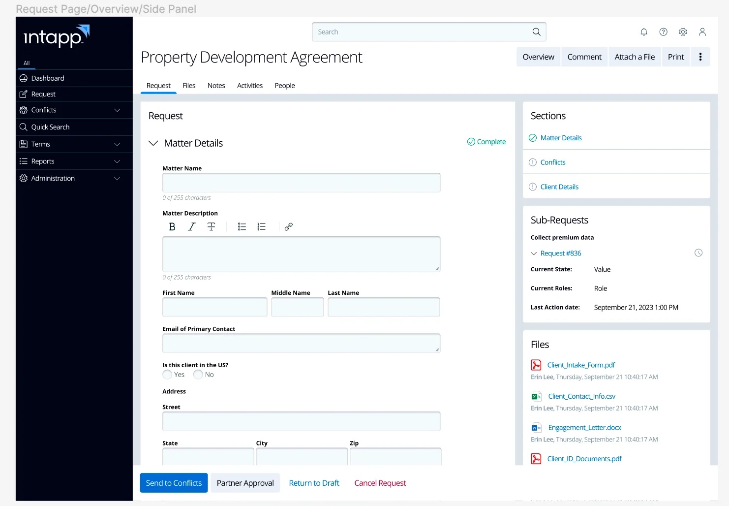
Taking inspiration from form-tracking tools like Asana, I introduced a state showing whether
forms had been viewed and by whom, and hyperlinked the “complete” subtext so a user could jump
straight to the relevant part of the form rather than hunting for it.
Full size ↗Request overview with side panelSections, sub-requests and files pulled into a persistent right panel, so the state of a request is legible without scrolling through it. For a collaborative workflow, knowing a request is stalled on a named colleague is worth more than any visual refresh — and that finding came out of the rebuild, not the brief.
Detail: the unglamorous majority
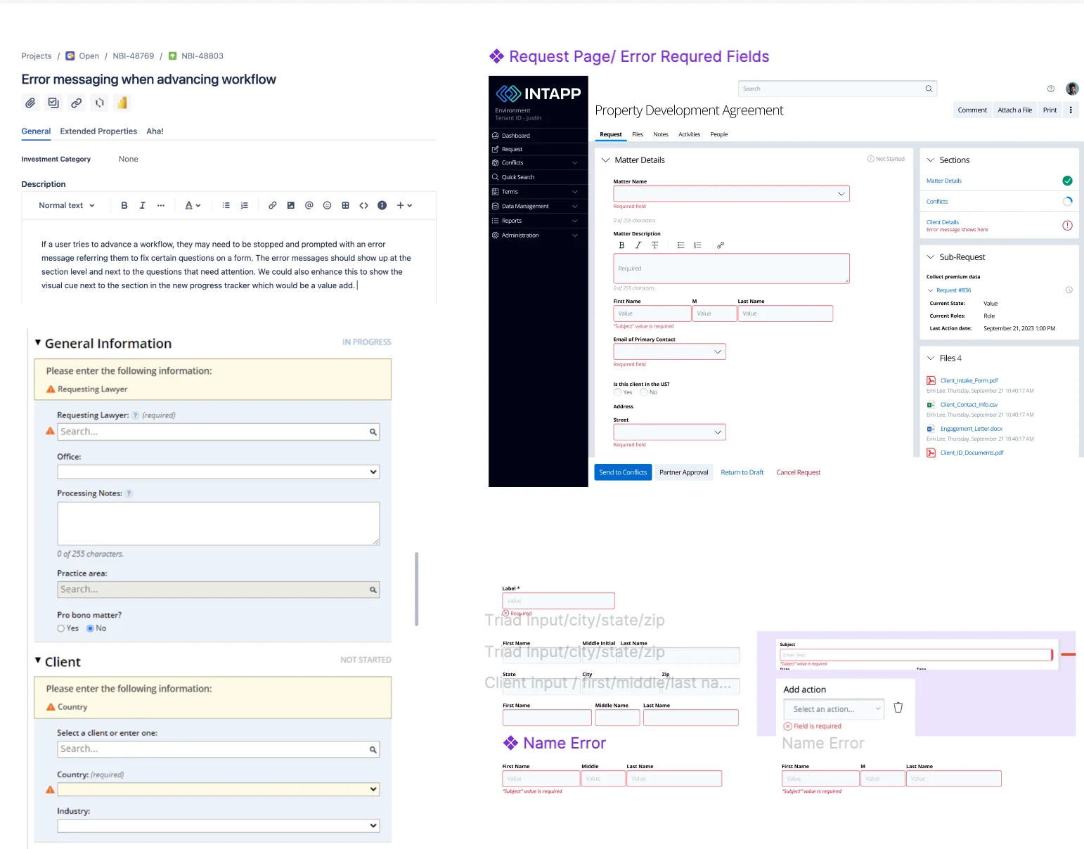
Enterprise work is mostly the states nobody demos. Every component needed its error handling,
its empty state, its filters, and its row-level actions specified before engineering could
build any of it.
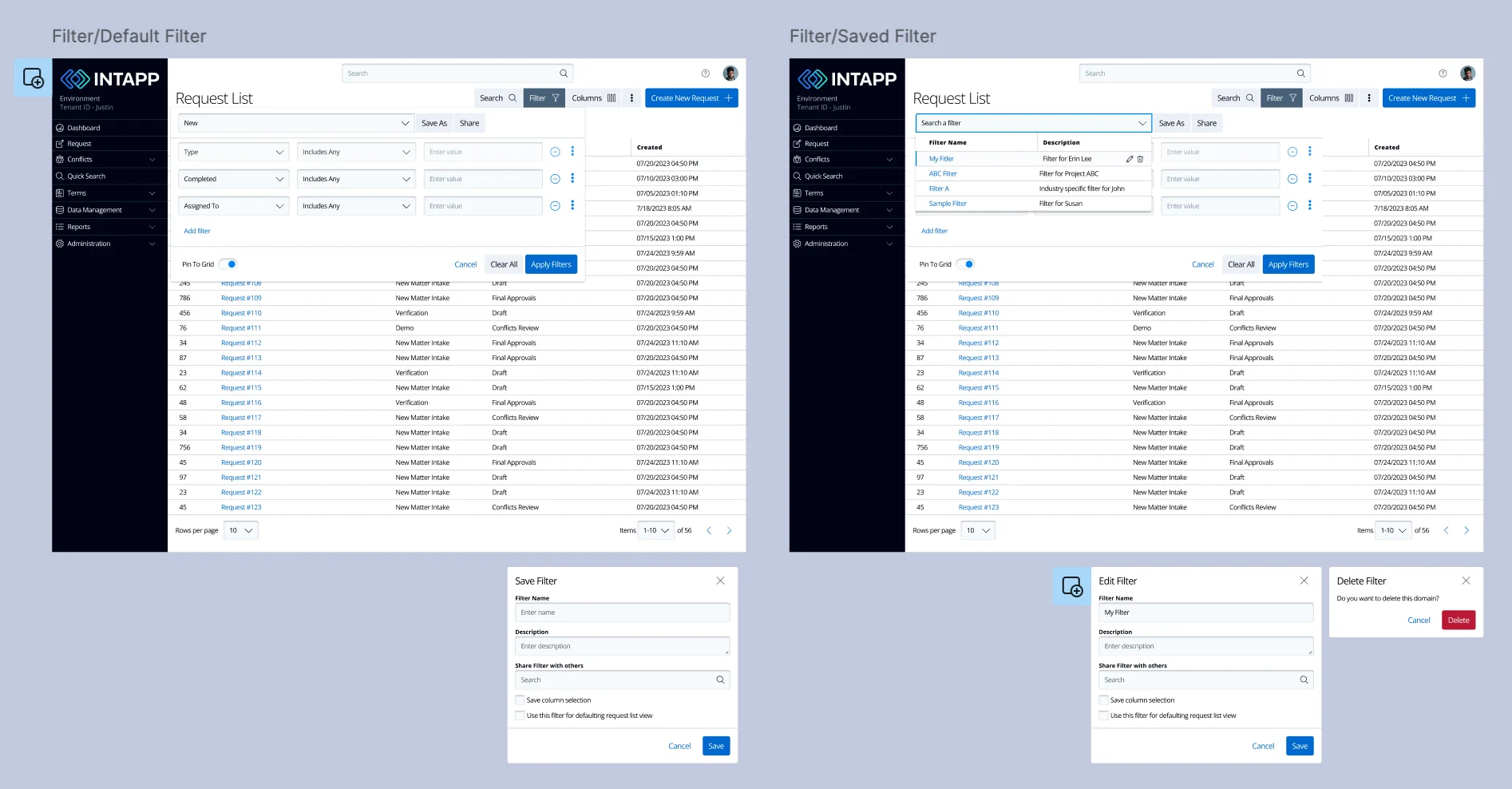
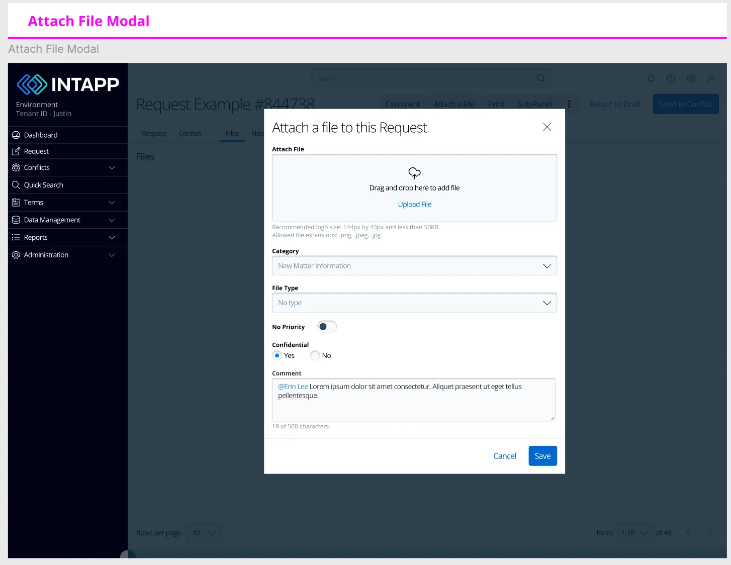
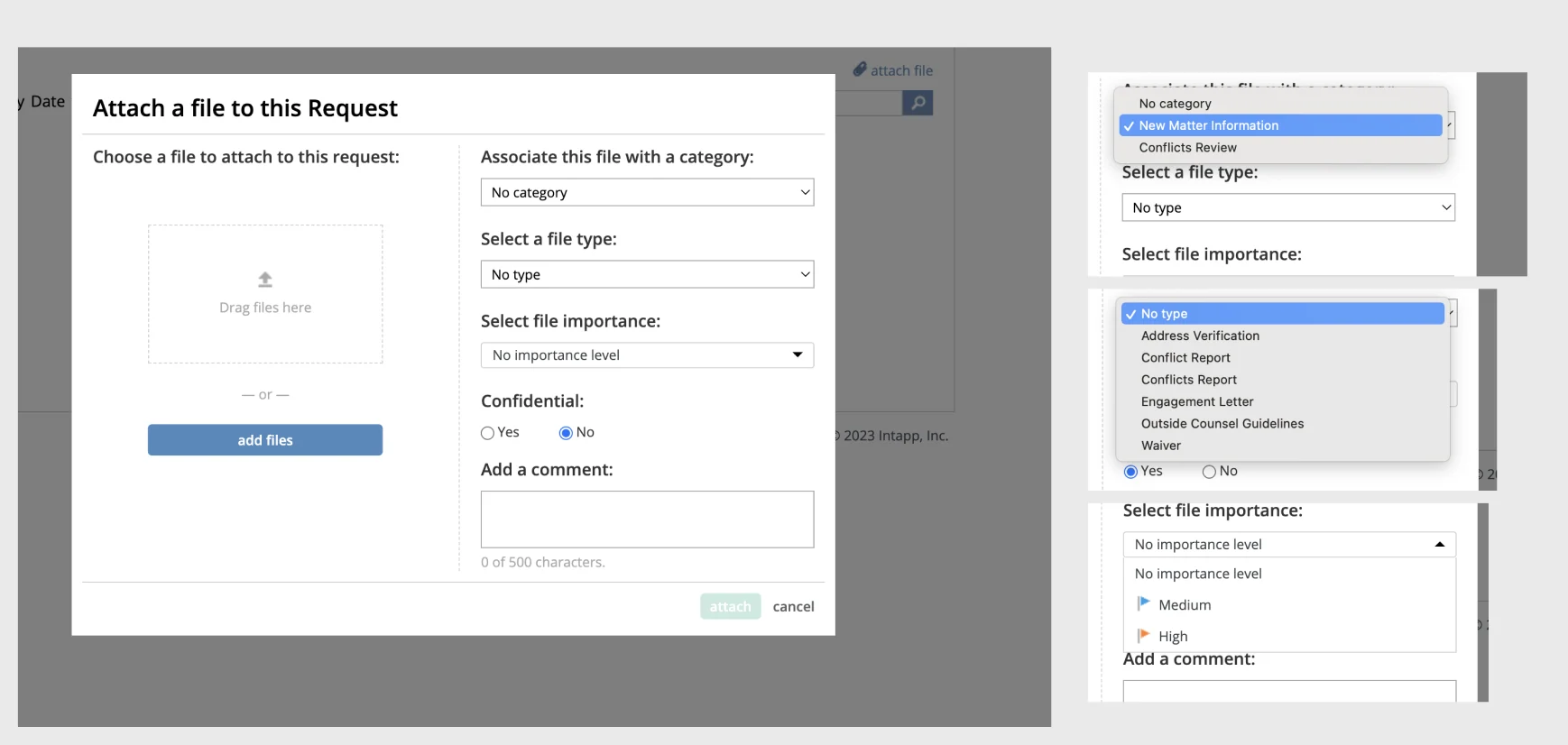
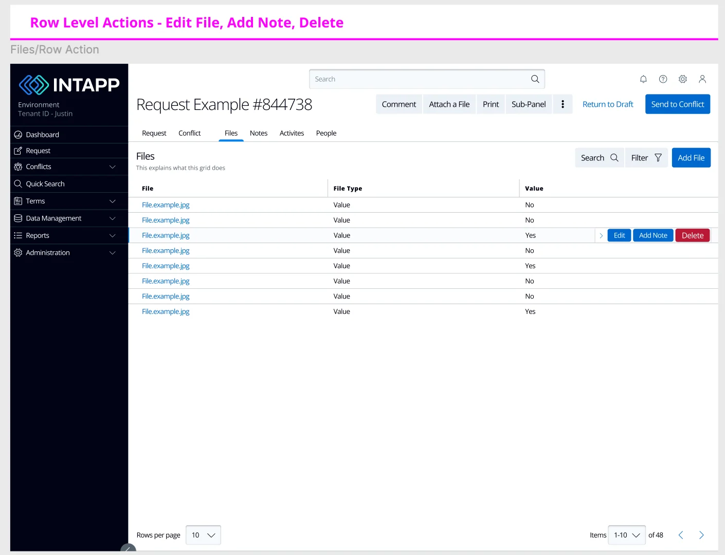
Full size ↗Error messaging across componentsWhat happens when someone tries to advance a workflow that is not ready. In a compliance product the error state is not an edge case — it is the mechanism. The system exists to stop things proceeding, so the message explaining why has to be as designed as the happy path.Full size ↗Default filter vs saved filterDefault and saved filter states for the request list. Saved filters are what make the analyst's day survivable — they live in this list, and the difference between a good and a bad day is whether their view persists between sessions.Full size ↗Attach fileAttaching a document is where compliance metadata gets captured — category, file type, confidentiality, importance. Every one of those fields is a question someone must answer at upload, because nobody will ever come back and fill them in later.Full size ↗Attach file — every option stateThe same modal with every dropdown opened. Specification work: engineering cannot build a select whose options nobody has written down, and polluted option data was one of the things the audit found.Full size ↗Files — row-level actionsEdit, add note, delete — exposed per row rather than buried in a bulk-action menu. Built on the existing grid component system rather than a new table, which under a fixed timeline is the reason this shipped at all. The most useful design-systems decision on a legacy product is usually to find what already exists and not reinvent it.
Iterate: how the work actually ran
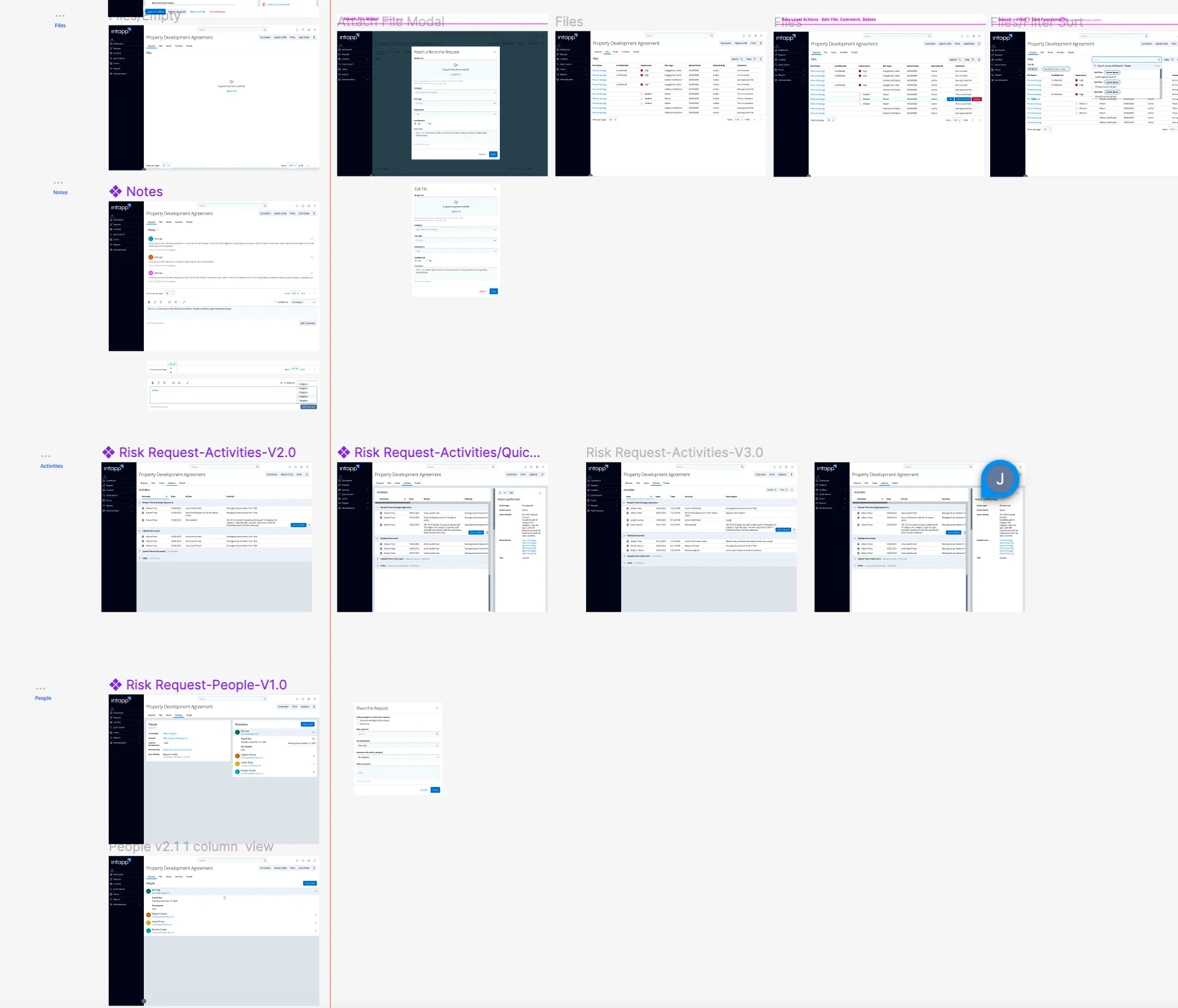
None of the above arrived finished. Designs were critiqued with the PM and the team, revised,
versioned, and then copied into the master file for the Senior Designer’s approval.
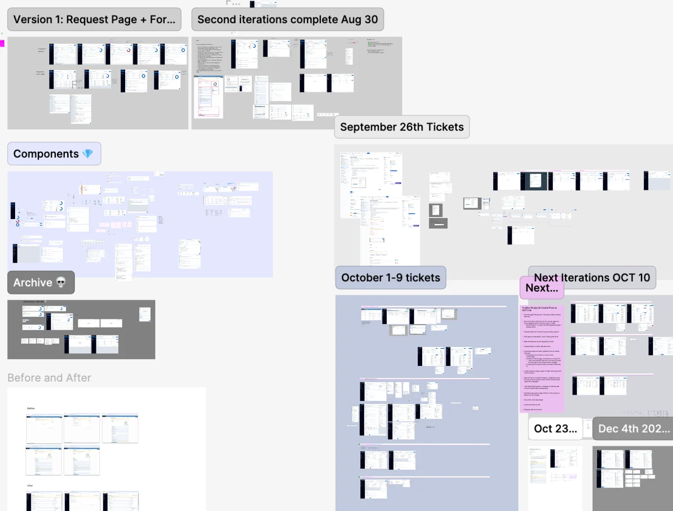
Full size ↗The working fileRisk Request Activities, versioned down the file. The bird's-eye view of a working file is the most honest artifact in any case study: it shows how many times the thing was wrong before it was right.Full size ↗Delivery boardWork organised by ticket batch and date — second iterations complete 30 Aug, the September 26th tickets, October 1–9, next iterations Oct 10. Including an explicit Before and After section, because on a legacy modernisation the comparison is the deliverable stakeholders actually want to see.
After
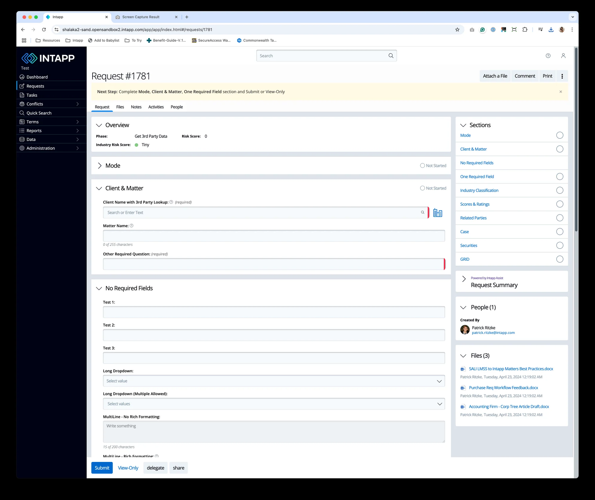
Full size ↗After — the redesigned requestThe same job as the first image in this case study. Flat sections instead of nested collapsibles, labelled fields, and the industry risk score promoted to a single glanceable figure — because for the partner, that number is very often the only thing they came to see.Full size ↗After — with the request summary panelThe analyst's version of the same screen: the form on the left, and sections, people, files and summary held in a persistent panel on the right. One layout, two reading speeds — which is what the six-role problem needed.
What I would tell you in an interview
There is no outcome metric here and I will not manufacture one. I was an associate on a
ten-week initiative I joined halfway through, and I do not know what the A/B test returned or
whether the collaborative form state survived to production.
What this project taught me is the thing I now do first on any design-system work: build the
existing screens out of the system before designing anything new. Every genuine gap I found —
including the collaborative state, the most valuable change I made — came out of that
translation, not out of the brief. The brief said facelift. The rebuild said the form did not
know it had more than one author.
The other lesson is about goals I did not write. “Reduce time per session” sounds like a
failure metric until you understand that nobody wants to be in a compliance tool. Designing
for people who want to leave quickly is a different craft from designing for engagement, and
most of what I know about enterprise UX started there.