A mobile app for building better habits, designed by a team assembled across four countries. I owned profile and accounts, and the real problem turned out to be that a profile in a social goal app has two audiences.
Role
Product Designer (contract)
Timeline
Jul 2021 – Mar 2022
Team
Pod of 3, inside a 10-designer distributed team
Surfaces
Profile · Accounts · Teams · Settings
Stack
Figma
Constraints
Ten designers across four countries and as many timezones
A new design system being built while screens were being designed
Weekly deliverable dates across eight numbered iterations
The problem
Pledgr is an app for goal-setting and habit building. My pod owned profile and accounts,
and the brief sounded like the least interesting assignment in the file.
It was not, because of one question nobody had answered: whose profile is it?
In a social goal app, a profile page has two completely different readers. You open your own
to see whether you are actually doing the thing you said you would. Someone else opens yours
to decide whether to follow you, join your team, or challenge you. Those two readers want
different content, different hierarchy, and different buttons — and almost everything
difficult about this project came out of serving both from one layout.
The engagement
I came in as a contract product designer through my former mentor Will Ntim, a senior
designer whose background includes PayPal, Visa, and Home Depot. He assembled designers from
Canada, India, the UK, and the US and ran the project like a real product team — sprints,
rituals, critique, dated deliverables.
I worked in a pod of three, running agile sprints with product and engineering and taking part
in critique across the full ten-designer group. The file is organised by due date, which is
how I can show you the whole arc rather than only the end of it.
Define: what actually goes on a profile?
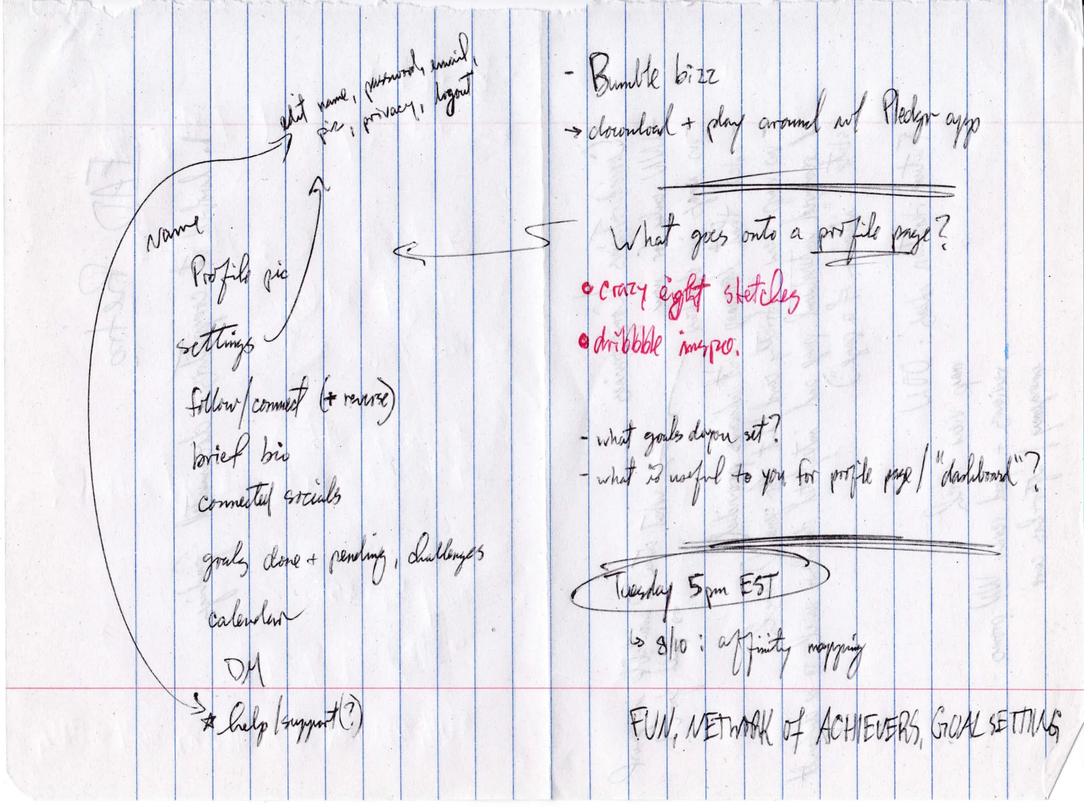
Full size ↗Word map — profile and accountsBefore any box was drawn: what goes into a profile page, written out by hand and branched. The question in the middle of the page is the one the whole engagement turned on, and the surrounding notes are the raw list of everything that might claim space there. Doing this on paper keeps you from accidentally designing the first idea.
Ideate: crazy eights
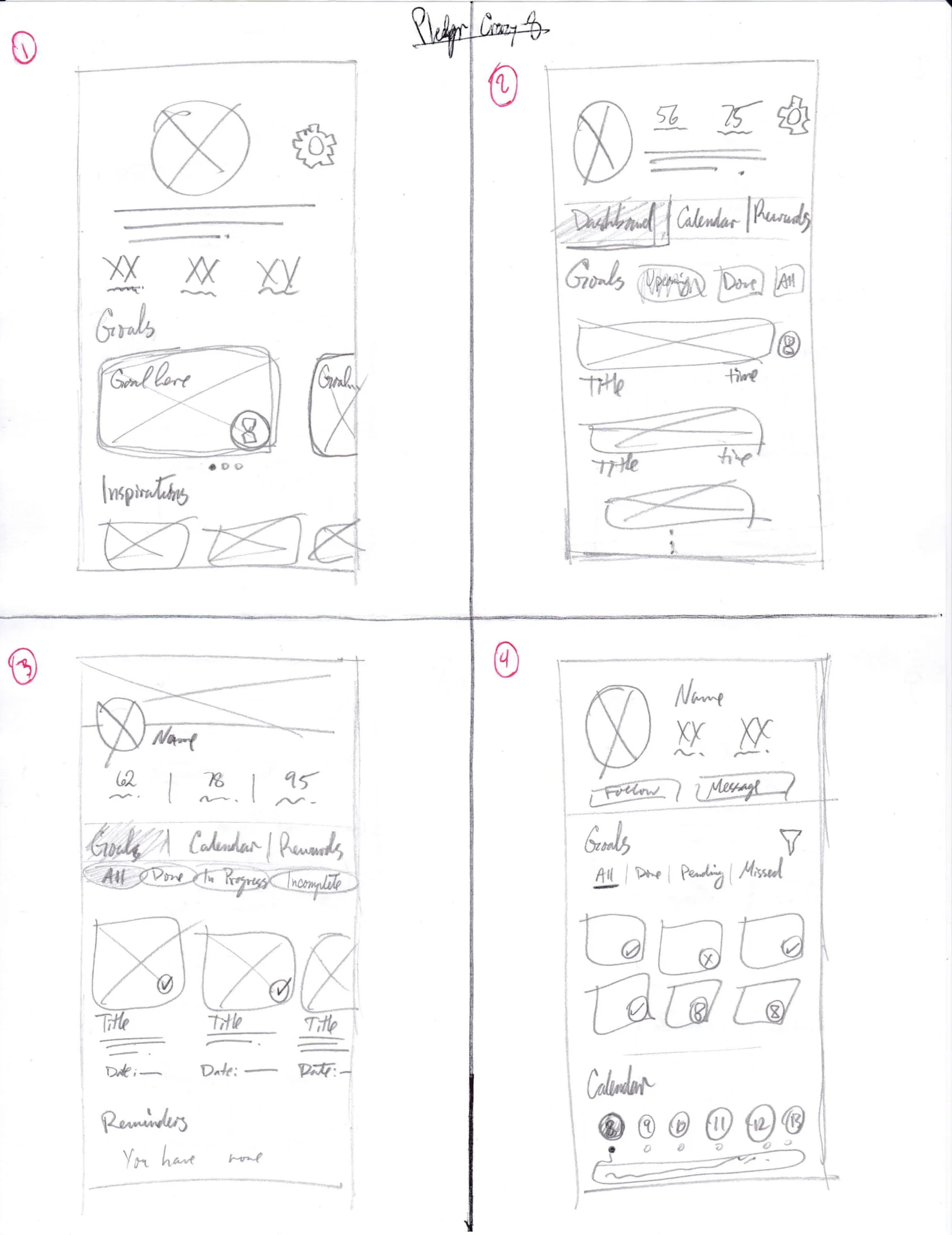
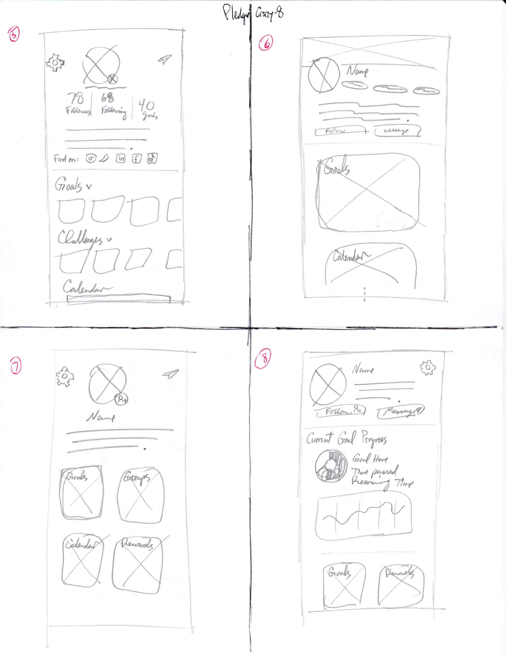
Full size ↗Crazy eights — sheet 1Eight layouts, eight minutes. Some of these are bad on purpose: the method only works if you keep drawing past the point where you have run out of good ideas, because the ones after that are the ones you had not already thought of.Full size ↗Crazy eights — sheet 2The second sheet is where the structure that shipped first appears — a profile header, a horizontally scrolling goal row, and a dated activity block underneath. A note on this page reads: be sure to account for a CTA that lets you challenge someone on their profile. That is the two-readers problem showing up in pencil, weeks before it showed up in a design review.
First passes
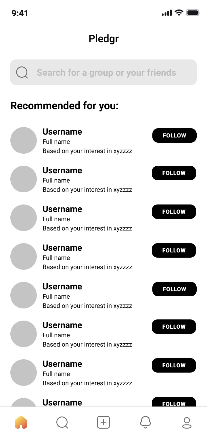
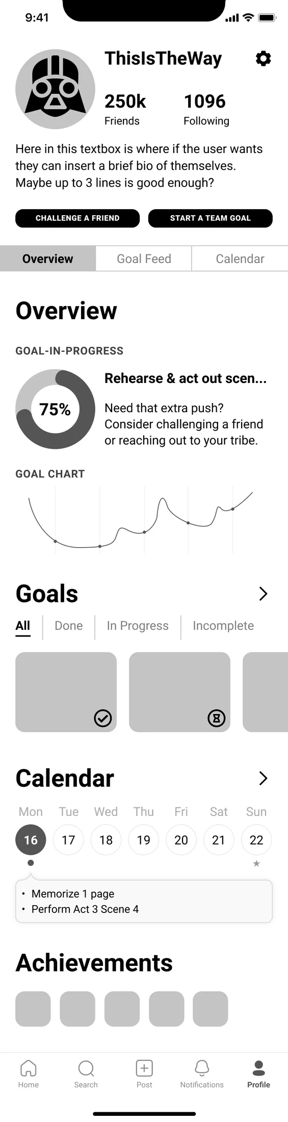
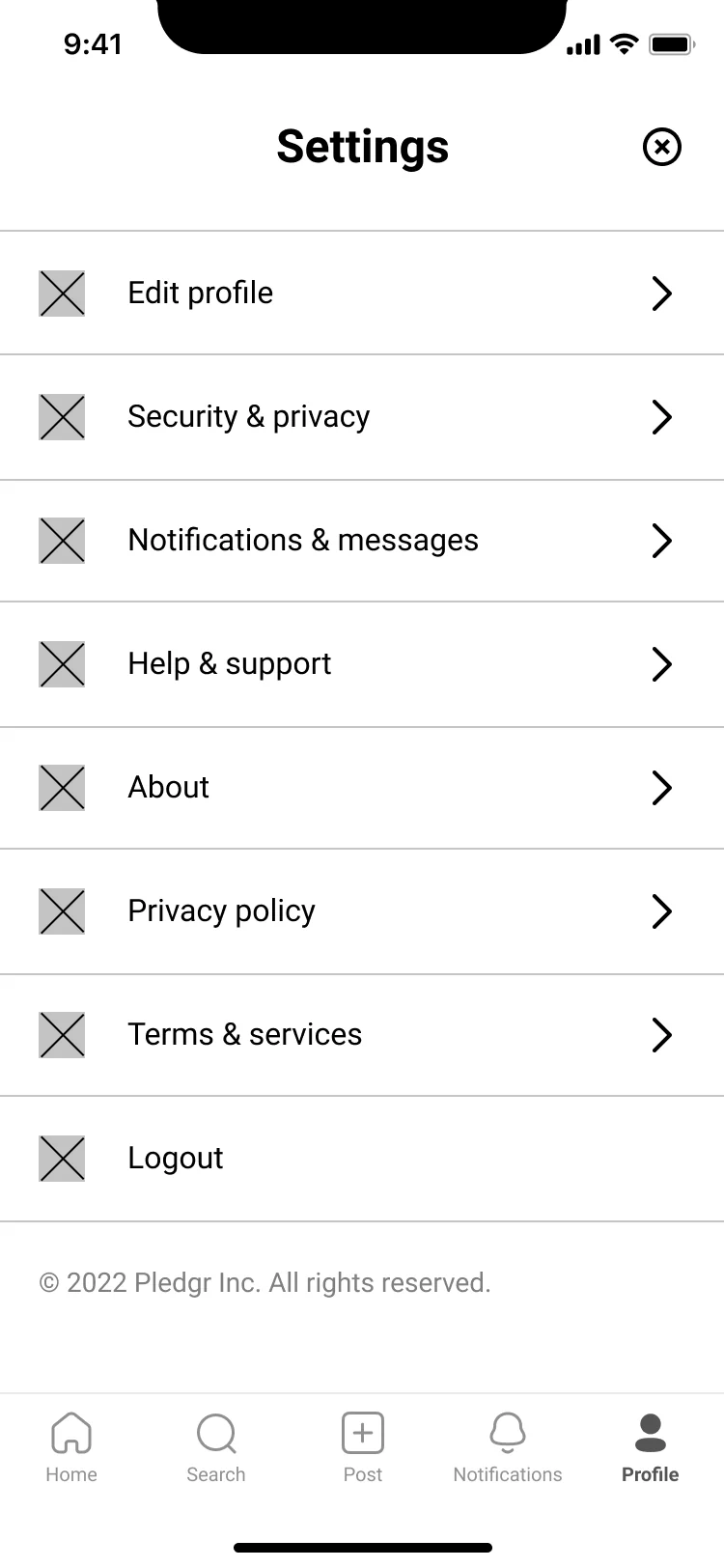
Full size ↗Initial community screenThe first attempt at the social layer — a recommended list and a follow button. It is deliberately plain, and it is useful precisely because it exposes the gap: a row of identical usernames gives a person no reason to follow anyone. Whatever makes someone worth following has to come from the profile, which puts the weight back on the surface my pod owned.Full size ↗Profile samplerEverything the profile could possibly hold, laid out at once: progress ring, trend chart, goals, calendar, achievements. A sampler is not a proposal — it is an inventory you then argue down. Four of these blocks survived and the rest moved behind tabs.Full size ↗Settings samplerAccounts was the other half of the assignment, and settings is where a social product's promises get tested. Every row here eventually had to answer what a stranger can see — which is why security and privacy stopped being one row and became its own screen.
Iteration 1 — mid fidelity
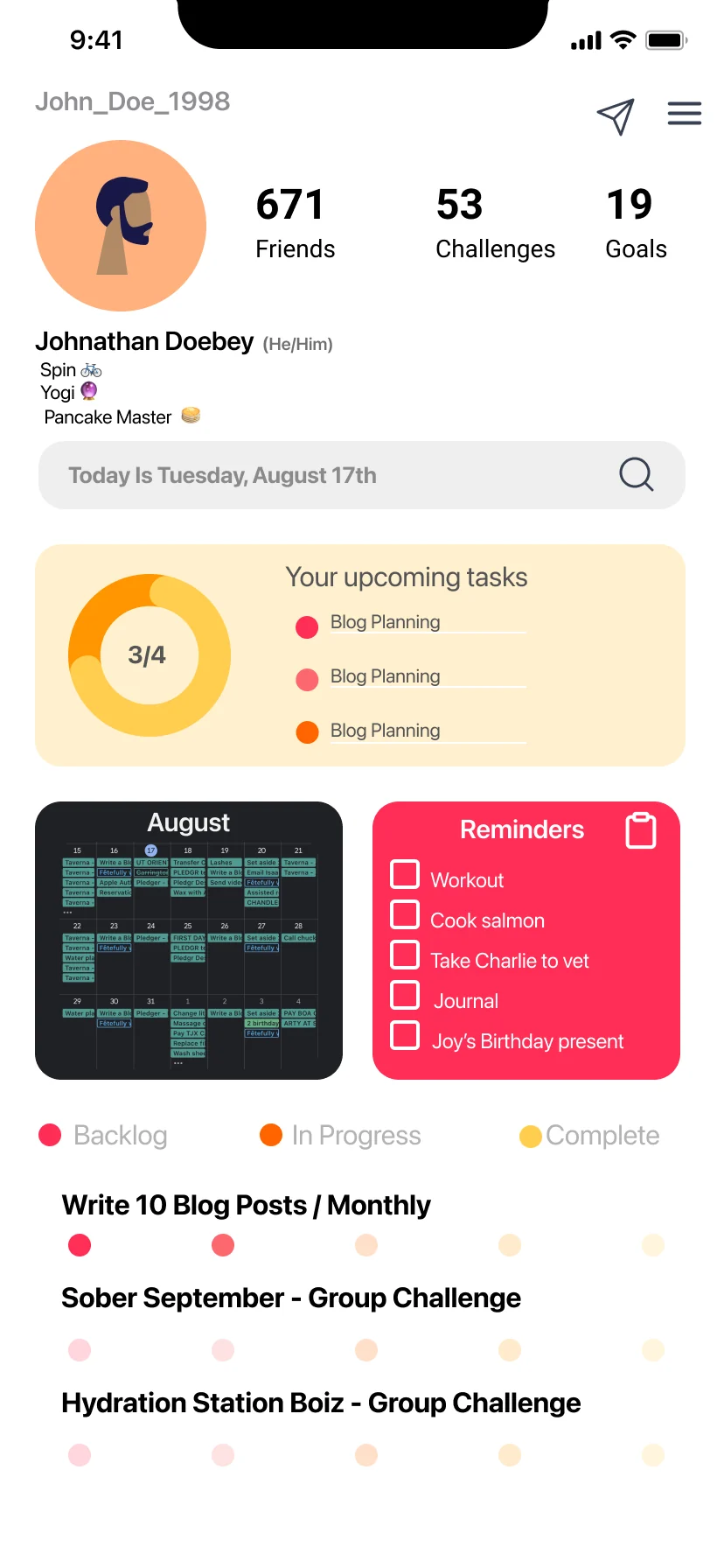
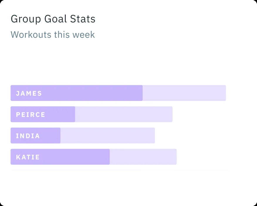
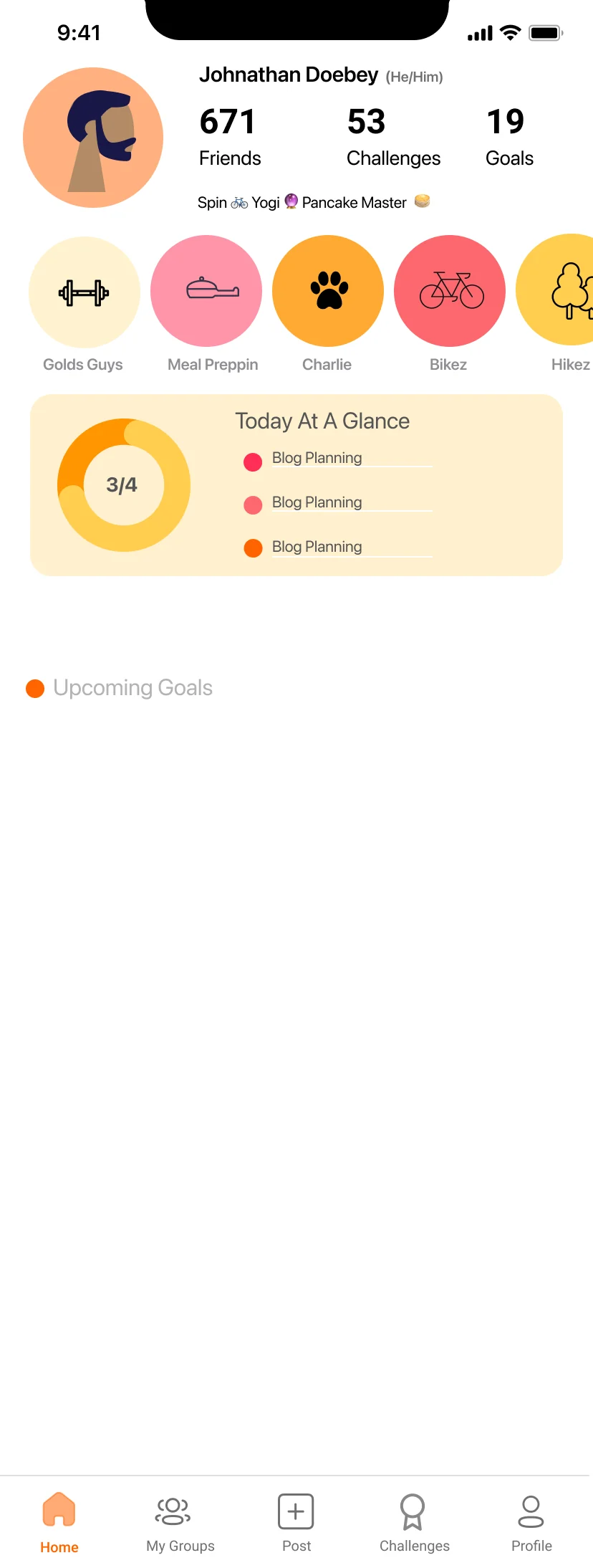
Full size ↗Screen idea 1A kanban model borrowed on purpose — backlog, in progress, complete — with a calendar heat grid and a reminders list. My note in the file says it came from looking at Asana and ClickUp. Treating personal goals like a project backlog is a real design position, and showing where it came from is how you let a team argue with the position instead of with you.Full size ↗Screen idea 3Same content, different navigation and a row of goal-category icons under the bio. Running near-identical variants sounds wasteful and is not: when only one variable moves, a critique produces a decision rather than a discussion.Full size ↗Group goal statsThe accountability idea in its smallest form: tap a group goal and see everyone's progress against their own target. My note beside it imagined a workout group holding each other to it through comments and emoji when people log a session. Four bars is all the mechanism needs — social pressure is cheap to design and expensive to get wrong.Full size ↗Iteration 2The iteration where the page gets a spine: a single Today At A Glance card takes the top, and everything dated moves beneath it. The earlier versions showed a person everything about themselves; this one answers what do I need to do today first, and lets the rest be scrolled to.
The visual turn
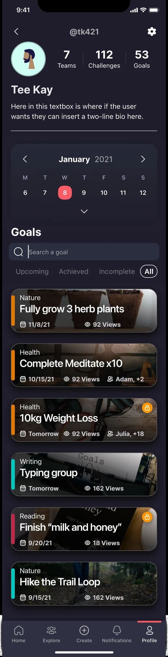
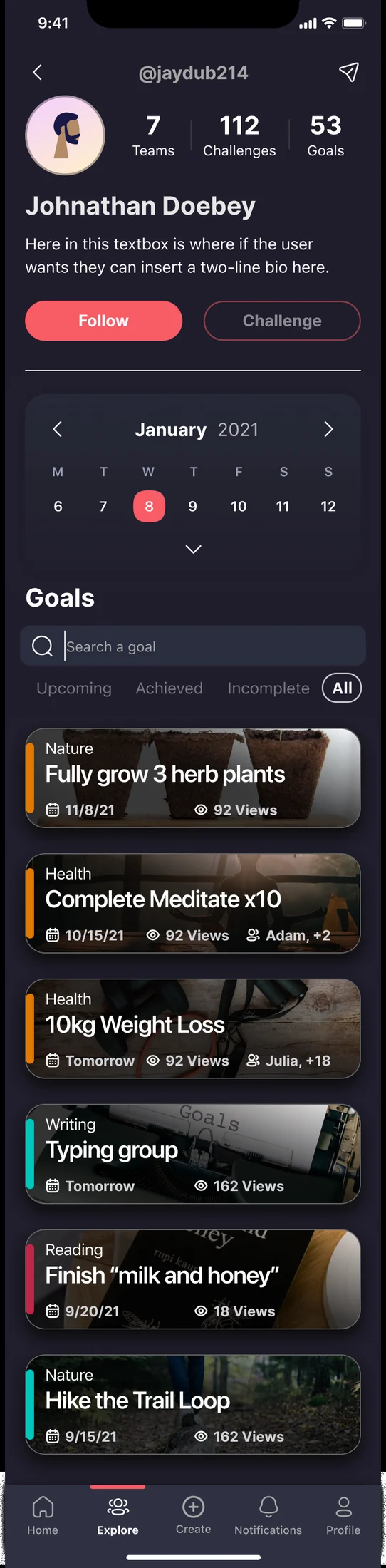
Full size ↗Prototype 1 — my profilePrototype 1 is where the product changed character. Light mode made a goal list read like a task manager; dark mode with photographic goal cards makes the same data read like something you want to look at. For an app whose only real competitor is not opening the app, that is a product decision, not a style one.Full size ↗Prototype 1 — someone else's profileThe same screen as another person sees it. These two frames exist as a pair at every single stage of the file, because the moment they drift you have two profile designs to maintain and a user who cannot predict what others see of them.
Dev-ready
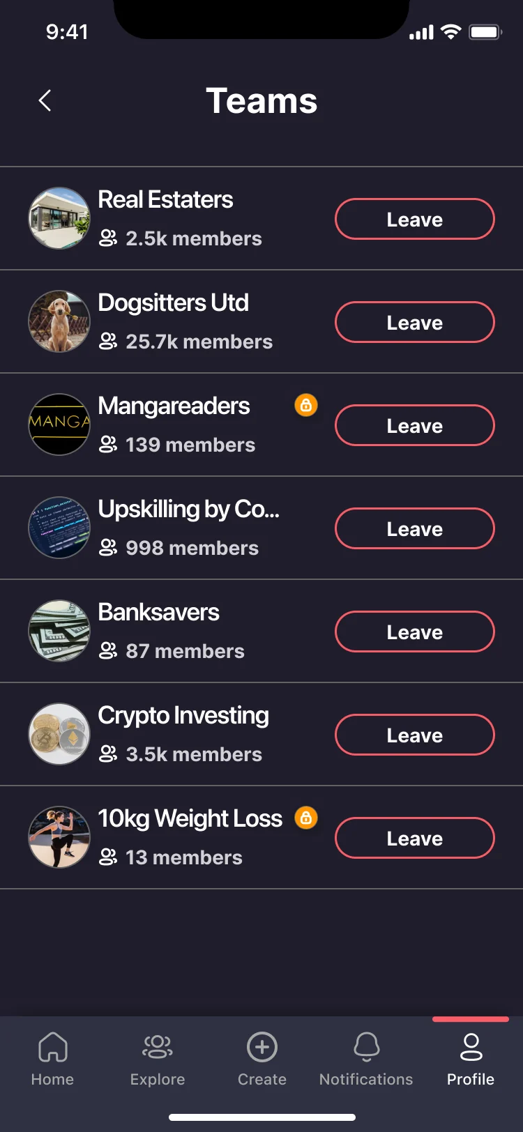
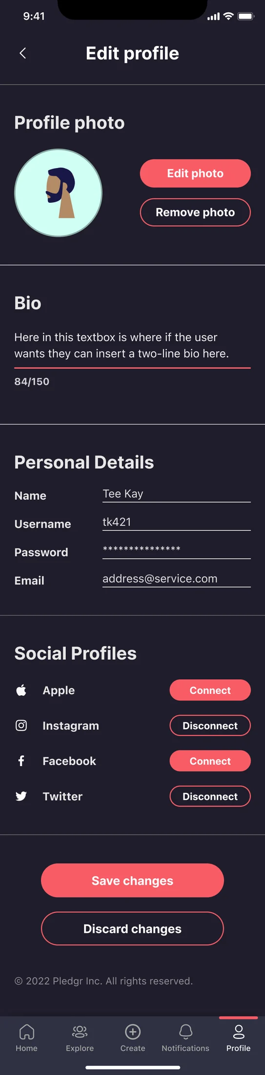
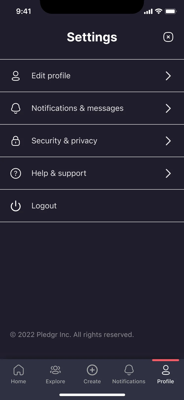
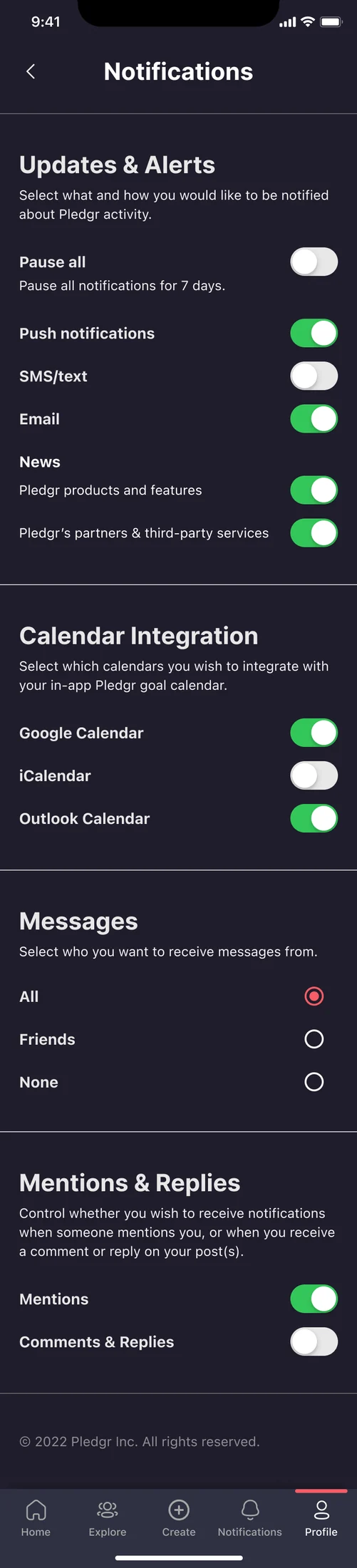
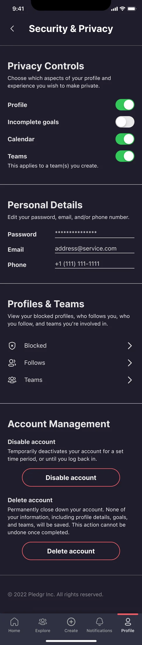
Full size ↗My own profile — populatedThe final version of my own profile. Goals are cards with their own imagery, each carrying a deadline and a participant count, and the calendar strip above them anchors the whole page to a date. No follow button, no challenge button — on your own profile those would be noise, and their absence is the clearest signal of which profile you are looking at.Full size ↗Someone else's profile — populatedThe same layout with two buttons added under the bio: Follow and Challenge. That is the whole resolution of the two-readers problem — one structure, one difference, placed where a thumb already is. Challenge is the one that matters, because it turns a profile from something you read into something you act on, and it is the CTA that was first written on a crazy-eights sheet in pencil.Full size ↗TeamsTeams with member counts and a single destructive action per row. Leave is shown rather than hidden in a menu, which is a deliberate choice in a product built on social pressure: if leaving is hard to find, people stop opening the app instead.Full size ↗Edit profileConnected accounts show Disconnect, not Connect, because the state a person needs to act on is the one that already exists. Save changes and Discard changes both appear, both labelled with the noun — a profile edit that silently autosaves is a privacy problem in a product where other people read the result.Full size ↗SettingsFive rows, down from the sampler's nine. Each surviving row is a destination with real content behind it; the policy links moved into Help and support where people actually go looking for them.Full size ↗Notifications & messagesGrouped by what the notification is about, not by the channel that delivers it, with a pause-all at the top of the list. Calendar integration sits in this screen rather than in a separate one because in a goal app a calendar is a notification source — it is where the deadline you agreed to lives.Full size ↗Security & privacyThe screen the two-readers problem finally cashes out in. Privacy is set per item — your profile, your calendar, and separately your incomplete goals — because the thing a person most wants to hide in a habit app is the goal they are failing. Designing that as its own toggle, rather than burying it in a blanket private-profile switch, is the difference between a product people trust and one they quietly abandon.
What came out of it
A fully prototyped version with a new UI and design system that was developed and reached
testing. I stayed in touch through the development timeline and made smaller edits as it
progressed.
What I would tell you in an interview
The design lesson is the pair of frames. Every stage of that file has “my own profile” and
“someone else’s profile” sitting next to each other, and keeping them adjacent is what kept
the answer honest. It would have been much easier to design the one I was looking at and
retrofit the other, and the retrofit is always where the inconsistencies get in.
The organisational lesson is bigger. Ten designers across four timezones, building a design
system at the same time as the screens that depend on it, is a coordination problem before it
is a design problem. Working in a pod of three inside that meant most of the real work was
keeping our corner consistent with nine other people’s decisions, asynchronously, with no
overlapping hours for half the team.
It is the smaller version of the problem I hit again on Saddle Pass, where one design system had
to survive three codebases. The answer was the same both times: decide the shared vocabulary
early and write it down, because you cannot correct drift in a conversation that never happens.