People with cardiovascular complications need to move more and are frightened of overexerting. The watch on their wrist already measures everything required and does almost nothing useful with it.
Role
Interaction Designer
Timeline
Design exploration
Surfaces
Apple Watch
Stack
Interaction design · Secondary research · Sketching
Constraints
Designing inside an existing platform's capabilities
A health context where a wrong prompt is a safety issue
The problem
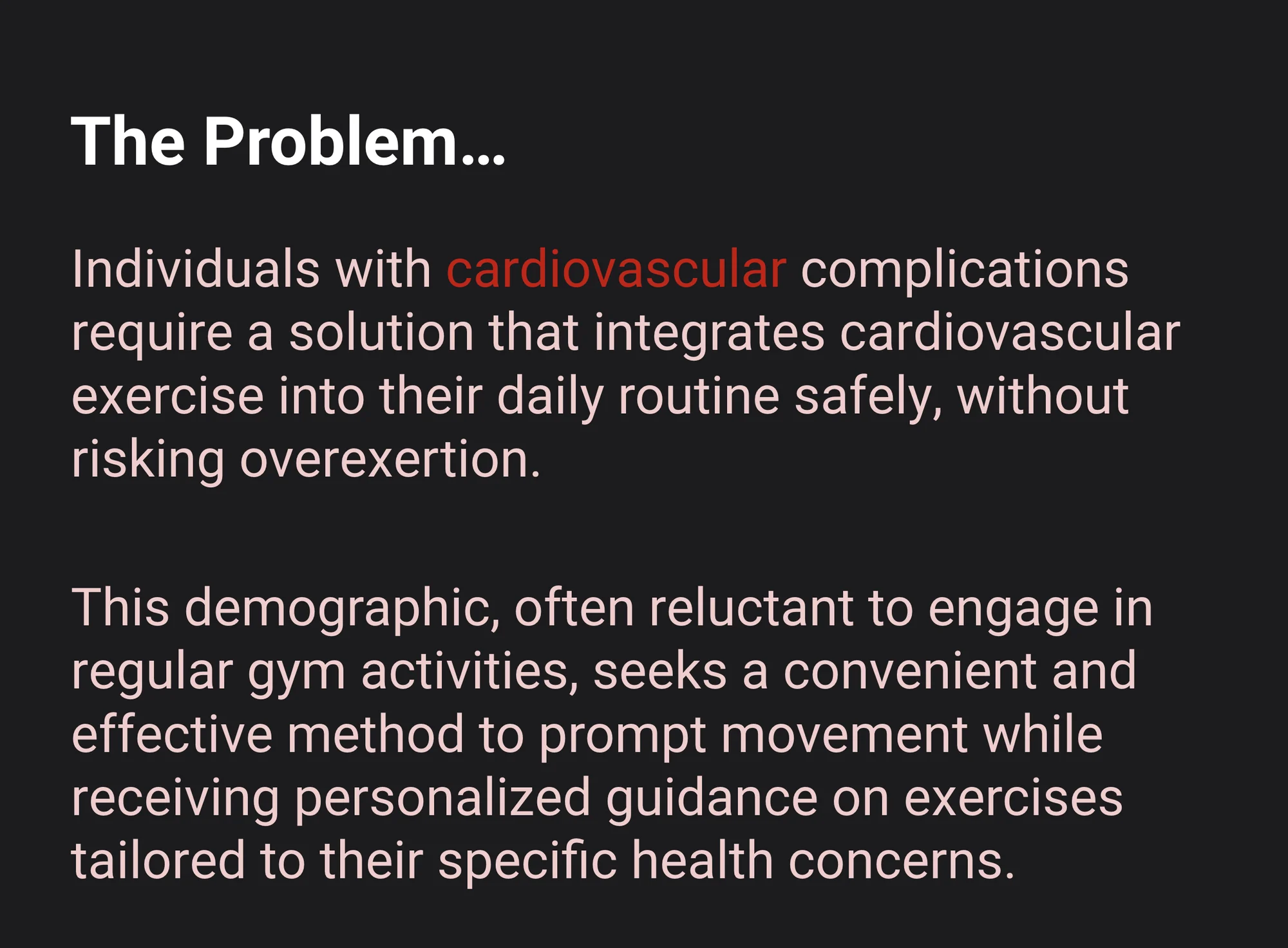
Full size ↗The problemTwo constraints that pull against each other: these people need to move more, and they are specifically afraid of moving too much. Any design that only solves one half makes the other half worse, which is why a generic fitness prompt is the wrong answer here.
Who it is for
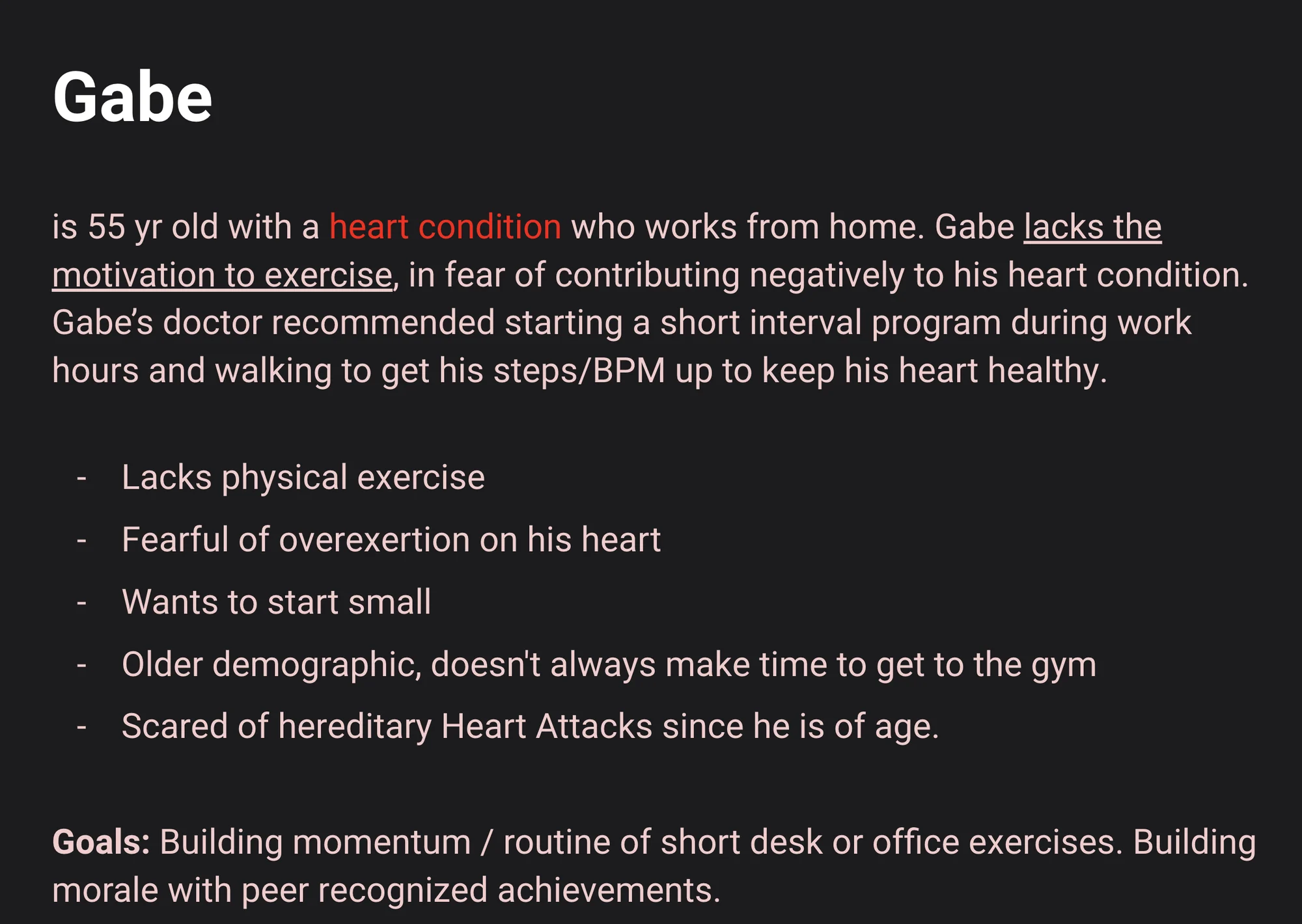
Full size ↗GabeGabe's doctor told him to start a short interval programme during work hours and to get his steps and BPM up. His goals are building momentum through short desk exercises and building morale through peer-recognised achievements. The phrase that does the design work is “wants to start small” — it rules out every goal-setting pattern that opens by asking for a target.
What the device already does
A wearable concept is only honest if it is built on the hardware’s real capabilities, so the
next step was an audit of the platform rather than a moodboard.
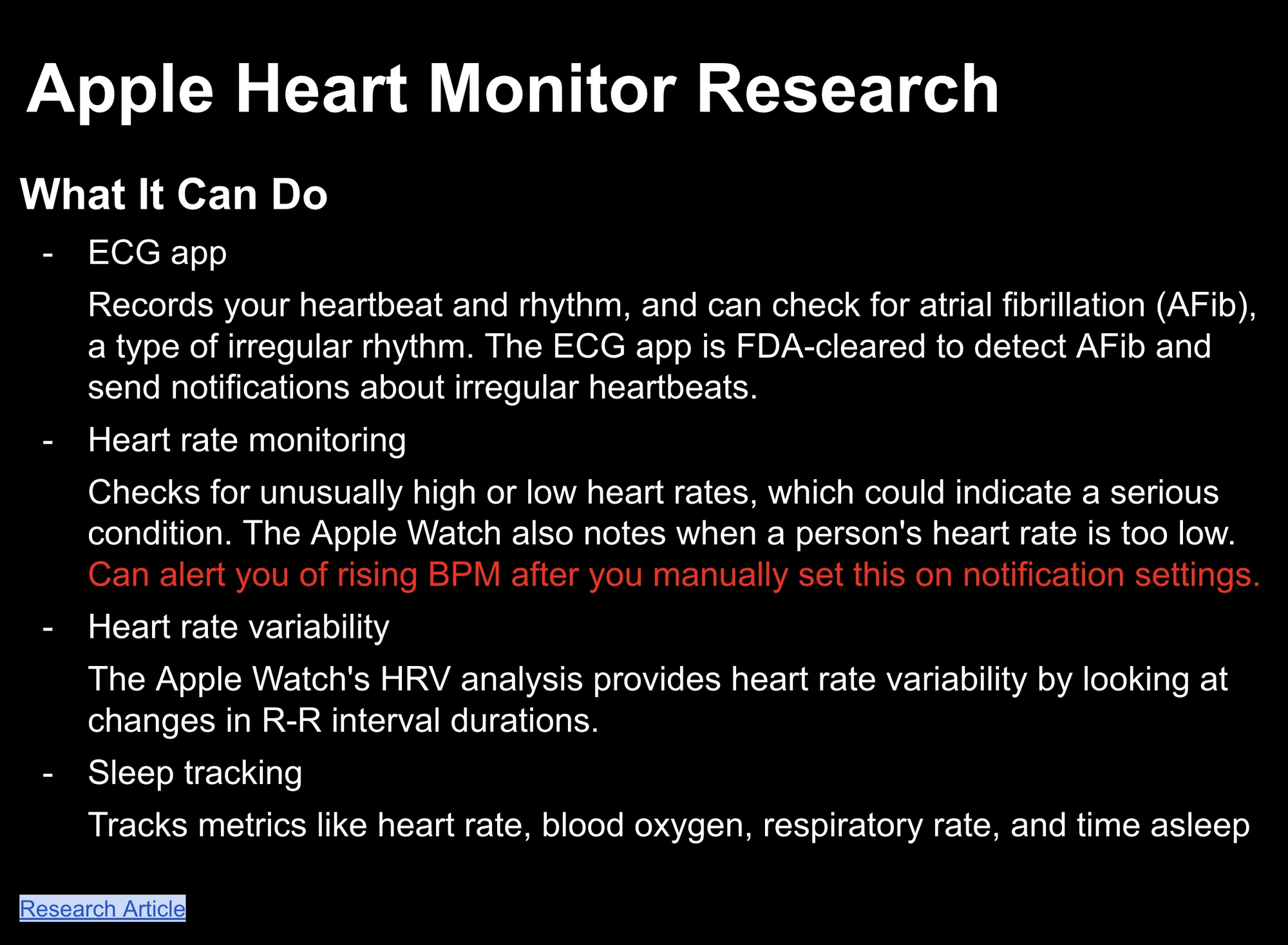
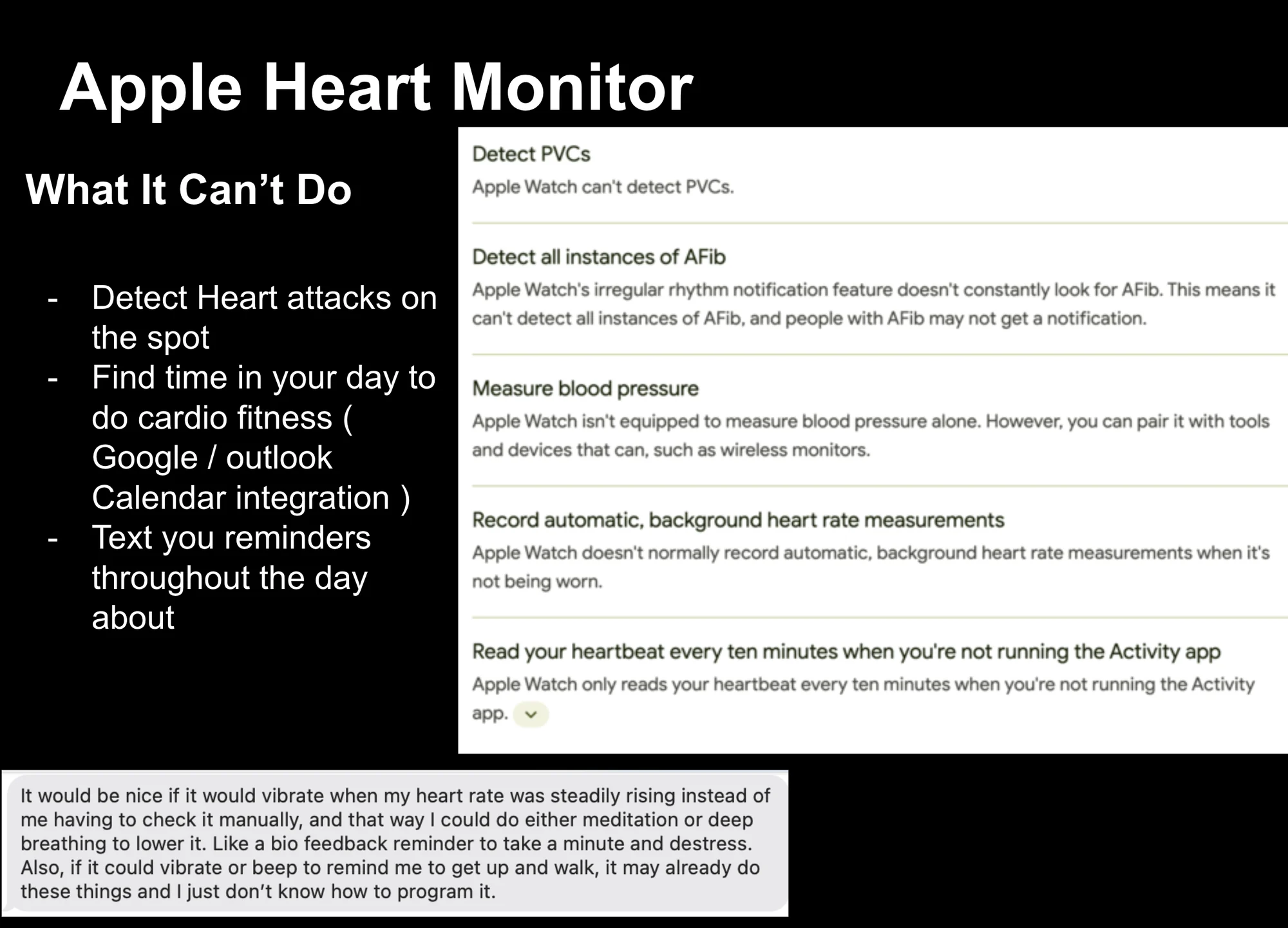
Full size ↗What it can doECG with FDA-cleared atrial fibrillation detection, high and low heart-rate alerts, heart-rate variability, sleep metrics. The highlighted line is the one the whole concept hinges on: it can alert you to a rising BPM, but only after you manually set that up in notification settings.Full size ↗What it can't doThree gaps, each quoted against Apple's own documentation so the claim is checkable. The user note underneath is the brief in a sentence: it would be nice if it vibrated when my heart rate was steadily rising instead of me having to check it manually, so I could meditate or deep breathe to lower it. The capability exists; the behaviour does not.
Sketching the behaviour
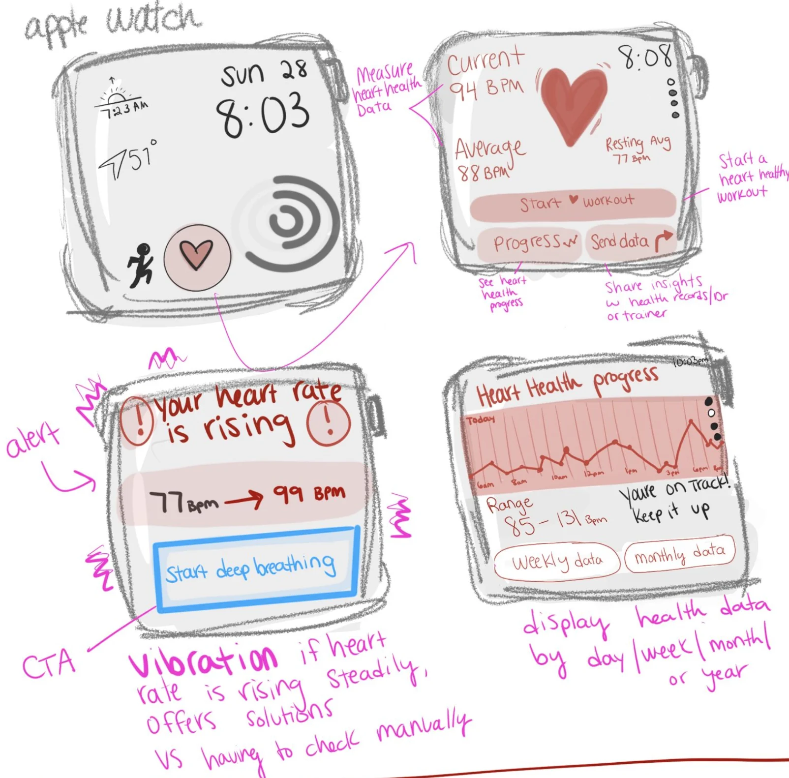
Full size ↗Initial sketchingFour screens and the paths between them, annotated in pink with what each transition is for. The alert is the heart of it — “your heart rate is rising, 77 BPM → 99 BPM” with a single Start deep breathing action — because an alert that only reports a number tells an anxious person they have a problem and gives them nothing to do about it. The annotation says it out loud: vibration if heart rate is rising steadily, offers solutions, vs having to check manually.
What I would tell you in an interview
The transferable part is the two-slide audit. Before designing anything for an existing
platform I now write down what it can already do and what it cannot, with sources, because the
answer changes what you are designing. Here it turned a fitness concept into a notification
design problem — the sensors were already correct and the interface was asking the wrong person
to do the watching.
The second thing is the shape of that alert. A health signal with no action attached is just
anxiety delivered on a schedule. Pair every alert with the smallest thing the person can do
about it — that rule came from this project and I have applied it to every AI confidence
warning and error state I have designed since.