Design a functional tiny home for a family earning $65k. The hard constraint was not the budget or the square footage. It was that a six-year-old and his parents needed to be able to get away from each other inside 340 feet.
Role
Project manager · Researcher · Product designer
Timeline
2020
Team
Student team; I ran the process and presented the final
Surfaces
Physical dwelling · Smart-home control app
Stack
Physical prototyping · Personas & journey mapping · Proto.io
Constraints
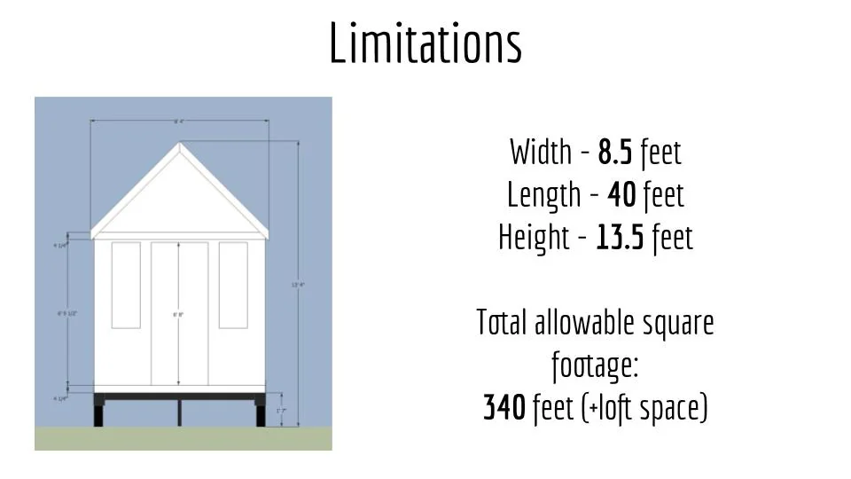
8.5 ft wide, 40 ft long, 13.5 ft high — 340 sq ft plus loft
Target households earning $15k–$75k a year
Two bathrooms required inside a one-room footprint
The problem
With single families struggling to find housing they can afford, the brief was to design a
functional tiny home for lower-income families — households between $15k and $75k a year.
The problem statement we landed on was narrower, and it is the one everything else answers to:
The Smith family needs an affordable, flexible, and sustainable tiny home that incorporates
togetherness and privacy as they grow.
Togetherness is easy in 340 square feet. Privacy is the design problem.
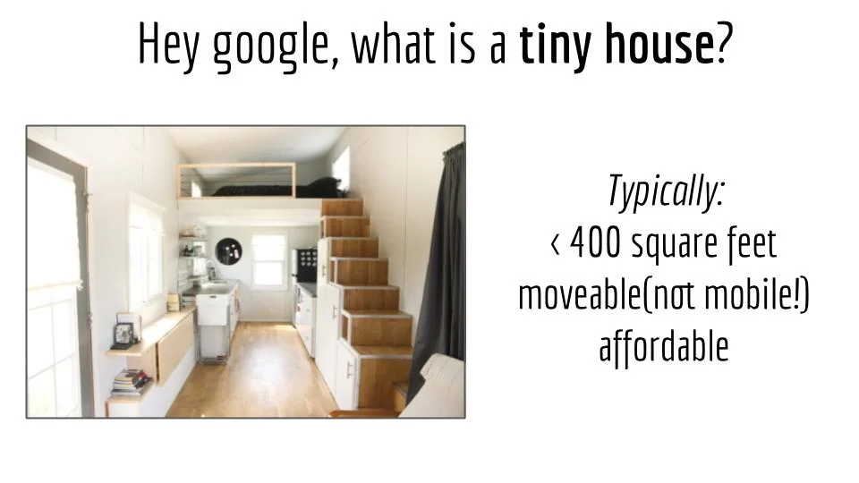
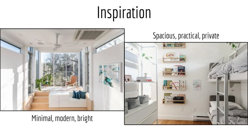
Full size ↗Starting from the definitionUnder 400 square feet, moveable but not mobile, affordable. Writing down the definition is not padding — “moveable but not mobile” is the line that rules out RV conventions and puts us in architecture, which changes every decision that follows.Full size ↗The hard numbers8.5 by 40 by 13.5 feet. These are road-legal towing limits, not aesthetic choices, and they are the reason this is a design problem rather than a decorating one. Every square foot spent on one need is taken from another, visibly.Full size ↗Competitive research and directionWe researched tiny homes and the companies already making them, determined our limitations, and worked out what could make ours stand out. The three words under each image are the direction: minimal, modern, bright on one side, spacious, practical, private on the other — and private is the one nobody else was solving.
Who lives here
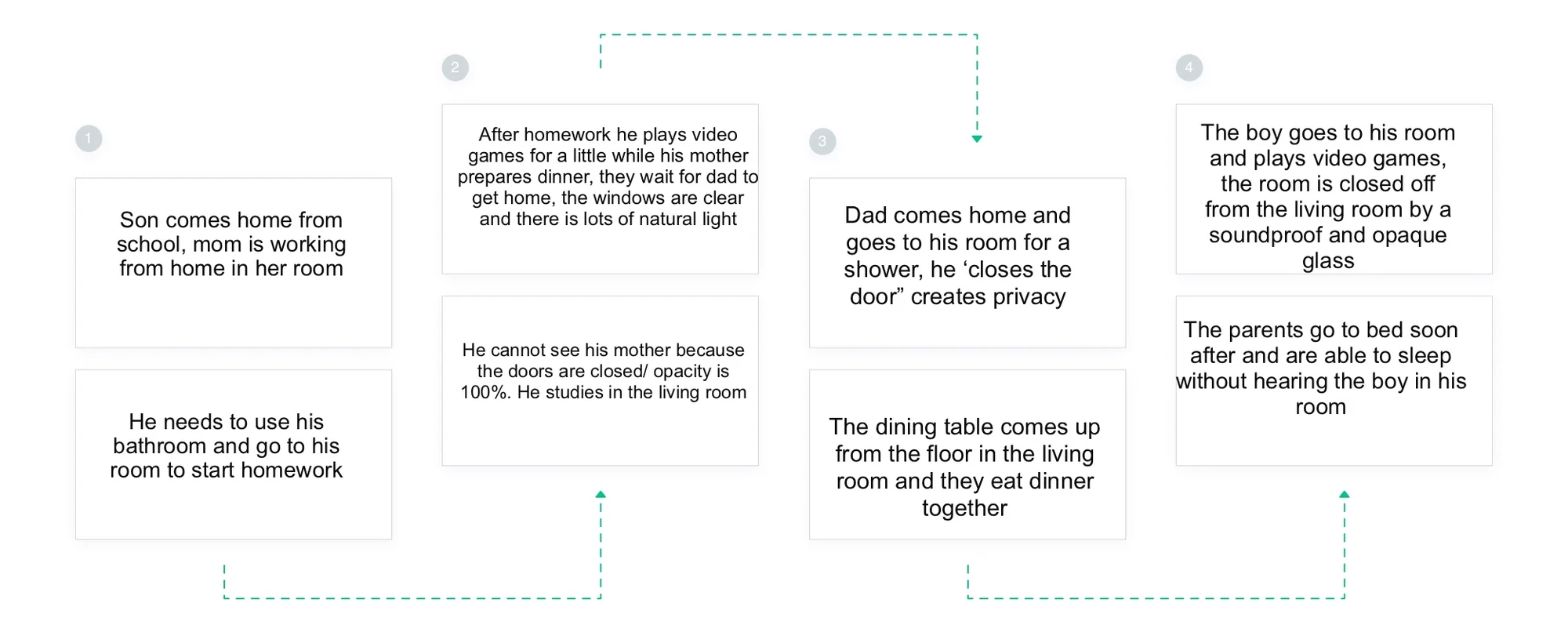
Full size ↗The Smith familyJohn, Mary, and six-year-old Michael, on a combined income around $65k. We referred back to this family through the entire process, and they exist for one reason: they gave us the two-bathroom problem. A six-year-old and two parents sharing one bathroom in 340 square feet is the constraint the whole floor plan bends around.Full size ↗One evening, hour by hourThe journey is a single weekday evening, and it is where the features came from. Mother working while the son does homework. Father showering without crossing the boy's room. Dinner at a table that is not there the rest of the day. Everyone asleep without hearing each other. Four moments, four requirements — and not one of them could be met by adding a wall.
Building it
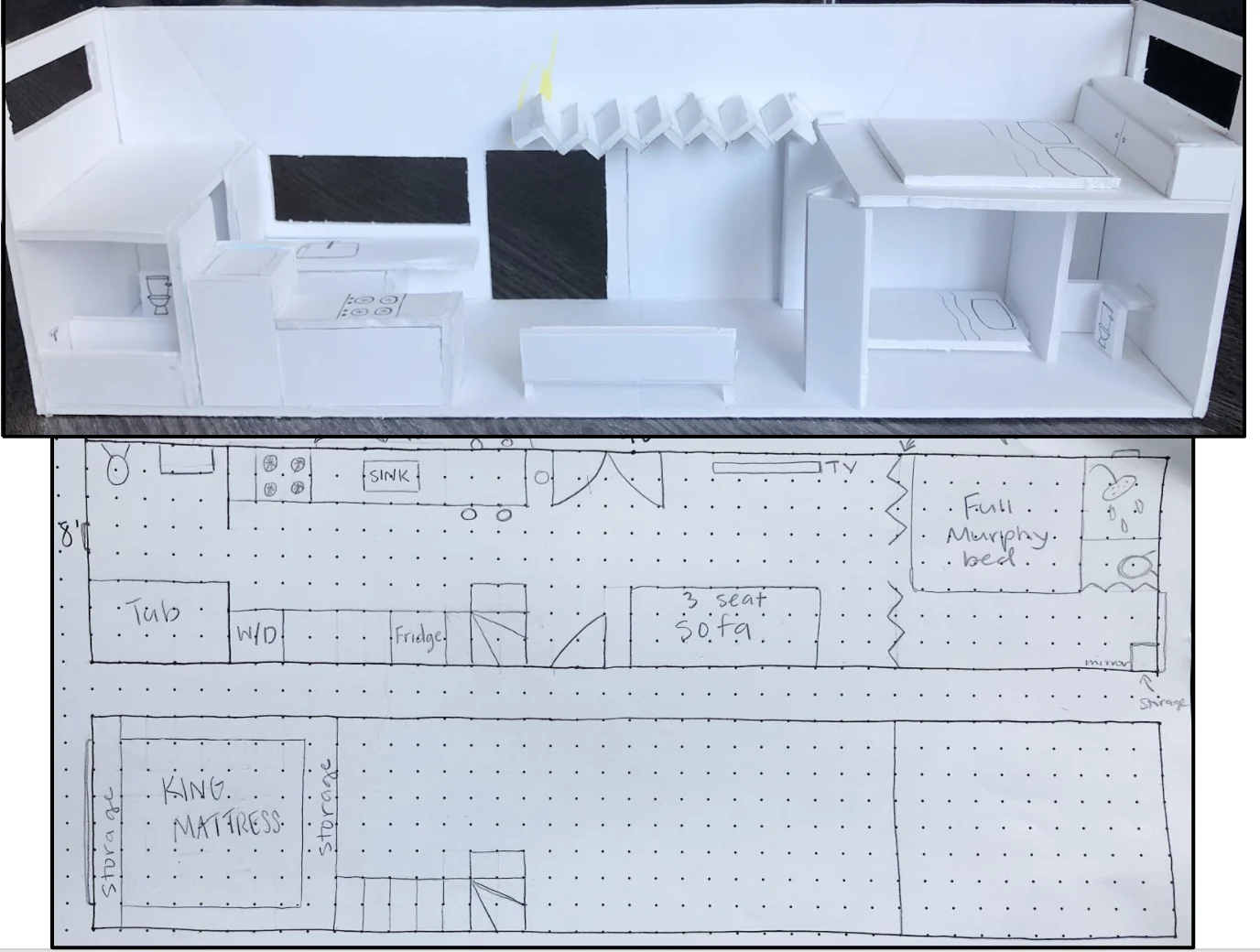
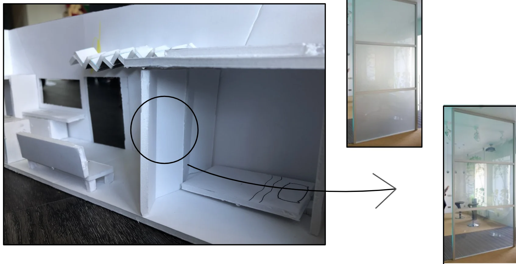
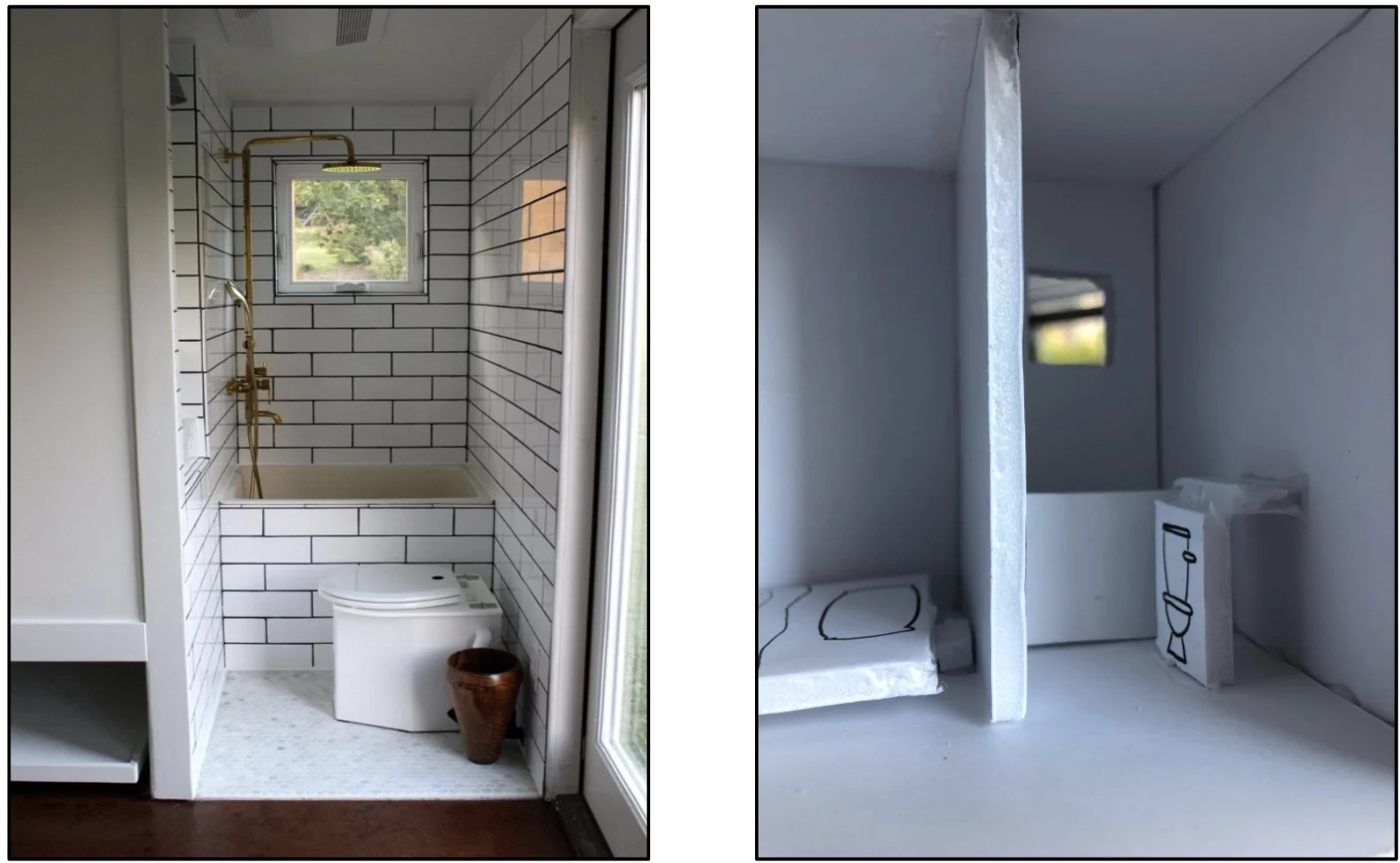
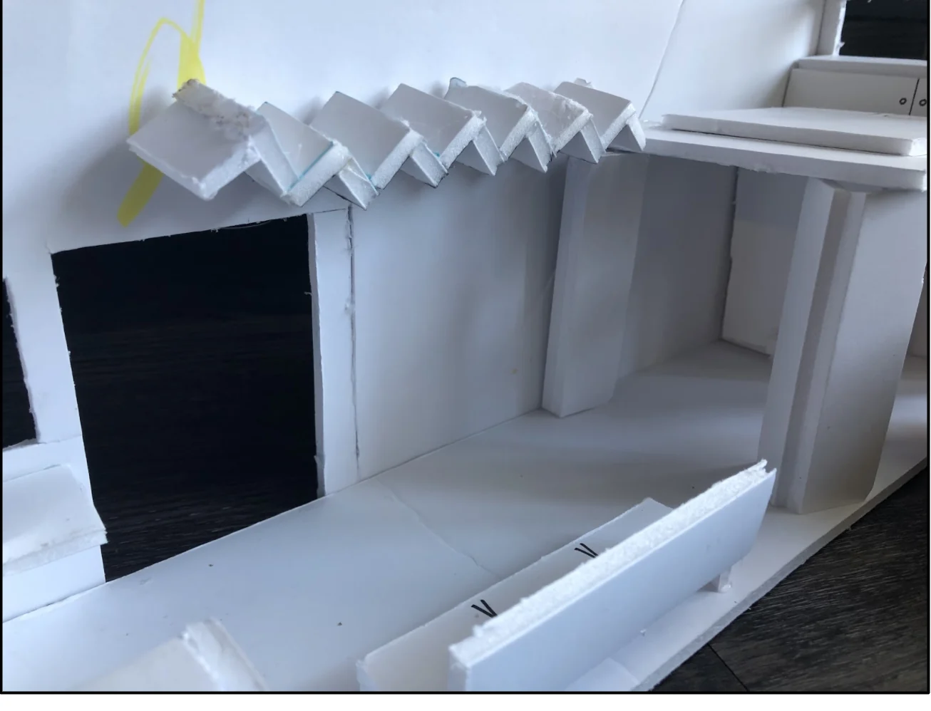
Full size ↗Low fidelity, in two mediaThe floor plan on grid paper and the physical model built from it. We started with low-fidelity wireframes to iterate through options fast, then built the physical product to show what the features actually were. A model does something a plan cannot — it makes someone reach in and discover that the door they drew cannot open.Full size ↗Opaque doors that act as windowsThe central move: doors that pass light but not sight, variable from clear to opaque. They solve the journey's contradiction directly — the boy studies in the living room with natural light while the room next to him is closed. In a house with no spare square footage, privacy had to become a property of a surface rather than a room.Full size ↗Two bathrooms, 340 feetThe requirement that sounded impossible. Splitting them was the only way the evening in the journey works — the father showers without entering his son's room — and it cost us enough floor area that the rest of the plan had to fold, slide, or stack.Full size ↗Stairs that move out of the wayStairs that concertina flat when nobody is climbing them. Alongside a folding couch and murphy bed and a dining table that comes down from the living room wall, the house has roughly a third more usable floor than it has floor — every fixed object had to justify being fixed.
The interface for a house
We wanted a tablet or app that could control the home’s features from one screen — and the
interaction model had to work for a gym teacher, a librarian, and a six-year-old.
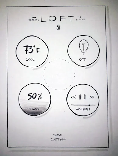
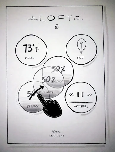
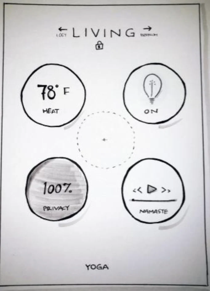
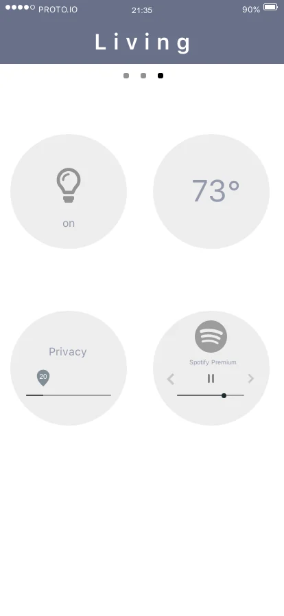
Full size ↗Sketch — the loft roomFour circular controls around an empty centre. Temperature, light, privacy, music — the four things this house can change about itself. The dashed circle in the middle is not decoration: it is the control surface, and it is empty until you put something in it.Full size ↗Sketch — slide to activateThe mechanic in one drawing: whatever you drag to the middle of the screen is the thing you are now editing. One gesture, four controls, no menus and no mode errors — and the room name stays at the top, so you always know which room you are changing. This is the idea the whole app is built on, and it was settled in pencil.Full size ↗Sketch — a saved sceneThe same four controls set to a named scene: 78° heat, lights on, privacy at 100%, a yoga playlist. Hobbies on a persona card usually decorate the page. Here, yoga became a stored state — which is the moment a research artifact earns its place.
Light comes from above, so sliding up and down sets opacity or brightness as a percentage.
Temperature turns like a knob. Music connects out to Spotify or Apple Music over Bluetooth.
Each control borrows the physical gesture the real thing already has.
Second iteration — mid fidelity
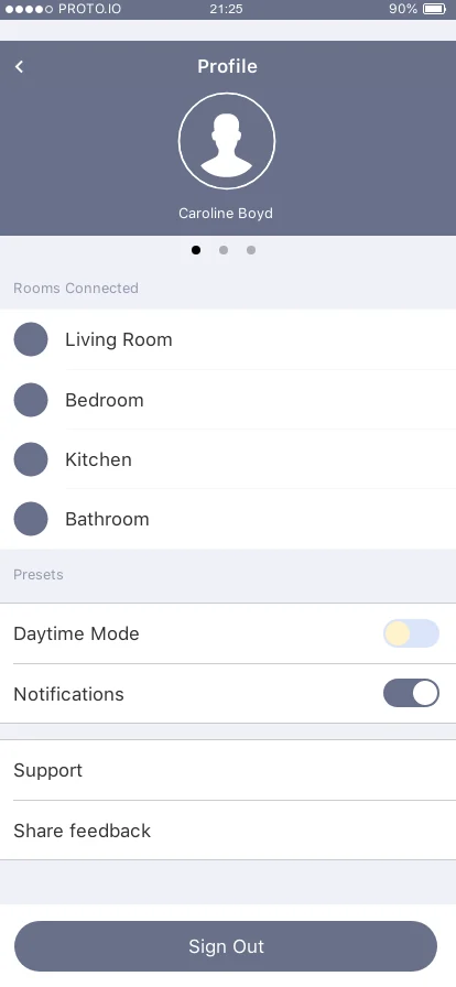
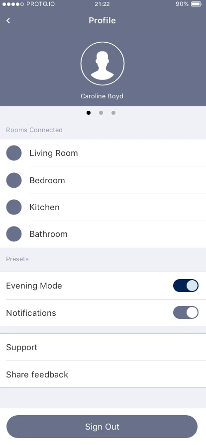
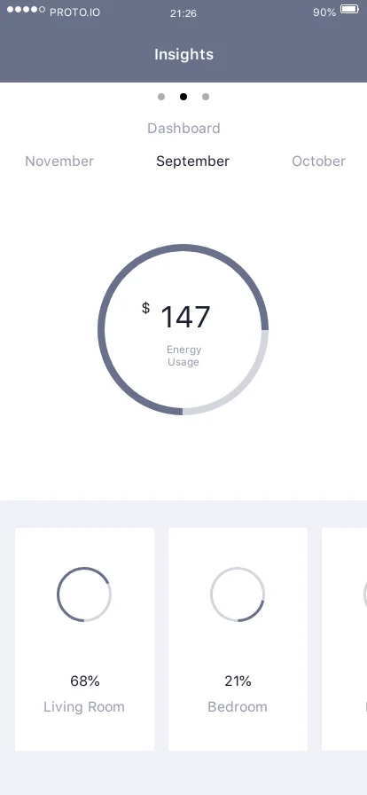
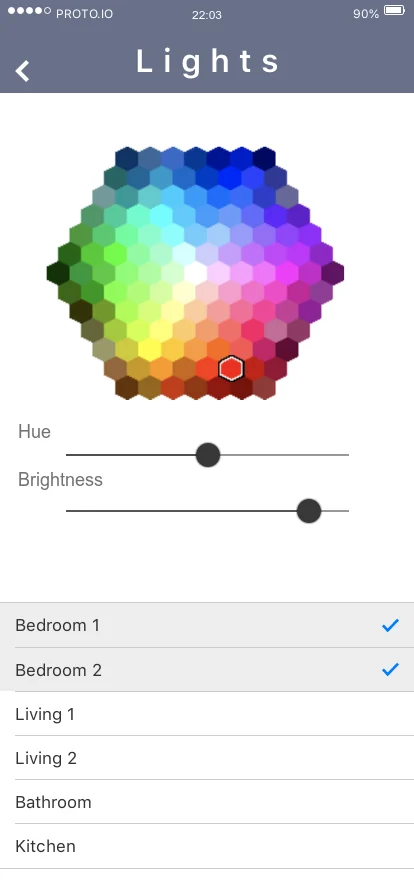
Full size ↗Sign inA home's control app has an account, which sounds mundane until you ask who in the household gets one. The answer shapes everything downstream — who may change the privacy level of a room they are not in.Full size ↗Profile — daytime modeRooms connected, then presets. Daytime and Evening are the two states a 340-foot house genuinely has, because the same floor is a living room at six and a bedroom at ten.Full size ↗Profile — evening modeThe paired state. The journey said the boy's room closes off with opaque glass after bedtime and the parents go to bed without hearing him; Evening Mode is that sentence turned into one switch, so nobody has to set four controls in three rooms at the end of a long day.Full size ↗InsightsEnergy as dollars first and percentages second, because for a household on $65k the number that matters is the bill. Showing it per room is what makes it actionable — the living room is 68% of the spend, and that is where a change is worth making.Full size ↗Living — the four controlsThe sketch, built. Same four controls, same room name at the top, same one-tap-in model. Carrying a sketched mechanic through to mid-fidelity without diluting it is harder than inventing it, and it is usually where concepts quietly turn into ordinary settings screens.Full size ↗LightsColour, brightness, and which rooms it applies to — on one screen, with the room list as checkboxes rather than a separate navigation step. In a house this size people change several rooms at once far more often than one.Full size ↗TemperatureA dial, because a thermostat is a dial. Borrowing the physical affordance is the cheapest usability win available when you are replacing a physical control with a glass one.Full size ↗PrivacyThe control for the opaque doors, and the only one in the app that could not borrow an existing gesture. The slider is the gradient — you drag through the actual range from fully private to 100% natural light, so the control shows the result rather than a number describing it. This is the screen that makes the architecture work, which is why it is the one the app had to get right.
What I would add
Soundproofing the adults’ bedroom, so they are not kept awake by a six-year-old’s gaming. The
journey already identified that need and the physical design only half-answered it — opaque
glass solves sight and does nothing for sound.
What I would tell you in an interview
This is the project where I learned that the interface and the environment are one design.
The app is not an accessory to the house; the opaque doors are unusable without a good privacy
control, and the privacy control is pointless without doors that can change. Designing either
one in isolation would have produced something worse.
It is also the clearest example of a journey map actually earning its keep. One ordinary
weekday evening, written out hour by hour, produced the two-bathroom requirement, the folding
table, the opaque glass, and Evening Mode. I did not brainstorm a feature list — I wrote down a
family’s night and read the features off it.