School projectThe University of Texas at Austin — SDCT
Treadmill walking is boring enough that people stop doing it. The fix is not a better treadmill, it is somewhere to walk — and the hardest design problem is that you are blind to your own living room while you do it.
Role
Spatial / Interaction Designer
Timeline
Spring 2024
Surfaces
visionOS · Immersive environment
Stack
Apple Vision Pro / visionOS · Game engine — terrain, vegetation, lighting
Constraints
The user is walking, on a machine, unable to see the real room
visionOS conventions — no controllers, gaze and pinch only
An environment convincing enough to want to stay in
The problem
A treadmill is a machine for walking nowhere. People buy them, use them for a month, and stop —
not because walking is hard but because a wall is a bad view.
StepScape puts somewhere on the other side of the headset. You put on a Vision Pro, pick a
place, and walk through it while the treadmill does the work.
The interesting part is not the idea. It is the constraint sitting underneath it: the user is
moving, on a powered machine, with their eyes fully occupied. Everything about the interface
has to be decided against that.
The surface it lives on
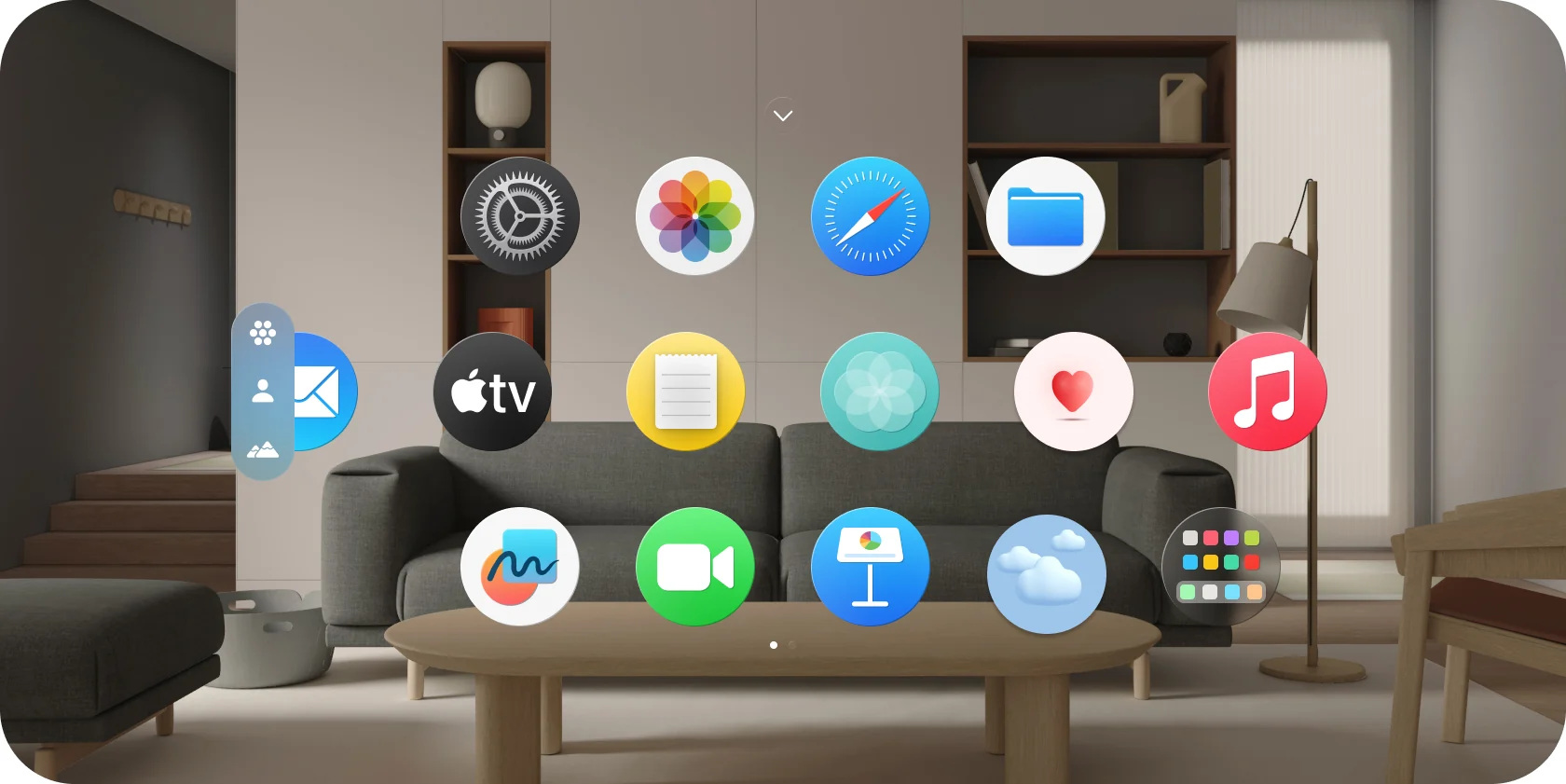
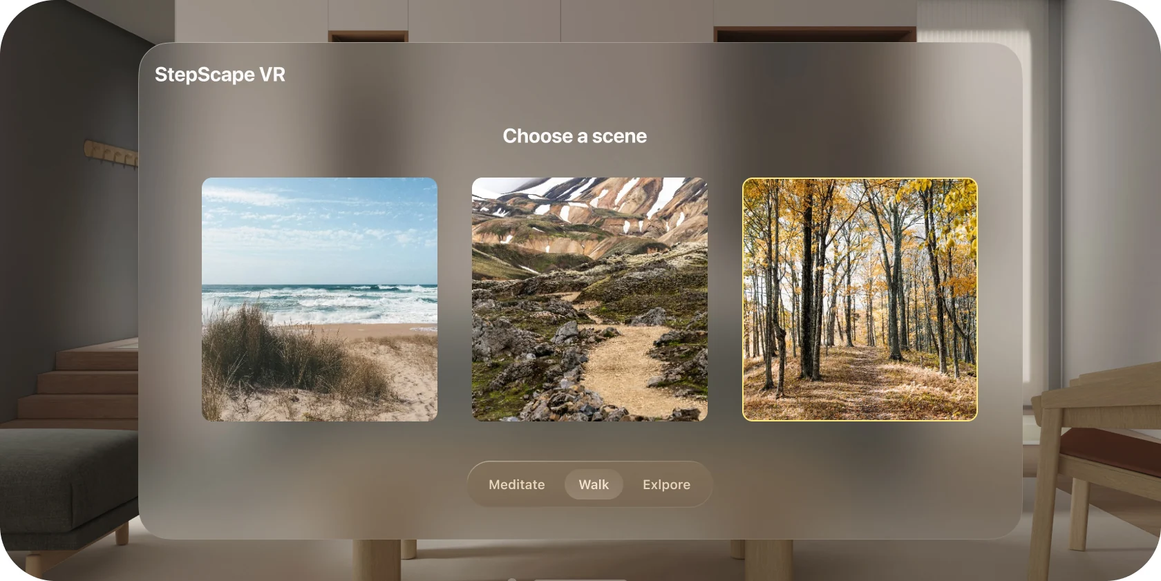
Full size ↗Where it starts — passthroughAn app on this platform does not open on a screen, it opens in a room. The icons float in the user's actual living room, which means my app has to be designed knowing its background is somebody's furniture, at whatever brightness their afternoon happens to be. That is the first thing spatial design takes away from you: control of the backdrop.Full size ↗Choose a sceneThree places and three intentions, and the intentions matter more than the places. Meditate, Walk, Explore are not difficulty levels — they change what the environment does with you in it. The panel is deliberately a flat window rather than something volumetric: you are still standing in your room at this point, and a floating sheet is a thing people already know how to use.
The screen I would defend
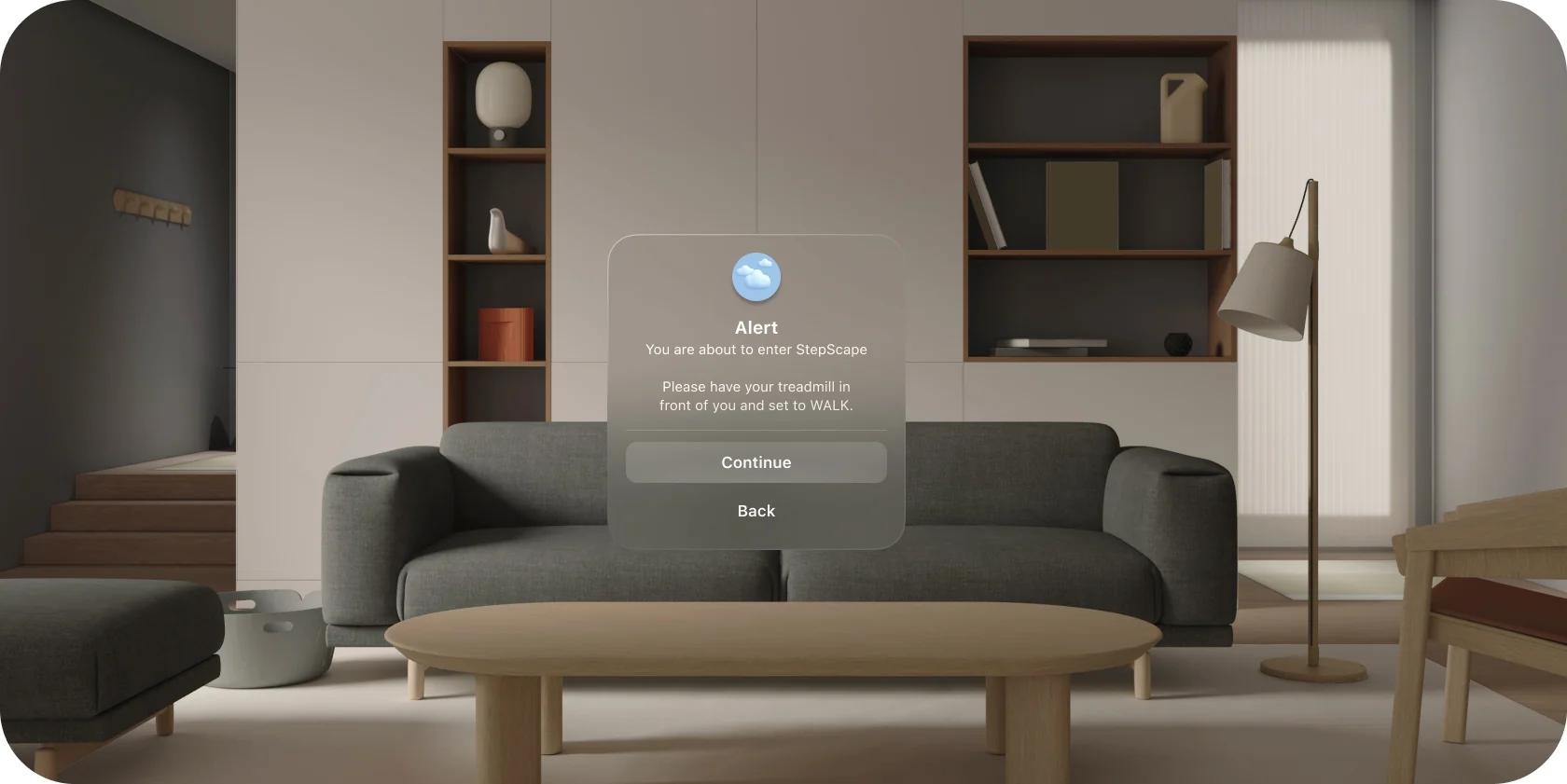
Full size ↗Before you go in“You are about to enter StepScape. Please have your treadmill in front of you and set to WALK.” This is the whole project in one dialog. The moment the immersive scene begins, the user cannot see the machine they are standing on, so the last thing they see has to be an instruction about the physical world — and the one setting that could hurt them is named in capitals. In flat design a confirmation dialog is usually friction worth removing. Here it is a safety interlock, and it is the last reversible moment in the session.
Three decisions are packed into it:
It is modal, and it should be. Everything after this point is non-reversible in the sense
that matters — you cannot glance down.
It states a physical precondition, not a digital one. The treadmill is in front of you.
The speed is set. Those are the two facts the software cannot check.
Back is a real option, weighted equally. Someone who is not ready should find leaving
easier than continuing.
Building the place
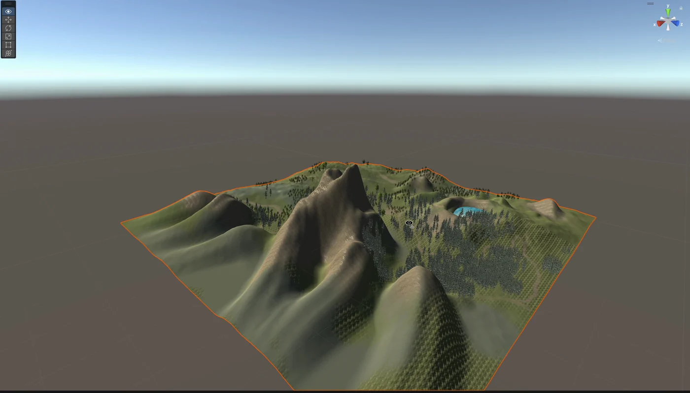
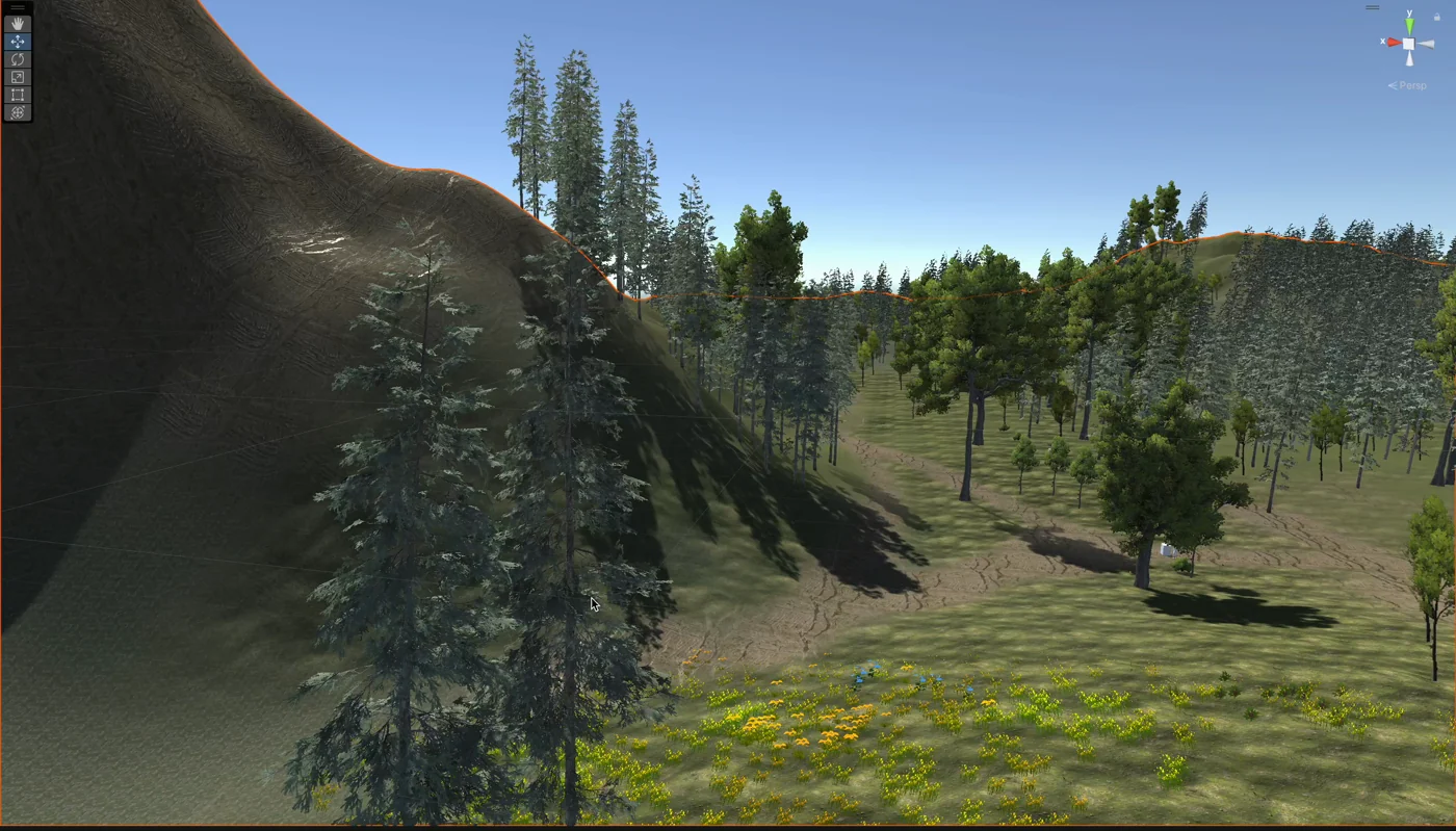
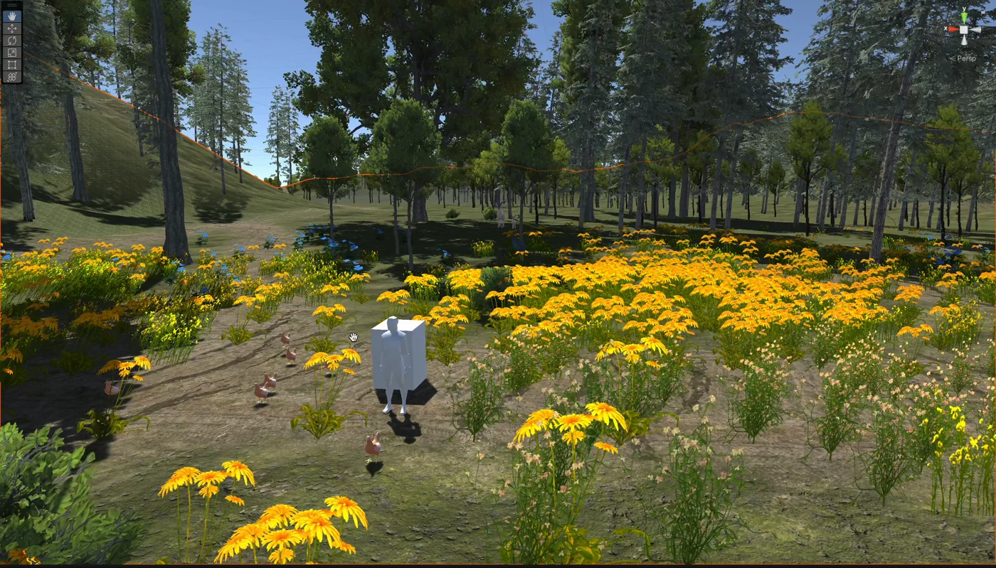
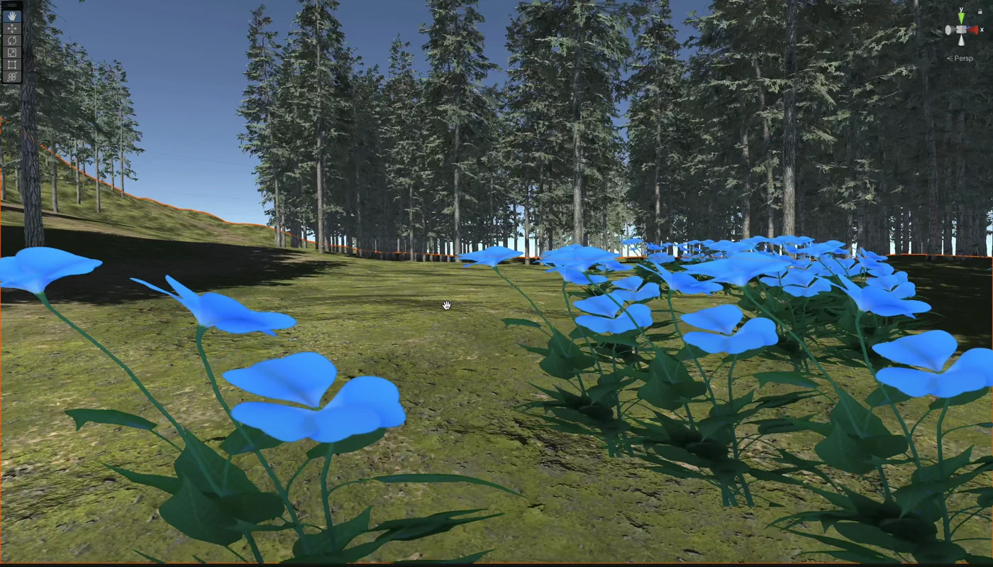
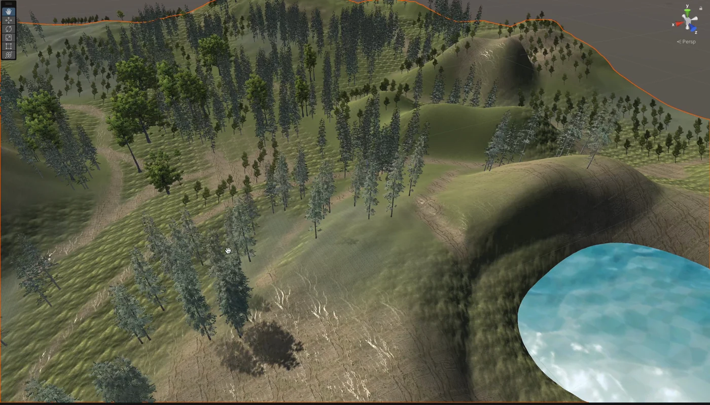
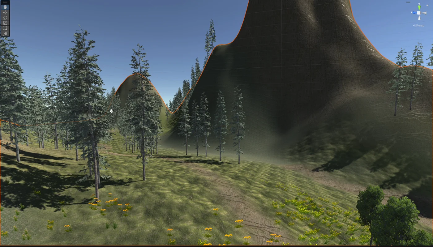
The interface is half the work. The other half is that somewhere has to exist, so I built it —
terrain, vegetation, water and lighting, in a game engine.
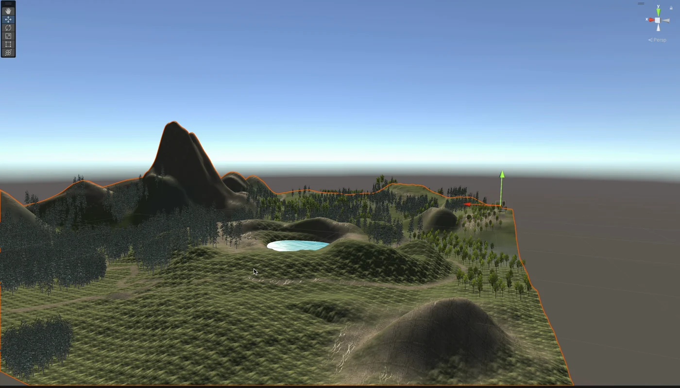
Full size ↗Terrain, earlyThe landform first, on a bare mesh, before anything is planted. At this stage the only question is whether a walking route exists — where the ground rises, where it turns, how far you can see. Everything that makes it look like a place gets added later, and none of it will rescue a boring shape.Full size ↗The whole placeThe island from above, which is a view the user will never have. Designing an environment for someone walking through it at eye level means the plan view exists only for me — and the thing I am checking here is that no route is a straight line. A straight path on a treadmill is a corridor; a curving one keeps giving you a new thing to walk toward.Full size ↗Walking the slopeThe same terrain at eye height, which is the only view that counts. Trees are doing two jobs here: they make the place feel real, and they hide the edge of the world. A treadmill walker has unlimited distance and the environment does not, so the design problem is concealing a boundary you will never stop approaching.Full size ↗Scale checkA plain untextured figure dropped into the meadow, because the flowers either come up to your knees or they do not and no amount of looking at a screen will tell you. Scale is the thing VR punishes hardest — a landscape that reads perfectly in a screenshot can feel like a model railway the moment you are standing in it.Full size ↗Something to look at, up closeBlue flowers placed where a walker's eye lands rather than scattered evenly. In a scene you move through at a fixed pace, the interesting things have to arrive on a rhythm — too sparse and it is a field, too dense and the frame rate goes, and the frame rate is not an aesthetic problem in VR, it is a nausea problem.Full size ↗Water as a landmarkThe lake exists to be navigable-by. On a treadmill you have no map and no reason to turn, so the environment has to supply the orientation a real walk gets for free — a big, unmistakable thing that tells you where you are and which way you have come.Full size ↗The Walk mode viewWhat the Walk mode actually looks like from inside: a destination on the horizon and enough foreground to give you a sense of speed. Without near objects passing you, walking in VR feels like standing still while the world zooms — and that mismatch between what your legs report and what your eyes report is exactly where motion sickness comes from.
What I would tell you in an interview
Spatial design taught me a category of constraint that flat design does not have: the user’s
body is part of the system, and it can be hurt. Every other product I have worked on fails by
wasting someone’s time. This one fails by putting a person on a moving belt and taking away
their eyes.
That reframes a confirmation dialog from friction into a safety interlock, it makes frame rate a
health requirement rather than a polish item, and it makes scale a correctness question instead
of a taste one.
The other thing I took is that I had to build the environment, not specify it. There is no
handing a landscape to someone as a redline — you sculpt the terrain, plant it, walk it at eye
height, and find out that the route you drew from above is boring. That is the same loop I now
run in code on product work, which is why this sits on the same site as the rest of it rather
than in a folder marked “school.”